days to give it a try before you buy! Download now. The best deals on licenses are coming soon Download now. The best deals on licenses are coming soon

WEBIX JAVASCRIPT LIBRARY BLOG

UI development best practices, front-end programming tips and news to speed up your Web development.

Follow us:

Write for us: learn about our guest posts guidelines.

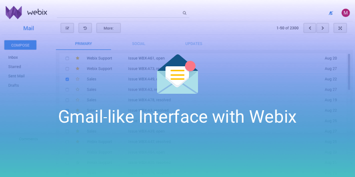
Creating a Gmail-like Interface with Webix

An app logic well done is only half a job accomplished. The other half is designing such a UI that would enhance the functionality of the app and make it rational and easy to navigate. Besides, it’s important to create a nice-looking interface to make apps recognizable and visually appealing.

Gmail has one of the most recognizable interfaces on the web. It’s neat and clean and can be used to rationally organize the massive app contents. In fact, Gmail UI can be used not only for email management but for other tasks as well. If you would like to know how to recreate such an interface and don’t know where to begin (or in case you are just curious), follow me. I’ll show you how to implement Gmail’s approach to designing interfaces with the Webix UI library.

Gmail-like interface with Webix

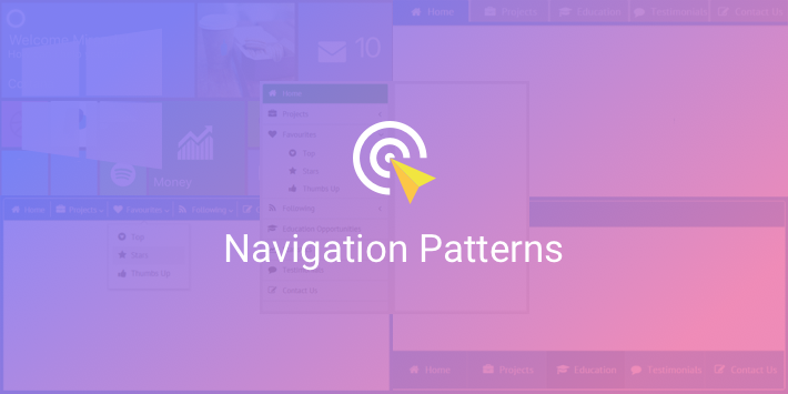
In-App Navigation Patterns

When the content of your web app gets bigger and bigger, it’s a good idea to split it into multiple screens. This, in its turn, demands convenient navigation, so that users could quickly find what they need. User experience isn’t supposed to turn into the quest for the Holy Grail.

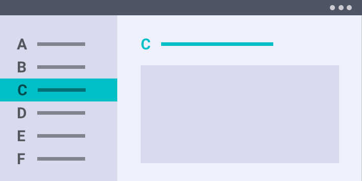
Numerous navigation patterns have been designed to achieve this honorable goal. So if you are looking for ways to make your apps more handy and good-looking, join me on my ship, and together we’ll find our way in the sea of In-App Navigation and visit four remarkable islands of the Webix Archipelago: Sidebar, Tabbar, Top Menu, and Winmenu.

navigation design patterns

Master-Details Pattern with Webix UI

I guess, the master-details pattern needs no special introduction for practised web developers who create business apps that work with users, sales and such. Nearly any real life app has such a relation model and demands clear and easy navigation and inspection of information. Whether you plan to develop an email app, an address book, an RSS reader, a CRM, a social net app or any other app that is based on a list-details layout, the master-details pattern is a relevant solution.

Webix UI Library provides a number of ways to implement this technique: from simple to more complex, from pretty awkward to really handy ones. I’ll demonstrate them all while creating a mock email management app, and at the end of it all, you’ll see the most efficient, reliable and good-looking solution. Well, without further ado, let’s get down to the details of our master plan.

Master-details pattern with Webix UI

Preserving Data during Page Reloads

No one is exempt from making mistakes and getting browser crashes. This can be really annoying, if you have worked hard for a long time filling in an extremely complicated form, looking for data in a big spreadsheet with complex filters or have just set a nice and convenient layout scheme to work on a web page — and everything is lost just because the page is reloaded or closed. It is a good idea to save and store temporary data to rescue your users from such a disappointing experience and help them not to lose their time doing everything all over again or readjusting their working space every time they open the same page.

If you create applications with forms, tables and complex layouts and want to help your end-users restore the data that haven’t been saved locally or sent to a server due to some accidents and mistakes (page reloads, browser crashes, laptop shutdowns, etc) or just want to let them preserve the state of an app for any other reason, I will show you how.

preserving data on page reload

1 5 6 7 8 9 10