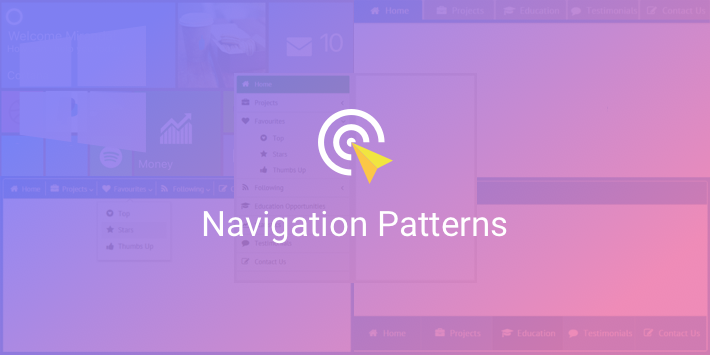
When the content of your web app gets bigger and bigger, it’s a good idea to split it into multiple screens. This, in its turn, demands convenient navigation, so that users could quickly find what they need. User experience isn’t supposed to turn into the quest for the Holy Grail.
Numerous navigation patterns have been designed to achieve this honorable goal. So if you are looking for ways to make your apps more handy and good-looking, join me on my ship, and together we’ll find our way in the sea of In-App Navigation and visit four remarkable islands of the Webix Archipelago: Sidebar, Tabbar, Top Menu, and Winmenu.
Modern Approach – Sidebar
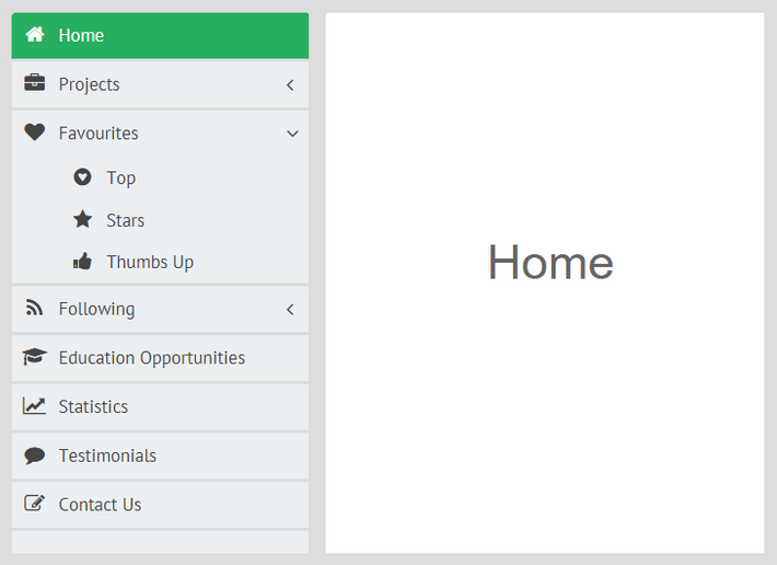
Ahoy there! Our first stop is the Isle of Sidebar, which can offer you a modern and handy approach to designing in-app navigation. Sidebar provides comfy navigation in limited space, as quite a lot of options can be placed onto its vertical panel. Moreover, Sidebar is suitable for screens of all sizes: if you develop mobile apps, you can use the collapsible version of a sidebar. But enough words, let’s take a closer look at the example.
To be able to use all the treasures of Sidebar, you can include its files by setting links to Webix CDN:
type="text/css" media="screen" charset="utf-8">
<script src="//cdn.webix.com/components/sidebar/sidebar.js"
type="text/javascript" charset="utf-8"></script>
After you do this, you can effortlessly initialize a sidebar and populate it with data:
type:"wide", cols:[
{
view:"sidebar", id:"sidebar", data:menu_data,
ready:function(){
this.select("home");
}
},
{
//main view
}
]
});
As a result, we have a fully functioning sidebar that awaits your content.
Off we sail now to our next destination.
Older, but Still Hip Classic – Tabbar
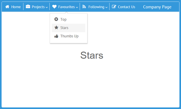
We have reached the great Isle of Tabbar, that can boast older traditions. Tabbar provides web developers with a classical approach to designing in-app navigation which is still relevant and will probably be such in the nearest future.
Top Tabbar
First, let’s explore the northern part of the island – Top Tabbar.

This navigation pattern is also handy and helps save screen space, though the number of tabs is limited: the more tabs you have, the smaller their headers become. The tab headers that don’t fit can be put to a popup. However, in this case, users won’t be able to see all the headers at once, and the navigation won’t be so convenient anymore.
Okay, here’s the code for initializing a top tabbar:
type:"space", margin:0, rows:[
{ view:"tabbar", id:"tab", options:menu_data, multiview:true },
{ cells:[
//cells with the content of the multiview
] }
]
});
For tabbar navigation, you have to enable multiview and afterwards create the multiview with arbitrary content.
And now let’s pay a visit to Bottom Tabbar.
Bottom Tabbar
The only difference from the previous navigation pattern is that the layout with Bottom Tabbar has tabs at the bottom of the page, which is especially convenient for mobile apps.

Beside placing the tabbar below the multiview, I specified the "bottom" type of the tabbar, since by default it is top:
rows:[
{ type:"header", template:"Company Page"},
{ cells:[
//cells with the content of the multiview
] },
{ view:"tabbar", type:"bottom", id:"tab", height:70, options:menu_data, multiview:true }
]
});
As we sail through the Webix Archipelago, we’ve come to one of its oldest parts, and here is our next destination – the Isle of Top Menu.
Old, and Probably Not Very Trendy – Top Menu
Not so many web developers sail to Top Menu nowadays. This approach is a bit less handy than the previous ones because the options are displayed in popups, which are pretty fragile. A single movement of the mouse pointer in the wrong direction can close the submenu. Besides, with this navigation pattern users don’t see their current position within the app.
I have placed the menu on a toolbar at the top of the page. Here is the code that defines the menu and loads it with data:
view:"menu", id:"menu", subMenuPos:"bottom",
data:menu_data,
type:{
subsign:true,
height:40
},
on:{
onMenuItemClick:function(id){
$$("details").setValues(this.getMenu(id).getItem(id));
}
},
ready:function(){
this.select("home")
}
};
subMenuPos sets the relative position of popups with submenus. The subsign property defines whether to display the submenu icon.
Now it’s time to say goodbye to Top Menu and sail to the last island.
Non-Standard UI – Winmenu from Components
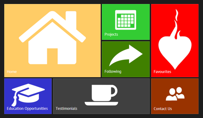
On the outskirts of the archipelago, there is an extraordinary place – the Isle of Winmenu. It can offer an approach designed for developers who want to try something uncustomary. For example, if you want to recreate Windows 8 Start menu, this approach can offer exactly what you need.
To get access to the riches of Winmenu, you can create a custom component on the base of Webix List. You can take the code of the widget from this demo repository.
Each menu option has two compulsory properties (value and img) and a number of optional ones. You are to set them, when you define data for Winmenu:
{ id:"home", value:"Home", color:"#fc3", img:link+"home.png", width:2, height:2, x:1, y:1 },
{ id:"projects", value:"Projects", color:"#44c956", img:link+"12.png", x:3, y:1 },
//other options
];
In the x and y properties I specified the relative position of each menu option, and for some of the options I set larger size parameters.
Now I will initialize Winmenu:
view:"winmenu", data:menu_data,
on:{
onItemClick:function(id){
webix.message(this.getItem(id).value);
}
}
};
webix.ui({
width:800, height:620,
xCount:4, yCount:3,
padding:30, rows:[menu ]
});
As you can see, this navigation pattern is modern-looking, convenient and colorful and can be a good alternative to more traditional approaches.
Conclusion
It’s time to end our voyage, guys. I thank you for joining me and I hope that the voyage has been full of pleasant and curious discoveries. Together we’ve looked at several approaches to making web apps easier to navigate: Sidebar, Top and Bottom Tabbar, Top Menu and, finally, Winmenu.
Navigation patterns evolve, and only the sky’s the limit, so maybe very soon a better approach will appear and will become the new black of in-app navigation. What do you think? On that note I say goodbye to you. May you have many a victorious voyage in the JavaScript Ocean. See you later!
Meanwhile, you can consider some related texts to read:

