In the midst of a busy schedule, you might wonder where all your money went. Tracing all your expenses can be a bit tricky. Usually there are some expenses that you might forget when making a budget, such as irregular bills, special days like Christmas or any parties. It is a good practice to write down every purchase to see a bigger picture of your expenses. And here come the budget tracker apps. From regular groceries to irregular nights out, such apps make budgeting easy.
In this tutorial, I’ll show you how to build a budget tracker app using Webix UI components. You’ll learn how to track income and expenses, and visualize your financial data with charts.
You can find the full source code and a live demo here.
Overview of the Budget Tracker App: Features and UI Components
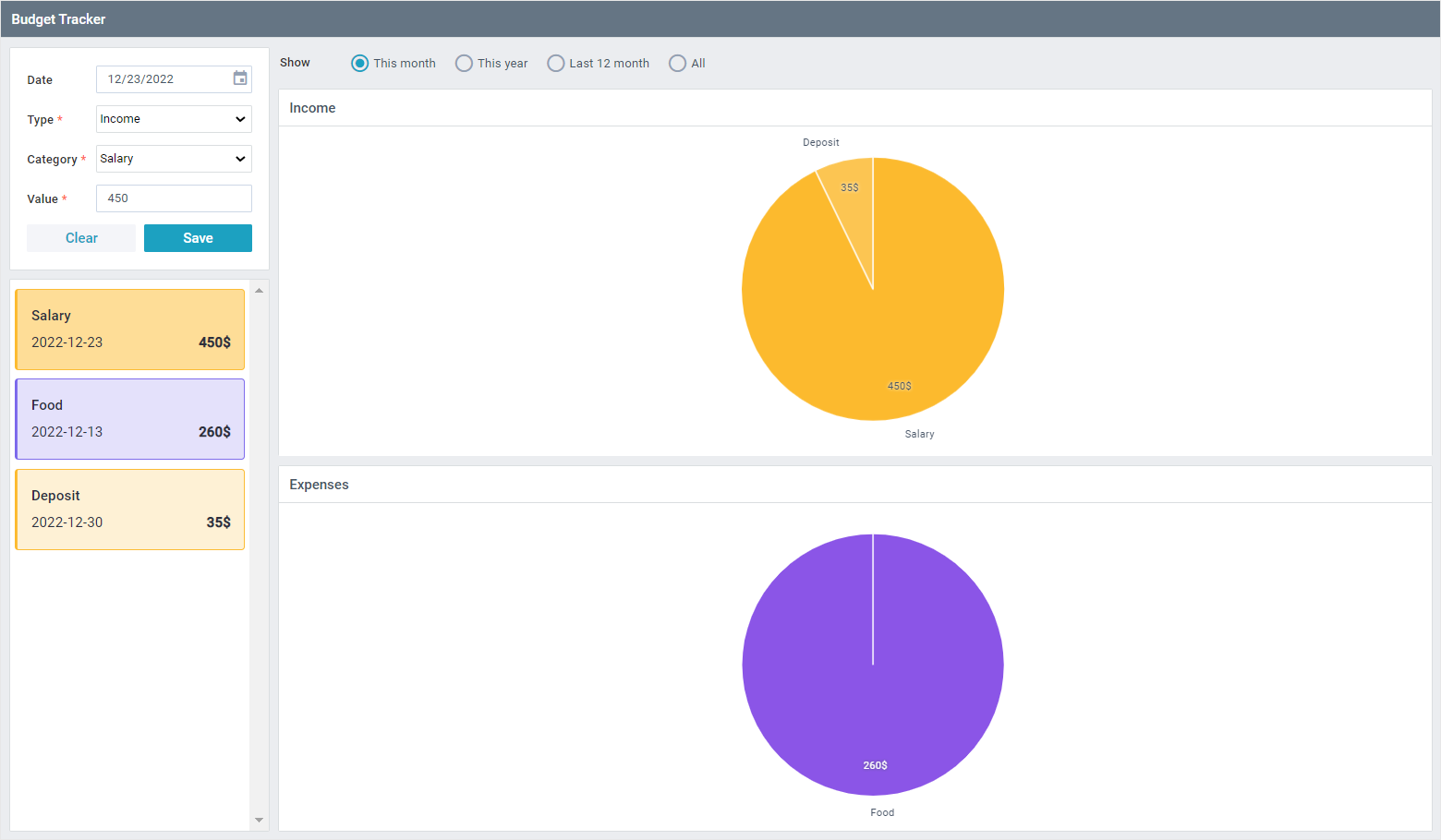
The idea is to make an income and expense list. There will be a category, type, date, and value for each entry in the list. Users will be able to select “This month,” “This year,” “Last 12 months,” or “All” modes of two charts — “Expenses” and “Income”.
To collect user data, we will use the Form widget. In presenting entries, the List will be helpful. Chart is a widget of choice for data visualization.
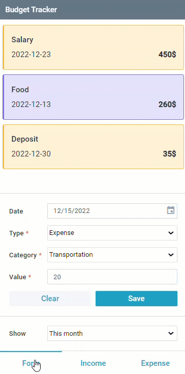
Our app will have a distinct layout for full-screen and compact devices. All the widgets will be on the same “page” in a full screen mode. In compact mode, you will be able to switch through three tabs: “Form,” “Revenue,” and “Expense”. For this layout, we’ll make use of the Multiview component.
In a browser, the app will look like this:
-
- full-screen mode
-
- compact mode
Setting Up Your Budget Tracker App with Webix UI
Before we start building our budget tracker app, let’s include Webix resources using either a direct download or a CDN link to integrate the Webix UI components into our project. Standard GPL version of the library will work just fine for our project. It is available for download here or via CDN with the following links:
How to Create Responsive Layouts for Your Budget Tracker App
As I mentioned before, we want to have two distinct layouts: one for full-screen mode and another for compact devices. To store each of them, let’s define two variables called smallUI and bigUI. To make the interface easier to comprehend, widgets in the layout are saved in separate variables.
id: "top",
rows: [
multiview,
{
type: "form",
rows: [select],
},
tabbar,
],
};
const bigUI = {
id: “top”,
type: “space”,
cols: [
{
maxWidth: 300,
type: “wide”,
rows: [form, list],
},
{
type: “wide”,
rows: [
radio,
{
rows: [
{
template: “Income”,
type: “header”,
},
chartIncome,
],
},
{
rows: [
{
template: “Expenses”,
type: “header”,
},
chartExpenses,
],
},
],
},
],
};
Let’s now look at how to create the necessary interface components to deliver the previously stated features.
Building Dynamic Layouts for Different Screen Sizes
We need to know the width of the screen to decide if it is big or little. The screen is considered “wide” if its width is greater than 700 px. To check the width, we call the getSize() function which returns a string. The output string is then saved as a variable named currentSize.
let currentSize = getSize();
The buildUI() function works in a similar way. We check the value of currentSize and build a layout for large or small displays based on it.
currentSize === "small" ? smallUI : bigUI,
$$("top")
);
Let’s add an event listener to monitor whether the browser window was resized. If there is a change, we rebuild the layout and synchronize data between components using the synchronize() function. We’ll go into more detail about this function later.
const newSize = getSize();
if (newSize != currentSize) {
currentSize = newSize;
$$("form").unbind($$("list"));
buildUI();
synchronize();
}
});
The app’s main function, called webix.ui(), builds the entire interface based on the currentSize value.
rows:[
{ template:"Budget Tracker", type:"header", css:"webix_dark" },
currentSize === "small" ? smallUI : bigUI
]
});
synchronize();
Storing Budget Data with Webix DataCollections
To store our data, we can use DataCollection – a view-less component that stores a collection of non-hierarchical data. For each part of the data we should create a separate DataCollection. The types and categories DataCollections will help to build the List component. And the budget one will be the main data storage.
data: [
{ id:1, value: "Income" },
{ id:2, value: "Expense" }
]
});
const categories = new webix.DataCollection({
data: [
{ id: 1, value: "Food" },
{ id: 2, value: "Rent" },
{ id: 3, value: "Shopping" },
… ]
});
Using the onStoreUpdated event to trace the change in datastore, we add new data after the change. In response to the store update, entries are filtered in the list and charts based on the value of the radio or select (in compact mode). With the help of scheme it is possible to set the date as today if the user didn’t set it.
data: webix.storage.session.get("money-data") || data,
on: {
"data->;onStoreUpdated": function(obj, id, mode) {
if (mode) {
webix.storage.session.put("money-data", this.serialize());
filterByDate(
$$("select")
? $$("select").getValue()
: $$("radio").getValue()
);
}
}
},
scheme: {
$init: (obj) =>; {
// by default, if the user didn't set the date, let's consider it's today
if (!obj.date) obj.date = new Date();
if (typeof obj.date === "string") obj.date = new Date(obj.date);
},
},
});
Creating the Multiview
The multiview is stored in a separate variable. It consists of three cells. The first one is for the form and list; the second and third are charts.
cells: [
{
id: "formView",
rows: [list, form],
},
chartIncome,
chartExpenses,
],
};
Building the Form for Income and Expense Entries
The following Webix components are included in the form:
- Datepicker for selecting a date,
- two Selects for types and categories,
- Text for inputting a expense\income value,
- “Clear” and “Save” buttons.
We set the maxDate attribute to new Date() to prevent users from selecting a date in the future. Every field on the form has to be filled out, thus we need to set the required property of each component to true. Among other conditions, the value of money must be a number. Webix has certain predefined rules, which may be accessed via the webix.rules class. In this case, we use webix.rules.isNumber to verify that the user input a number. Additionally, we include a few notifications to make it easier to see the incorrectly filled-out fields.
view: "form",
id: "form",
elements: [
{
view: "datepicker",
name: "date",
label: "Date",
suggest: {
type: "calendar",
body: {
maxDate: new Date(),
},
},
},
{
view: "select",
name: "type",
label: "Type",
options: types,
required: true,
invalidMessage: "Please, select an option",
},
{
view: "select",
name: "category",
label: "Category",
options: categories,
equired: true,
invalidMessage: "Please, select an option",
},
{
view: "text",
label: "Value",
name: "value",
validate: webix.rules.isNumber,
type:"number",
required: true,
invalidMessage: "Please, enter a number",
},
{
cols: [
{
view: "button",
label: "Clear",
click: () =>; $$("list").unselect(),
},
{
view: "button",
label: "Save",
click: saveItem,
css: "webix_primary",
},
],
},
],
};
To add an entry to the list, we’ll use the addItem() function, which adds income or expense entries to the DataCollection and updates the budget list. If all validations are passed, we will add a new entry to the DataCollection and clear the form. This function will also check for validations and update the DataCollection if we need to update the item.
const form = $$("form");
if (form.validate()) {
const values = form.getValues();
if (values.id) budget.updateItem(values.id, values);
else {
const id = budget.add(values, 0);
$$("list").select(id);
}
}
}
Displaying Income and Expenses in a Webix List
We are going to render a list with expense and income values. Depending on the type, a cell will get CSS class with specific colors. To implement this, we need to redefine the default List. Webix provides an ability to change the component’s appearance and feel inside the type property by altering HTML for the items.
First, we configure the templateStart property. It is a container that wraps the elements defined by template. This property contains the webix_l_id attribute, which value is obj.id. This allows detecting the item by its ID. And also here the particular CSS class is given to an element. Next is the template itself, which contains necessary HTML markup. Lastly, there is a templateEnd – the closing element for the templateStart.
view: "list",
id: "list",
type: {
templateStart: (obj, common, marks) =>; {
const css = types.getItem(obj.type).value === "Expense" ? "expense" : "income";
return `
},
template: obj =>; {
return `
${categories.getItem(obj.category).value}
${obj.value}$
`;
},
templateEnd: ”
”
},
onClick: {
delete_icon: (e, id) =>; removeItem(id)
}
};
The onClick event is used to remove items. Entry will be deleted after the confirmation from the user.
webix.confirm({
title: "Entry will be deleted permanently",
text: "Do you still want to continue?",
type: "confirm-warning",
})
.then(() =>; {
budget.remove(id);
});
return false;
}
Visualizing Financial Data with Webix Charts
We need to make two charts that follow the same pattern. Let’s make a constructor function to which we can pass values and it will return a chart.
return {
view: "chart",
type: "pie",
id,
value: "#money#",
label: obj =>; categories.getItem(obj.category).value,
pieInnerText: "#money#",
shadow: 0,
color: (item, i) =>; palette[i],
};
};
To get a gradient color palette for each chart, we use the getColorPalette() function. It takes the base color of a chart and a number of categories presented in it. To work with color as a number, we convert it to RGB. Each category gets a lighter color than the previous one. We populate the colors array with new shades and convert them back to Hex. Function returns an array of gradient colors.
const colors = [baseColor];
if(count>;1){
const c = webix.color;
const rgb = c.toRgb(baseColor);
const hsv = c.rgbToHsv(rgb[0], rgb[1], rgb[2]);
const f = hsv[1] * 0.8 / (count - 1);
for(let i = 1; i < count; i++){
const rgb = "rgb(" + c.hsvToRgb(hsv[0], hsv[1] - f * i * 2, hsv[2]) +")";
colors.push("#" + c.rgbToHex(rgb));
}
}
return colors;
}
Number of categories is stored in the categoriesNumber variable.
Here we call the getColorPalette() function with the selected base color.
const paletteE = getColorPalette("#FCBA2E", categoriesNumber);
Finishing this part, the getChart() function with the corresponding chart and a color palette is called.
const chartExpenses = getChart("expenseView", paletteE);
How to Filter Income and Expenses by Date
With Webix UI, users can easily filter their income and expenses by specific time periods such as this month, this year, or the last 12 months, to get an insightful financial overview. For each filter, there is a dedicated function. With the help of built-in Webix methods, such as the getMonth() and getFullYear() ones we get the current month and year respectively.
const now = new Date();
return now.getMonth() === date.getMonth() && now.getFullYear() === date.getFullYear();
}
function isThisYear(date) {
const now = new Date();
return now.getFullYear() === date.getFullYear();
}
Inside the isLast12Months() function webix.Date.add() method is used to subtract twelve months from the current date.
const now = webix.Date.dayStart(new Date());
const end = webix.Date.add(now, 1, "day", true);
const start = webix.Date.add(end, -12, "month", true);
return start <= date && date < end;
}
Radio buttons and a select (for a compact mode) are used to switch between the filters.
view: "select",
id: "select",
label: "Show",
value: 1,
options: options,
on: {
onChange: (v) =>; filterByDate(v),
},
};
const radio = {
id: “radio”,
view: “radio”,
label: “Show”,
css: “chart_radio”,
options: options,
on: {
onChange: (v) =>; filterByDate(v),
},
};
Depending on the value of radio\select, we apply the necessary date filtering function.
let filterer;
switch (value) {
case “1”:
filterer = isThisMonth;
break;
case “2”:
filterer = isThisYear;
break;
case “3”:
filterer = isLast12Months;
break;
case “4”:
filterer = null;
break;
}
budget.filter(filterer);
}
The prepareChartData() function is used by charts to filter values based on the type (expense or income). After that, the data is categorized, and the values for each category are added together.
this.filter("type", type);
this.group({
by: "category",
map: {
money: ["value", "sum"],
},
});
}
Synchronizing Data Across Components in Your Budget Tracker App
We use the sync() function to keep all components, such as the income list, expense list, and charts, in sync. Any changes to one component will automatically reflect across the app in real-time. Syncing allows you to copy data from the DataStore and pass them to the list. Any modifications made to the DataStore (such as adding, removing, etc.) will be immediately reflected in the list and charts.
To filter out chart data before they will be shown, we pass the prepareChartData() callback function as the second parameter of the sync method.
We set the value of the Radio component to 1 if it exists. At the end, to fill the form with data based on selection in the List component, we bind them.
const list = $$("list");
list.sync(budget);
$$("incomeView").sync(budget, function () {
prepareChartData.call(this, 1);
});
$$("expenceView").sync(budget, function () {
prepareChartData.call(this, 2);
});
if ($$("radio")) $$("radio").setValue(1);
$$(“form”).bind(list);
}
That’s it! We configured all the components, binded them, and linked them with data. Users can now record their income and expenses, filter them based on the date, and view financial data as charts.
Conclusion: Build Your Own Budget Tracker with Webix UI
You can find the full source code and a live demo here.
In this article, we demonstrated how to create a budget tracker with Webix components.
If you have any questions, please share them in the comments section below. To read more about all possibilities of the Webix widgets with related samples, visit the documentation of the Webix library.