Rockers from the “30 Seconds to Mars” band dreamed of reaching the “red planet” in 30 seconds. But, unfortunately, modern science has not yet achieved such heights. According to the famous astrophysicist Neil deGrasse Tyson, we need about 26 million seconds for this journey.
Do you know what we can do in 30 seconds right now? Let’s try to create a small app using the Webix UI library and check if it is possible. The main idea and information for this article were provided by our client, an interview with whom you can read in our blog.

Our “test” application will consist of three parts:
- toolbar with the app name
- datatable
- pager to navigate through the table elements.
In a browser, you will see the following result:
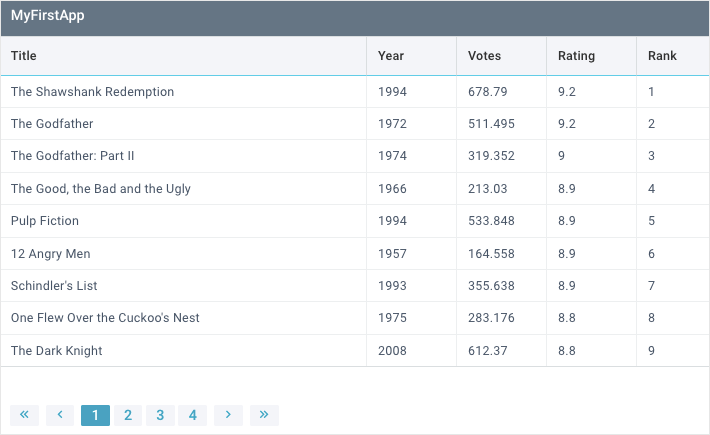
In this app, the users will be able to perform the following operations with data:
- sort data when clicking on the header of the corresponding column
- resize columns
- reorder columns using drag-and-drop
- navigate through the table elements using pagination.
We have outlined the app interface and its functionality. Now let’s see how to implement all these features in code in 30 seconds (if it’s at all possible).
You can find the full source code and live demo here. And if you want to create a Webix application by yourself, take a look at our library of widgets. There you can find widgets for any task you need, namely: data manipulation, visualization, navigation, layout, and much more.
Preparing the Ground
Before we start to develop the application itself and turn the timer on, let’s make some basic preparations. First, we need to create the corresponding files in which our components will be stored:
- datatable.js
- toolbar.js
- pager.js
- index.html
After this, in the index.html file, we need to include Webix sources to use the required components. The most suitable way to get Webix sources is to download the library archive and specify the needed scripts directly. You can download the library here.
But since we set ourselves a limit of 30 seconds, it will be more efficient to use CDN links:
<link rel="stylesheet" type="text/css" href="https://cdn.webix.com/edge/webix.css">
Each of the future components will be developed in a separate file and saved to the corresponding variable. We will need them later to build the layout.
Next, we need to include the previously created files to access their components.
<script type="text/javascript" src="js/pager.js"></script>
<script type="text/javascript" src="js/datatable.js"></script>
We need a container to initialize our app. For convenience, let’s create a div element with a corresponding id. We will use its id in the widget’s constructor to indicate the exact location for initialization:
Layout
In the Webix library, each component is a separate JS object. To set up such a component, we need to specify its basic settings in the form of key: value pairs inside its object.
By nesting such objects into each other, we can form the application’s layout. And to initialize the layout, we need to pass its object to the webix.ui() constructor as a parameter.
The preparations have been made. Now is the time to set the timer for 30 seconds and start coding. Let’s go!
We put the toolbar and datatable entities into the array of the rows property. This config is responsible for the layout rows. We keep in mind that our main components are stored in the toolbar and datatable variables. And there is still a pager component. We haven’t forgotten about it. The pager will be included in the datatable.
container: "container",
rows: [toolbar, datatable],
})
To start executing the code only after the page is fully loaded, we need to pass the webix.ui() constructor to the webix.ready(function(){}) method.
webix.ui({
container: "container",
rows: [toolbar, datatable],
});
})
Voila, our layout is ready! As you can see, we spent only 5 seconds out of 30 available on this part. Moving on.
Creating components
Now is the time to move on to developing our three components:
- toolbar
- datatable
- pager
Let’s start with the toolbar.
Toolbar
In the toolbar.js file, we need to create a “header” for our table and save it to the toolbar variable. As you remember, we used it to build the layout. The widget code will look like this:
view: "toolbar",
css: "webix_dark",
cols: [{ view: "label", label: "MyFirstApp" }],
}
The toolbar component is declared via the view: “toolbar” expression. In the body of the toolbar, we can create any layout structure with the rows and columns we need. In our particular case, it will include only one column, where we place a label with the “MyFirstApp” name of the application.
This label with a separate label component is declared via the view: “label” expression. The label text we specify via the label property. To visually separate the toolbar from the main part of the app, we set the built-in styling via the css property.
It took us another 10 seconds to create the toolbar. Well done!
DataTable
The main component of our application is the datatable. In our case, it will contain information about the movies. In the datatable.js file, we create the datatable component and save it to the corresponding variable. The widget constructor will look like this:
view: "datatable",
css: "webix_data_border webix_header_border",
autoConfig: true,
dragColumn: true,
resizeColumn: true,
pager: pager,
url: "./data/data.json",
}
The widget is declared via the view: “datatable” expression. Next, we need to load the film’s data into it. In theory, the data need to be located on a remote server. In our case, they are stored in the “data” folder in the “data.json” file.
To load remote data, we need to set the url property to the path the data are stored. If the data were on the client-side, we would use the data property to parse it.
We have declared the widget and loaded the data into it. Now we need to distribute the information to the corresponding rows and columns. The autoConfig property is responsible for this, and we need to set it to true. In this way, the data are automatically distributed across rows and columns.
By default, the width of all the columns except the first one is distributed equally.
But in real life, there are cases when one column can contain more data than others. With this in mind, the widget allows you to change the column size when moving its border. The resizeColumn property is responsible for this behavior. To activate it we need to set it to true.
To display initially hidden column borders we need to enable built-in styling via the css property
As we mentioned above, our users can reorder columns by dragging and dropping them to the desired place. To implement this behavior, the dragColumn property needs to be set to true.
As a result, we spent 20 seconds creating the main components of the app. And we still have 5 seconds left for the pager. Hurry up!
Pager
Let’s move on to the pager. It is stored in a separate pager.js file in the pager variable. Its constructor will look like this:
template:
"{common.first()} {common.prev()} {common.pages()} {common.next()} {common.last()}",
size: 9,
group: 5,
page: 0,
}
Using specific properties of the widget, we can set the following parameters:
- size – number of records per page
- group – number of pages
- page – the page to be shown initially
- template – display template
Let’s take a closer look at the template. Our pager will look like this:
To get this interface and configure its behavior, we use the following settings:
- common.first ()– a navigation element with an icon in the form of two left arrows that redirects the user to the first page
- common.prev () – a navigation element with an icon in the form of a left arrow that redirects to the previous page
- common.pages () – controls with page numbers. They are set automatically depending on the data and the number of displayed elements per page.
- common.next () – a navigation element with an icon in the form of a right arrow that redirects to the next page
- common.last () – a navigation element with an icon in the form of two right arrows that redirects to the last page.
The pager is ready. Now we need to connect it to our datatable. To do this, the datatable widget provides a particular pager property. We need to set it to the name of the variable in which the pager is stored (in our case, it is pager).
That’s it! Our application is ready. The timer shows precisely 30 seconds. If you open the index.html file in a browser, you will see the following result:
Conclusion
You can find the full source code and live demo here.
In this article, we have figured out how to create a small application for displaying data in a table format based on the Webix UI components. To read more about all possibilities of the Webix widgets with related samples, visit the documentation of the Webix library.

