An app logic well done is only half a job accomplished. The other half is designing such a UI that would enhance the functionality of the app and make it rational and easy to navigate. Besides, it’s important to create a nice-looking interface to make apps recognizable and visually appealing.
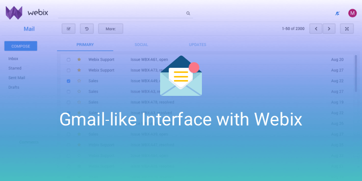
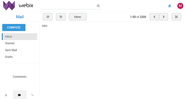
Gmail has one of the most recognizable interfaces on the web. It’s neat and clean and can be used to rationally organize the massive app contents. In fact, Gmail UI can be used not only for email management but for other tasks as well. If you would like to know how to recreate such an interface and don’t know where to begin (or in case you are just curious), follow me. I’ll show you how to implement Gmail’s approach to designing interfaces with the Webix UI library.
Designing a Gmail-Like Layout with Webix
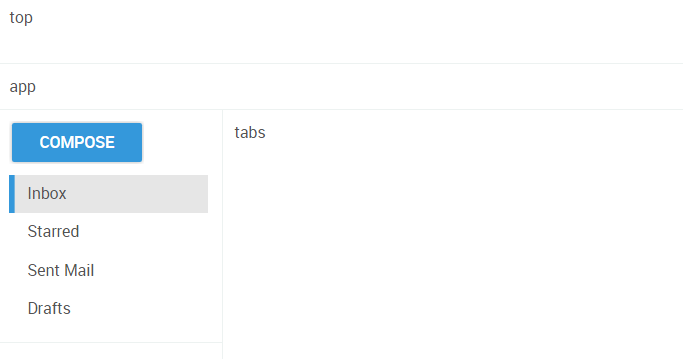
The first thing is planning the layout. Basically, the whole Gmail page consists of four main parts. So, let’s create the following panels:
- a top panel topHeader for the logo and avatar;
- an app panel appHeader that will be a toolbar with buttons and other controls;
- a sidebar panel for navigation;
- a tabs panel infoTabs for displaying lists of data.
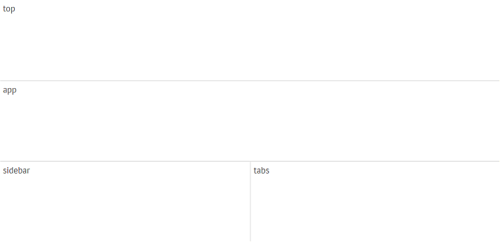
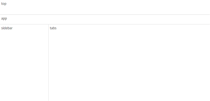
Next, let’s change the height and width of the panels according to the planned contents:
Building the Sidebar Panel
Let’s begin with designing the sidebar.
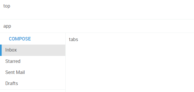
Adding Top Buttons and Categories to Sidebar
First, let’s place a short List of email categories on the sidebar:
rows:[
{ view:"list", select:true, data:categories, scroll:false, autoheight:true }
]
};
Gmail UI has a big Compose button placed above the list. Let’s add a similar button as well:
rows:[
{ view:"button", value:"Compose"},
//list
]
};
At this stage the top part of the sidebar looks like this:
It looks OK, but it could look better with a bit of built-in CSS. Let’s align the button and style it. button_raised is a Webix CSS class for 3D-styled buttons, that will give the button the desired Gmail-like look.
Next let’s give them more space with the padding and the margin, so that the contents didn’t stick to the left border:
padding: 10, margin:10, rows:[ /* button and list */ ]
};
Have a look at the sidebar now:
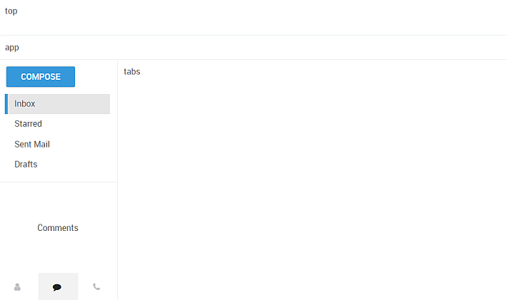
Creating Bottom Tab Panels in Sidebar
The list of categories doesn’t take much space on the sidebar, so you can place something useful below it. In Gmail, you can see a contact list and other extra features there. Let’s do the same and create a MultiView for displaying this element of the UI.
Note that in Gmail UI the bottom tabbar, not the top tabbar, is used. The sidebar definitely looks better if the tabbar doesn’t clash with the list above:
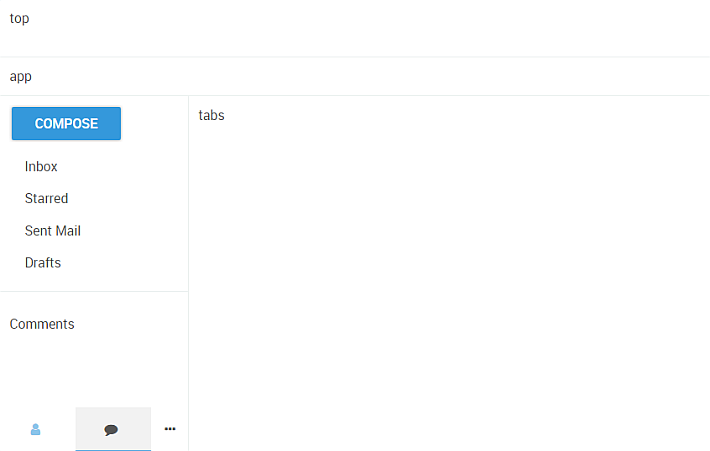
type:"clean", rows:[
{ animate:false, cells:[
{ id:"a1", template:"Contacts" },
//...
]},
{ view:"tabbar", value:"a2", type:"bottom", multiview:true, options:[
{ id:"a1", value:"" },
//...
]}
]
};
For a fast change of contents in the multiview, the animation effect is switched off. To make all the three tabs visible on the sidebar, let’s make them narrower:
Next, change the color of the icons on the tabs:
color: silver;
}
.webix_item_tab.webix_selected .webix_icon{
color: #222;
}
You probably noticed that when the Gmail tabview renders no contacts or chats, real contents are substituted by plain center-aligned text. Let’s create similar templates for the example:
Contacts
” },…
display: table;
width: 100%;
}
.draft .webix_template .title{
display:table-cell;
text-align:center;
vertical-align:middle;
}
Let’s put everything together and you’ll see the completed sidebar:
Top Panel: Logo, Avatar, and Search Bar
The Top Panel
The top panel is a suitable place for logos, avatars, and other main app info. If there’s enough space and you feel like it, you can place a couple of handy controls there, just like it’s done in Gmail.
First, let’s place a logo and a user avatar on the left part of the panel:
{ template:" ", css:"logo", height: 60, width:200 },
{},
{ template:"
“, css:”user_info”, width:60 }
]};
The avatar is actually a div with a white letter on a colored background.

As you see, there’s a lot of space left, so let’s use it for a search control and a small icon button. By the way, on a white background, the search control may look better with only the bottom border. You can style the search control with your own CSS class, but a suitable class already exists within Webix. To use it, let’s create a form view instead of a simple layout and place the controls inside:
{ view:"search" },
{ },
{ view: "button", type:"iconButton", icon:"bell-slash", width:50 }
]};
Have a look at the top panel now:

The App Panel
The app panel is the toolbar of the app. In Gmail, most of the controls are placed there. Besides, they are divided into two groups and put onto the opposite sides of the toolbar. Let’s create a similar toolbar:
{ view:"button", value:"Mail", width: 200 },
{ view:"button", type:"iconButton", icon:"check-square-o", width:50 },
{ view:"button", type:"iconButton", icon:"history", width:50 },
{ view:"button", value:"More:", width:90 },
{},
{ view:"label", label:"<b>1-50</b> of <b>2300</b> ", align:"right" },
paging,
{ view:"button", type:"iconButton", icon:"arrows-alt", width:50 }
]};
Without any additional styling the toolbar looks like this:
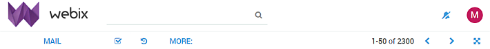
Let’s change the style of the buttons and make them more recognizable. This time, it’s relevant to use another Webix CSS class for buttons — webix_el_button:
color: #666;
border: 1px solid #dcdcdc;
background-image: linear-gradient(to bottom,#f5f5f5,#f1f1f1);
text-transform:none; //no upper case
}
The Mail button placed above the sidebar deserves a special style:
font-size: 20px;
text-transform:none; //no upper case
}
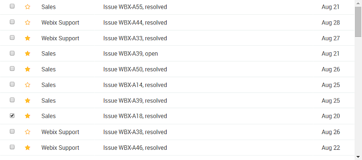
Main Panel: Interactive DataTable in Gmail-Style UI
Finally, it’s time for the last panel — the main view for displaying long data lists, whether it’s email, orders or goods in a shop. So let’s create a scrollable DataTable without headers:
view:"datatable", scroll:"y",
columns:[
{ id:"check", template:"{common.checkbox()}", width: 40 },
{ id:"star", template: function(obj){
return ""
}, width:40 },
{ id:"from", width: 150 },
{ id:"subject", fillspace:true },
{ id:"date" }
], header:false, data:/* data_source */
};
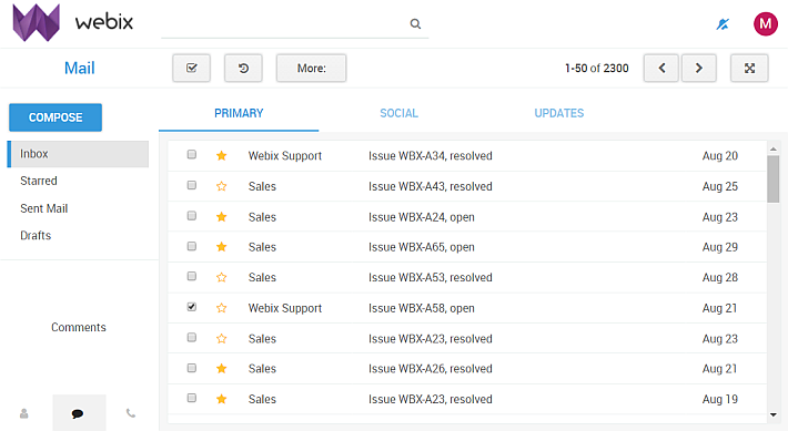
If you want to structure your data further and display them in separate lists like it’s done in Gmail, you can create a multiview with a top tabbar. To improve the design, you can add a light-gray margin around each tab by changing the type of the layout to space:
tabbar:{ optionWidth:200 },
cells:[
{ header:"Primary", body: { rows:[ mailTable ], type:"space"}},
{ header:"Social", body: { rows:[ socialTable ], type:"space"}},
{ header:"Updates", body: { rows:[ updatesTable ], type:"space"}}
]};
The data for the example is generated by a special function generateData().
Conclusion: Webix Gmail-Like UI Tutorial
Gmail interface is not the only one worthy of being noted, though it’s one of the most widely-known UIs in the world. This quite simple and clear approach to design can be used for a number of web apps, moreover, it’s not difficult to recreate and enjoy. The example with Webix can be further modified and used for real life apps.
With this Gmail-like interface, your Webix app can include:
– Sidebar with navigation and buttons
– Top toolbar with actions and search bar
– Tab panels for organizing data
– Interactive DataTable with sorting, filtering, and icons
If you are interested in further reading on UIs, consider these articles: