This is a guest post from our friends DevelopIntelligence.com
Pity the poor table. Designed originally for the purpose of displaying row and column data, it has often had to serve double duty as a generalized layout tool, despite the many quirks that tables have for layout purpose and the fact that syntactically, a table is intended to contain data. Other solutions involved absolute positioning of display blocks, but these are often highly problematic in devices that can have windows of varying dimensions.
In March 2017, the grid layout was reintroduced into the CSS specifications after having been retooled for the better part of two years, and Chrome, Mozilla, and Vivaldi wasted no time in supporting the grid functionality. Given the central role that layout plays in CSS, the grid layout provides a degree of functionality that can radically simplify the HTML code being generated, though it comes at the cost of a bit of a learning curve.
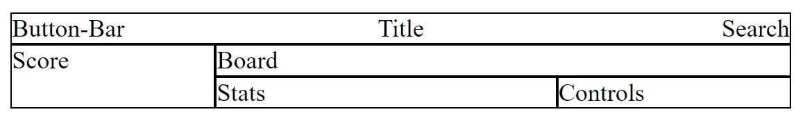
A good example to illustrate a grid is a four by four grid rectangle using area names. The HTML describes five areas used as part of a game output:
<div class="grid">
<div id="button-bar" class="grid-item">Button-Bar</div>
<div id="title" class="grid-item">Title</div>
<div id="search" class="grid-item">Search</div>
<div id="score" class="grid-item">Score</div>
<div id="stats" class="grid-item">Stats</div>
<div id="board" class="grid-item">Board</div>
<div id="controls" class="grid-item">Controls</div>
</div>
Assuming the grid as uniform in size, the grid-items can be laid out as follows:
display: grid;
margin-top: 10px;
max-width: 500px;
grid-template-areas:
"header header header header"
"sidebar board board board"
"sidebar board board board"
"sidebar footer1 footer1 footer2";
}
.grid-item {
border: solid 1px black;
}
#title {
grid-area: header;
text-align: center;
background-color: navy;
color: white;
}
#score {grid-area: sidebar;}
#board {grid-area: board;}
#stats {grid-area: footer1;}
#controls {grid-area: footer2;}
In this case, the grid-areas property within the containing .grid element provides a map defining each area. The <div> elements with the corresponding ids are then mapped via CSS to each respective area. Thus the contents of the <div> element with id=”title” takes up the header area, #score takes up the sidebar and so forth:
There are several things of note here. First, with grid-areas, there is no need to create nested divs. A block is placed into a location, regardless of the order that it is listed in. This is actually a powerful tool because the layout can be reconfigured based upon media dimensions or similar characteristics, without having to change the HTML. For instance, you can create the above layout if the minimum device screen width is 501px, or a stacked layout if the size is below that threshold (as would be appropriate for most smart-phones):
@media screen and (min-width: 501px){
.grid {
grid-template-areas:
"header header header header"
"sidebar board board board"
"sidebar board board board"
"sidebar footer1 footer1 footer2";
}
}
@media screen and (max-width: 501px) {
.grid {
grid-template-areas:
"header"
"board"
"controls"
"sidebar"
"footer1"
"footer2";
}
}
This is, by itself, worth the price of admission for grids. By being able to create different types of layout configurations without having to change the underlying markup, you can significantly reduce the amount of extra coding (and server-side media device detection) that needs to happen to better facilitate adaptive layouts.
But wait, there’s more. The second and third column in the grid are identical. Rather than repeating the column, another approach would be to combine the two columns but make this new column twice the width of the fourth. While at it, the left-hand sidebar should in general always be a fixed width, say 240px. This can be down with the grid-template-column property. Similarly, rows two and three also repeat, and can also be reduced to
.grid {
grid-template-areas:
"header header header"
"sidebar board board"
"sidebar footer1 footer2";
grid-template-columns: 240px 2fr 1fr;
grid-template-rows: 32px auto 40px;
}
.grid-item {
border: solid 1px black;
}
#title {grid-area: header; text-align: center;}
#score {grid-area: sidebar;}
#board {grid-area: board;}
#stats {grid-area: footer1;}
#controls {grid-area: footer2;}
The grid-template-columns property controls the width (either relative or absolute) of each named region from left to right while grid-template-rows covers definitions of the grid from top to bottom. Thus
grid-template-rows: 32px auto 40px;
establishes a three-by-three grid where the first cell is 240px wide and 32px deep. The second cell in the row has a measure of 2fr, or two “free space” units, while the third has one free space unit. Free space is determined by taking the overall dimensions of the grid (if known), subtracting all of the fixed dimensions, then dividing the resulting free space by proportion (2fr is twice the size of 1fr). If the grid is not otherwise constrained it will be the available width of the page, so if the width of the grid’s container is 700px then 1fr in the above will be set to 220px, 2fr will be 440px. Should the container be resized, the free space will be recalculated.
Grids can be defined by area, but they also can be defined by the bounding lines. Names can be established from the templates by using square-bracket enclosed names for the spaces between the area widths. For instance, the streets in Seattle use Street for east/west lines and Avenue for north/south lines, so the following would identify a relevant line:
grid-template-rows: [1st-Ave] 32px [2nd-Ave] auto [3rd-Ave] 40px [4th-Ave];
You can then identify the board area as:
display: block;
grid-column: [2nd-Ave]/[5th-Ave];
grid-row: [2nd-Street]/[4th-Street];
}
which would correspond to
"header header header header"
"sidebar board board board"
"sidebar board board board"
"sidebar footer1 footer1 footer2";
where the “/” character should be read as “spanning to”, e.g.,
reads as:
The actual numeric positions can be used in this way as well:
will span from the second north-south line to the fifth.
This is a short-hand for the grid-column-start and grid-column-end commands (ditto for row):
grid-column-end: 5th-Ave;
/* or */
grid-column-start: 2;
grid-column-end: 5;
There are a number of good resources for digging deeper into grids:
- W3C CSS Grid Layout Specification
- A Complete Guide to Grid
- Grid By Example
- CoDrop CSS Reference: Grid
- Fremy Company CSS Grid Polyfill
CSS Grids have the potential to change the way that web pages are laid out. They give the user a much more precise tool for laying out content that is nonetheless responsible to device limitations and dimensions, creates a separation of concerns between content and layout, and makes both HTML and CSS clearer in terms of intent. They should become a major go-to feature for any web designer now and in the future.

