I remember my school years and those long evenings spent by painting a family tree. It was the first time in life when I faced the inevitable consequences of a poorly planned work – the sheet of paper unexpectedly came to an end and I had to redraw the scheme from the very beginning. That was a fail!
Time has passed and new technologies stepped into our lives offering a number of tools for that trivial task. I also saw that the big world is built around the same hierarchical schemes used everywhere: from simple IT org charts to multi-department companies’ hierarchy.
And although there’s a number of tools for manual drawing of organograms, drawing itself is no longer needed. Now I can simply pass the data into a cute Webix organogram widget and feast my eyes upon the ready-made chart in the browser!
No magic, just code (and Webix Pro):
All we need is customization
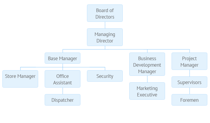
Ok, I see. Blue boxes placed into a straightforward layout are not that fantastic. For these needs Webix worked out a clear and simple way of configuring and styling, which means that whatever you cannot tune by widget properties can be changed in the CSS.
Let’s first of all dig into the JS config. There we can find two possibilities of item arrangement:
- Child items are placed horizontally under the parent item, to which they are connected by a blue line (wait a minute, we will make it purple). No settings are required, it’s a default layout;
- Child items are placed vertically under the parent one thus forming lists of dependent items. Such behavior needs to be set explicitly in the dataset with the $type property:
{ id:"1.1.2", value:"Development", $type: "list", data:[
{ id:"1.1.2.1", value:"- Faculty development workshops" },
{ id:"1.1.2.2", value:"- Student development" }
]}
]
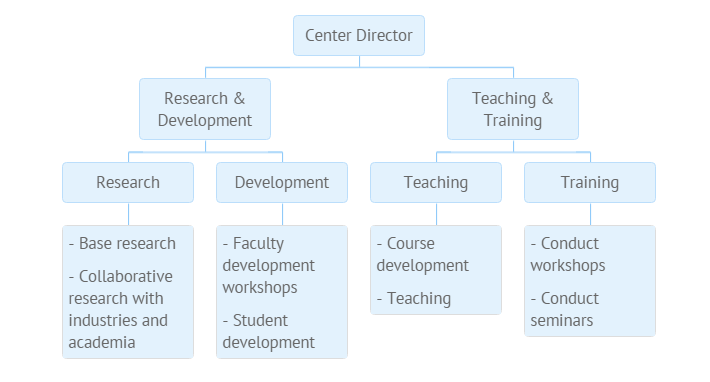
If needed, list items can be dispersed to separate blocks, which is switched on in the Organogram configuration:
view:"organogram",
type:{
listMarginX: 20, listMarginY: 20
}
});
Further on, let’s stylize our Organogram. We can use the full power of CSS to add colors for blocks and lines as well as define item template, insert bright icons… Gosh, I’m the painter!
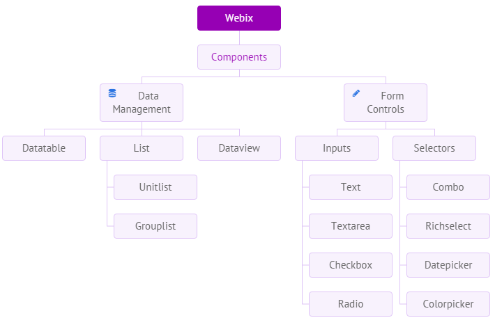
Why going this way?
A customized Webix Organogram can contain lots of helpful information like colored labels, pictures, interactive icons, page and email links.
No more “end-of-the-sheet” problems. The organogram is built automatically and can adjust to the dimensions of its contents. If a container is smaller than the Organogram needs, scrollbars will appear.
With Organogram you can always stay up-to-date: once configuration and styling are defined, you only need to reload data to actualize it. The data can come in all the Webix supported formats.
And, of course, dynamics. Nodes can be filtered, opened and closed! Interactivity can also be achieved with the help of numerous events that are already familiar to you from Webix Tree API.
Enough talking, it’s time to experiment! Browse the samples, read the docs and practice in the snippet tool. Hope your life will play bright colors while remaining well-organized and clear to understand. Btw, are you already waiting for a new Webix 3.3 release? 🙂
