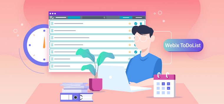
Every day we have to deal with a huge number of different tasks. It can be a business meeting, dinner with relatives, yoga class, or just cleaning. To hold all these events in mind and get everywhere on time, we need to either have a phenomenal memory or use “the benefits of technological progress”.
It just so happens that I don’t have enough competence to give you advice on boosting memory 🙂 Perhaps a healthy lifestyle and proper nutrition can improve the situation, but that’s all I can share.
In this article I want to talk about creating a small ToDoList app based on the Webix UI components. This tool will help you manage your daily tasks more effectively and will always be right on the hand (on your phone or laptop).
You can find the full source code and live demo here.
App Overview
We need to create a compact app with a user-friendly interface, where users can manage their daily tasks, namely:
- create new tasks
- edit active tasks
- pin important tasks to the top of the list
- finish completed tasks
- move completed tasks back to the list of active ones
- remove unnecessary tasks
- look through active and completed tasks
- search for necessary tasks in current and completed ones
- reorder active tasks according to their importance.
We have figured out the app functionality. Now let’s think about implementing all these features in the interface. And to begin with, we can divide the app into 2 conditional parts, namely: Toolbar and Task List.
In the Toolbar, we should place a button for creating new tasks, a search bar and controls for switching between active and completed tasks. This is very convenient, since the Toolbar will be placed at the top part of the app and users will always have basic controls before their eyes.
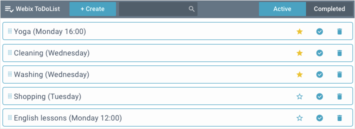
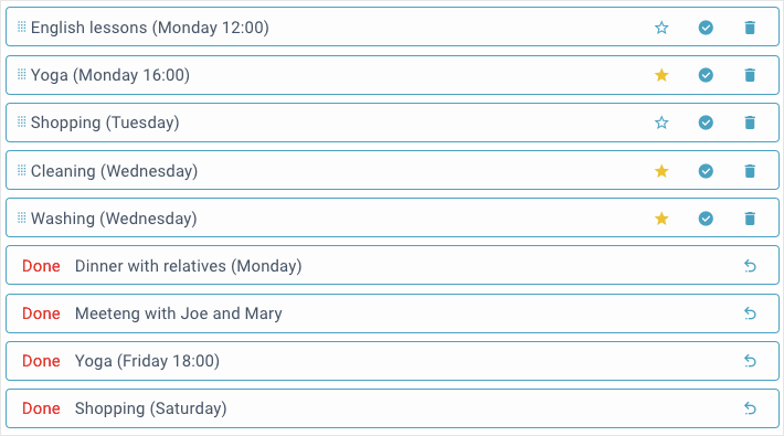
In the Task List, placed under the toolbar, users will be able to look through and manage tasks via the corresponding icons on each of them. In the browser, the app will look like this:
List of Active tasks
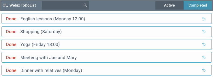
List of Completed tasks
Since Webix includes all the necessary tools for implementing the mentioned above features, we can move on to develop the app itself.
Preparing the Ground
At the beginning, we need to include the library sources. In our app we are going to use the basic GPL version of Webix, which can be downloaded here. Besides, we can also include the required files using the following CDN links:
<link rel="stylesheet" type="text/css" href="http://cdn.webix.com/edge/webix.css">
Let’s get started with the layout of the application. And it is worth mentioning here that Webix uses a declarative approach when building interfaces. It means that each component is a separate JS object. Inside this object we should specify all the widget parameters (properties and event handlers) as the key:value pairs.
By nesting such objects into each other, we create the app layout. To initialize it, we need to pass the layout object into the webix.ui() constructor as a parameter.
Since storing one large JS object is not very convenient, we will divide it into 2 parts mentioned above (Toolbar and Task List). Each of them will be developed in a separate file and assigned to the corresponding variable. To use them in our layout, we need to include their files in index.html.
<script type="text/javascript" src="js/list.js"></script>
The layout of our app will consist of two rows. For this, we need to include the variables with configurations into array of the rows property:
rows:[
toolbar,
list
]
});
To be completely sure that the app code will start executing after the HTML page is fully loaded, we should pass the layout construct to the webix.ready(function(){}) method:
webix.ui({
rows:[
...
]
});
});
We have included all the necessary sources and created the application layout. Now let’s move on to develop the corresponding parts of the interface and implement their functionality.
Creating a Task List
First of all, let’s create a Task List for our app. For this purpose the library has a whole line of widgets that allow you to display data in multiple forms (tables, blocks, lists, etc.). There are such components as datatable, treetable, dataview, list and others. You can find all these widgets here.
Based on the fact that we need to display tasks as a regular list, let’s use the list widget. Each of our list items will contain the task name and, depending on its status (active or completed), icons for managing this task. But we’ll talk about it a bit later.
Basic Configuration
In the list.js file we create a list and assign it to a variable that will be used during layout building. The basic list configuration will look like this:
view:"list",
id:"todo_list",
template:"#task#",
url:"./data/list_data.json"
}
The component itself is declared via the view: “list” expression. To access the widget for calling its methods, we specify a unique ID via the id property.
To load the existing tasks data, stored on a remote server, we use the url property. The data will be loaded into the component immediately after its initialization. The data have the following structure:
{ "id":1, "task":"English lessons", "status":true, "star":false },
{ "id":2, "task":"Yoga", "status":true, "star":true }, ...
]
To load data stored on the client side, we would use the data property instead of the url one.
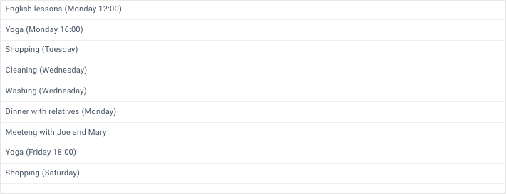
We have declared the component and loaded the initial data. Now we need to display these data in the proper form. For this we use the template property and set it to the “#task#” string pattern. This pattern retrieves a value of the specified key from each data object and displays it on the page. In the browser, the task list will look like this:
It looks good already, but that’s not quite what we need yet. Let’s customize the task rendering and define the corresponding icons for managing the tasks.
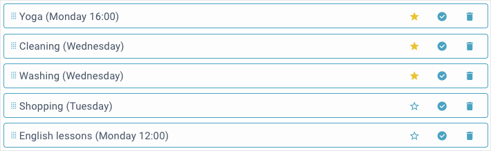
We have already mentioned above that the task icons will differ depending on the task status (active or completed). Besides the name itself, the active tasks will include the following elements:
- icon for dragging tasks
- icon for adding tasks to favorites (and removing from favorites)
- icon for completing tasks
- icon for deleting tasks.
And the completed tasks:
- “Done” label
- icon for returning tasks back to the list of active ones.
To implement all these features mentioned above, we need to create a special template function. It will return the required task template depending on its status. And the status of each task is stored in its data object under the status key.
For convenience, let’s assign the template function to the list_template variable. It will be used in the widget configuration later. The template function code will look like this:
if(obj.status){ // the active task template
return `
<span class='drag_icon webix_icon mdi mdi-drag'></span>`+
obj.task +`
<span class='delete_icon webix_icon mdi mdi-delete'></span>
<span class='complete_icon webix_icon mdi mdi-check-circle'></span>
<span class='star_icon webix_icon mdi mdi-`+`
(obj.star ? "star" : "star-outline")'></span>`;
}else{ // the completed task template
return `
<span class='done'>Done</span>`+
obj.task +`
<span class='undo_icon webix_icon mdi mdi-undo-variant'></span>`;
}
}
An obj parameter is a data object of a particular task. First, we need to check the task status stored in its object. If the status is true, the function will return the template for an active task. Otherwise, it will return the completed task one. Keep in mind that the template will be redrawn on any changes in the task data (including the status changing).
When the new template is ready, let’s include it in our app configuration. Besides we can set a fixed height for each task via the height property and style it via the css property. It can be done in the object of the type property. The widget configuration will look like this:
view:"list",
id:"todo_list",
type:{
height:45,
css:"custom_item",
template:list_template,
},
url:...
}
In the browser, the task list will look like this:
The List of Active Tasks
As you can see, the active and completed tasks are displayed together. Let’s fix that by filtering out the active tasks on initial loading.
To do this, we can create a special filterToDoList(status) function that will take the task status and return the filtered list. If the status is true, the function will return active tasks. Otherwise, it will return completed tasks. If the status is absent at all, the function will reset the list filtering. The function code will look like this:
const list = $$("todo_list");
if (status === undefined){
list.filter();
} else {
list.filter(function(obj){
return obj.status === status;
});
}
}
To filter and unfilter the list we use its filter() method. Depending on the status passed, it returns only the items according to their status or resets filtering.
When the function is ready, we need to call it in the callback function of the ready property. It is executed after the data loading.
view:"list",
…,
ready:function(){
filterToDoList(true);
}
}
Now, when initial loading, the users will see only the list of active tasks.
Editing Tasks
When describing the app functionality, we mentioned that the user will be able to edit the active tasks. Let it be done.
By default, the list component has no editing function. To fix it, we can expand the widget by adding extra functionality. All APIs for editing Webix widgets are stored in a separate webix.EditAbility module. To get an editable list, let’s create a custom component based on the webix.ui.list widget and the webix.EditAbility module.
To create a custom component, the library has a special protoUI constructor. We should pass the name of the new widget (let it be editlist), the editing module, and the basic widget to the constructor:
name:"editlist"
}, webix.EditAbility, webix.ui.list);
Now we should initialize a new widget. And for this, we need to replace the view: “list” expression with the view: “editlist” one and specify the following settings:
- editable:true – enables editing for all the list items
- editor:”text” – sets the “text” editor
- editValue:”task” – defines the value to be edited
- editaction:”dblclick” – opens the editor upon doubleclick on the item (task).
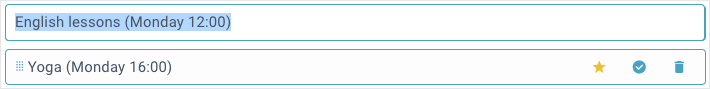
Thus, if the user doubleclicks any task, he will see the following result:
Let’s complicate the task and validate the edited field. And for this we can use the rules property, in the object of which we need specify the webix.rules.isNotEmpty rule:
view:"editlist",
id:"todo_list",
editable:true,
…,
rules:{
task:webix.rules.isNotEmpty
}
}
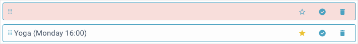
After the user has edited the task, the widget checks the entered value according to the specified rule. If the field is empty, it will be highlighted in red.
Now the user can edit all the tasks (active and completed). And since there is no special sense to change already completed tasks, let’s forbid users to edit them.
To do this, we need to handle the onBeforeEditStart event, which fires before the task editing. In this handler we check and return the task status. If the status is true (the task is active), the editor will start, otherwise, it will not.
To handle the widget events, we can use the on property. In the object of this property, we need to specify the desired event and set it to the desired handler. In code it looks like this:
view:"editlist",
…,
on:{
onBeforeEditStart:function(id, e){
const obj = $$("todo_list").getItem(data);
return obj.status;
}
}
}
Using the getItem() method, which takes the ID of the selected list item, we get the task object and return its status (true or false). Now the user can edit only the tasks from the list of active ones.
Reordering Tasks
Sometimes, the user needs to sort the tasks in the order they should be done. The most convenient way to reorder the tasks is drag-and-drop.
To drag the list items, we need to specify the drag property and set it to one of several possible values. For example, so that the user can drag the tasks only within the task list, we will set the drag property to “inner”:
view:"editlist",
…,
drag:"inner"
}
For more information about dragging the list items read this article.
Now, the user can sort the list by dragging a particular task to the desired position. As you remember, when creating the list item template, we defined a special icon for dragging the active tasks.
Let’s set drag-n-drop only for this icon. To do this, we need to handle the onBeforeDrag event in the object of the on property. Inside the handler, we specify the css class of the icon the event is triggered on. In our case, it is the drag_icon class:
view:"editlist",
…,
on:{
onBeforeDrag:function(data, e){
return (e.target||e.srcElement).className == "drag_icon";
},
…
}
}
Now the user can sort the tasks by dragging them using a special icon that only active tasks have.
Favorite tasks
There are also cases when the user needs to highlight favorite tasks and pin them up to the top of the list. Let’s implement this feature in our app as well. And for this we can use the previously created icons, with which the user will manage the task priority:
It should be borne in mind that the star variable is stored in the task object. If its value is true, the task is in favorites and is marked with the yellow star icon (the mdi-star class). Otherwise, it is a regular task with a simple star icon (the mdi-star-outline class).
For convenience, we specified the star_icon class for these icons. It will be used further to handle the onClick event.
Now let’s make it so that when the user clicks on the star icon, the obj.star value of the task is reversed. And the favorite tasks will be moved up to the top of the list.
To do this, we need to handle the event that fires when clicking on the icon with star_icon class. This can be done in the object of the onClick property provided specifically for such cases:
star_icon:function(e, id){
const obj = this.getItem(id);
this.updateItem(id, { star:!obj.star });
if(obj.star){
this.moveTop(id);
this.showItem(id);
this.select(id);
}else{
this.moveBottom(id);
}
}
}
In the handler, we get the task data object via the getItem() method, which takes the task ID as a parameter. After this we need to reverse the star value using the updateItem() method and check it.
If the updated star value is true, we take the following steps:
- move the task to the top of the list using the moveTop() method
- scroll the list to this item via the showItem() method
- select the task with the select() method.
Otherwise, we move the task down to the bottom of the list using the moveBottom() method.
Thus, the user can add active tasks to favorites and vice versa using the star-shaped icons. But that’s not all. When initial loading, the favorites tasks are still mixed with the usual ones. Let’s fix it and display them at the top of the list of active tasks.
To do this, we need to create a special sortToDoList() function that will sort the tasks according to their priority (star). The function code will look like this:
$$("todo_list").sort("#star#", "desc", "string");
}
The sort() method, used inside the function, takes the sort value, its order, and the type of data to be sorted and returns a new sorted list.
To sort the favorites tasks and move them up when initial loading, we need to call this function in the callback function of the ready property.
view:"editlist",
…,
ready:function(){
filterToDoList(true);
sortToDoList();
}
}
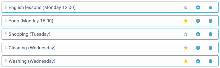
Now, all the favorites tasks will be displayed at the top of the list when initial loading:
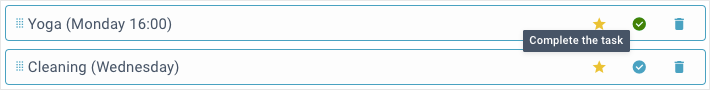
Completing Tasks
When the user has finished the task, he will want to complete it. Let’s implement such an ability using the icon specified in the template specifically for this case:
As in the previous example, we need to handle the click event of this icon using its complete_icon class. And this can be done in the object of the already familiar onClick property:
star_icon: ...,
complete_icon:function(e, id){
this.updateItem(id, { status:false, star:false });
this.moveTop(id);
filterToDoList(true);
}
}
In the handler we take the following steps:
- reset the task status and its priority using the updateItem() method
- move the task up to the top of the list (of completed tasks) with the moveTop() method
- filter out the active tasks to hide the completed one, using the filterToDoList(true) function.
So now the user can complete the finished task by clicking on the corresponding icon.
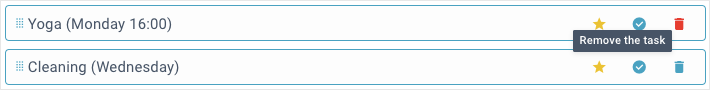
Deleting Tasks
The last important feature of the active tasks is an ability to delete unnecessary tasks. Let’s do it using one more icon specified in the rendering template:
And here we should do the same as with the previous icons. Let’s handle the click event of the icon with the delete_icon class:
star_icon: ...,
complete_icon: ...,
delete_icon:function(e, id){
this.remove(id);
return false;
}
}
In the handler we remove the selected item using the remove() method and return false to prevent other events. Now the user can delete unnecessary tasks with a simple click on the corresponding icon.
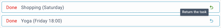
The List of Completed Tasks
When the user completes the task, it will be available only in the list of completed ones.
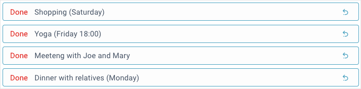
Here, the user cannot drag, edit or delete the tasks. All he can do is return the task back to the list of active ones. And for this, we created a special icon in the template for completed tasks:
By analogy with the active tasks, let’s handle the click event of the icon with the undo_icon class:
star_icon: ...,
complete_icon: ...,
delete_icon: ...,
undo_icon:function(e, id){
this.updateItem(id, { status:true });
this.moveBottom(id);
filterToDoList(false);
}
}
In the handler we take the following steps:
- update the task status using the updateItem() method
- move the task down to the bottom of the list of active tasks with the moveBottom() method
- filter out the completed tasks to hide active one, via the filterToDoList(false) function.
Now the user can return a previously completed task back to the list of active tasks by clicking on the corresponding icon in the list of completed tasks.
Creating a Toolbar
Now let’s focus on the toolbar of our app, through which users can create new tasks, search for the necessary tasks and switch between the lists of active and completed tasks. Visually, the toolbar will look like this:
To create this part of the interface, we will use the toolbar component. This panel will include the following elements:
- 2 label widgets with an icon and app name
- button control for creating new tasks
- search control for searching tasks
- segmented control for switching between active and completed tasks.
Now let’s get down to practice. In the toolbar.js file we create a toolbar and assign it to a variable. The widget itself is declared using the view: “toolbar” expression. We can set styles via the css property and fixed height via the height property.
To place the widget content horizontally, we need to put the desired elements into an array of the elements property.
view:"toolbar",
css:"webix_dark",
height:45,
elements:[...]
};
The labels with the icon and the widget name are declared via the view: “label” expression. To set a fixed width we use the width property. The name of each label is specified using the label property.
{ view:"label", width:30, label:"<span class='webix_icon mdi mdi-playlist-check'></span>" },
{ view:"label", width:130, label:"Webix ToDoList" }
]
Next we have a button for creating new tasks. We define it via the button control and specify a unique ID via the id property. This ID is needed in order to access the button and call its methods. And for the button name we use the value property.
{ view:"label", … }, …,
{ view:"button", id:"create_button", value:"+ Create", width:120 }
]
After the button, we should place the search bar. It is declared using the search control. Its peculiarity lies in the fact that unlike the usual text control (ui.text), there is a clickable “search” icon on the left part of its field. Let’s make it so that when entering any text, the “clear” icon will be displayed instead of the “search” icon. For this we set the clear property to the “hover” value. When the user clicks on this icon, the field will be cleared.
{ view:"label", … }, …,
{ view:"button", … },
{ view:"search", id:"search_input", clear:"hover", width:200 }
]
And finally, we still have the buttons to switch between active and completed tasks. We will implement them using the segmented control. Besides the ID and size parameters, we need to set the names for the corresponding segments. And it can be done via the options property.
{ view:"label", … }, …,
{ view:"button", … },
{ view:"search", … },
{ view:"segmented", id:"segmented", width: 240,
options: [
{ id:1, value:"Active" },
{ id:2, value:"Completed" }
]
}
]
We have created the toolbar interface. Now let’s make it functional.
Creating new Tasks
To create a new task, the user should click on the “+ Create” button. To implement this feature, we need to handle the click event of this button. And for this, the button has a special click property.
click:createNewTaskHandler }
The handler code will look like this:
const list = $$("todo_list");
filterToDoList();
const item = list.add({ task:"New Task", status:true, star:false });
filterToDoList(true);
list.showItem(item);
list.select(item);
list.edit(item);
}
In the function we take the following steps:
- reset the task list filtering by calling the filterToDoList() function without parameters
- add a new task using the add() method, which takes an object with the required data and returns the new task ID. We – assign it to the item variable for using in the following methods
- filter out the active tasks via the filterToDoList(status) function, passing it the status of active tasks as a parameter
- show the new item with the showItem(item) method
- select the new item with the select(item) method
- open the task editor with the edit(item) method.
Now, when clicking on the “+ Create” button, the user can add the new task at the end of the list of active ones and immediately edit it.
Switching between Task Lists
Next we have special buttons for switching between active and completed tasks. To implement such a switch, we need to handle the onChange event of the segmented control. And this can be done in the object of the already familiar on property:
options: [
{ id:1, value:"Active" },
{ id:2, value:"Completed" }
],
on:{ onChange:toggleHandler }
}
The handler code will look like this:
const button = $$("create_button");
if(id == 2){
filterToDoList(false);
button.hide();
}else{
filterToDoList(true);
button.show();
}
}
The function takes the ID of the selected segment as a parameter. If the “Completed” segment is selected (its ID is 2), we will filter out the list of completed tasks using the filterToDoList(status) function. Let me remind you that this function takes the task status that needs to be filtered.
To forbid the user from creating new tasks in the list of completed ones, we need to hide the “+ Create” button using the hide() method.
If the user selects the “Active” segment, we will filter the list of active tasks and display the “+ Create” button with its show() method .
Now the user can switch between active and completed tasks using the “Active” and “Completed” controls on the toolbar.
Searching for Tasks
And we just need to implement the task searching via the search bar placed on the toolbar of our app. As you may have guessed, we once again need to create a handler and use it in the on property object.
on:{
onTimedKeyPress:searchHandler
}
}
The onTimedKeyPress event mentioned above fires after a keystroke when the focus is on the control field.
The handler code will look like this:
const search_value = $$("search_input").getValue().toLowerCase();
const segmented_value = $$("segmented").getValue();
const isMatched
$$("todo_list").filter(function(obj){
const is_matched = obj.task.toLowerCase().indexOf(search_value) !== -1;
if(segmented_value == 2){
return !obj.status && is_matched;
}else{
return obj.status && is_matched;
}
});
}
In the handler we get the search bar value and the ID of the selected segment using the getValue() method. If the user selects the “Completed” segment (with ID of 2), we will filter out the completed tasks names of which match the search bar value. Otherwise, we need to filter out the active tasks in the same way.
That’s all the magic. Now the user can search for active and completed tasks using the search bar on the toolbar.
Conclusion
You can find the full source code and live demo here.
In this article, we have figured out how to create the ToDoList app based on the Webix UI components. To read more about all possibilities of the Webix widgets with related samples, visit the documentation of the Webix library.

