The main fall release of 2021 was marked by a number of important updates to the Webix library. Among other changes, a special place is kept to a deep update of one of the complex widgets of the library. And this article is dedicated to the flagship of the 9.0 release, namely, the new Webix JavaScript Pivot widget. Let’s figure out what has been changed and how the updates affected the functionality, interface and code in general.
Interfaces comparison
We will start with the changes that are first and foremost stare in the face. Let’s compare the updates that have affected the widget interface. And there is something to tell about here.
The fact is that the Webix team developed a fundamentally new, more convenient, and user-friendly interface. Previously, some of the tasks were solved by Pivot and Pivot-chart widgets. Each of them needed to be initialized and configured separately. In the new version, the same tasks are solved by a plain click on the toolbar control.
By the way, the toolbar has been changed quite conspicuously as well. It became static and now, besides filters, it also includes the controls for managing the widget.
The settings panel has also been radically changed. Instead of a bulky modal window in the old Pivot, the new version has a compact panel on the right side of the widget. I’m going to tell you about all these features in detail.
Display modes
In the new Pivot, a user can look through the data in 3 display modes:
- Table
- Tree
- Chart
For this, the widget provides special controls on the toolbar.
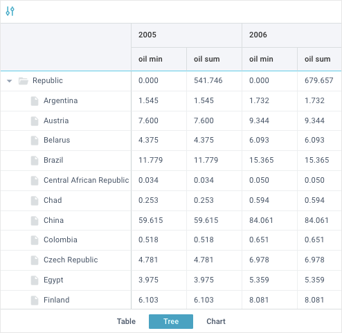
The Table and Tree modes are very similar. The main differences lie in the structure of the left panel, which displays the row names of the pivot table.
Tree mode
In the Tree mode, the rows on the left panel have a hierarchical structure. It has been inherited from the previous Pivot widget. You can collapse the rows, as well as manage by nesting and displaying rows via the corresponding controls on the settings panel.
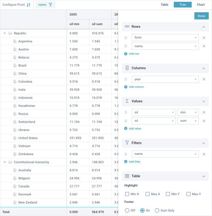
Table mode
In the new Table mode, the row names are displayed in the table columns on the left panel. Here you can still manage their priority and settings via the corresponding controls on the settings panel.
The only nuance is that the “Clean rows” checkbox is added to the general settings. It allows you to hide the repeated values in the leftmost column. It includes the rows with the highest priority. This approach greatly simplifies the visual search on the pivot table.
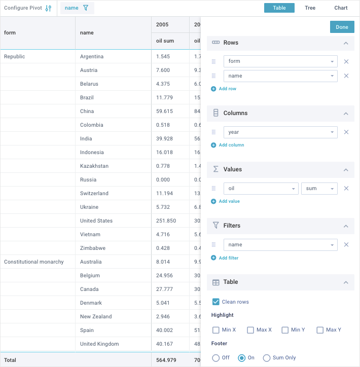
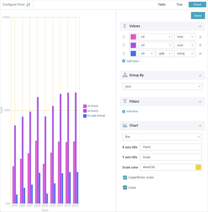
Chart mode
Essentially, the Chart mode is a remake of the Pivot-chart widget. The left panel is absent here, since the data is displayed in the form of highly customizable charts. You can also manage the diagram settings via the corresponding controls on the settings panel.
Compact mode
If we are already talking about display modes, it would not be superfluous to mention the widget compact mode. It is one of the features of the new Pivot version. Now, the users can look through the data as well as customize the pivot tables and charts using their mobile devices.
Old Pivot features
The previous widget version allowed using only two modes, namely: Tree and Chart. They can be called “conditional” for the reason that each of them was a separate widget. You had to initialize and configure them separately.
We must admit that creating new widgets is less convenient than just clicking on a button and displaying the data in the form you need (Table or Chart).
Pivot (old version)
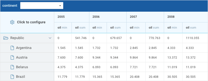
Pivot (old version)
Toolbar
Now let’s look at the changes that have touched the toolbar of the new widget. In the previous Pivot, the toolbar was displayed only when filters were added. In the new version, it becomes static and includes the following elements:
– the “Configure Pivot” button to display the settings panel
– filters
– controls for switching through the Tree, Table, and Chart modes.
You can see the visual differences in the pictures below:
New Pivot
Old Pivot
Settings panel
The settings panel has undergone significant changes too. In the old version, the settings were displayed as a modal window. It appeared when clicking the “Click to configure” button.
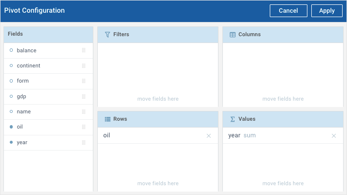
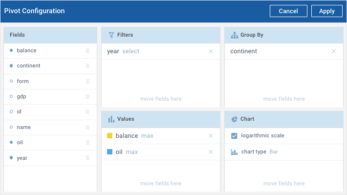
To configure the widget, you had to drag one of the values of the “Fields” section into the corresponding settings block (Filters, Columns, Rows, etc). In this case, the changes took effect only after clicking on the “Apply” button in the top right corner of this panel.
In the new Pivot version, setting the widget has become much more convenient. The settings panel became more compact. Now it appears on the right side of the widget when clicking on the “Configure Pivot” button on the toolbar.
At the same time, the main screen of the widget remains in the field of your vision. All changes are immediately reflected in the corresponding panels (the toolbar, left panel, table or chart panel).
The setting process itself has also been changed. Instead of inconvenient moving elements from block to block, now you just need to click on the round button with the “+” sign in the corresponding section you want to change. After this, you should select the desired value from the drop-down list of options. Other sections can be collapsed, which makes the settings panel even more compact.
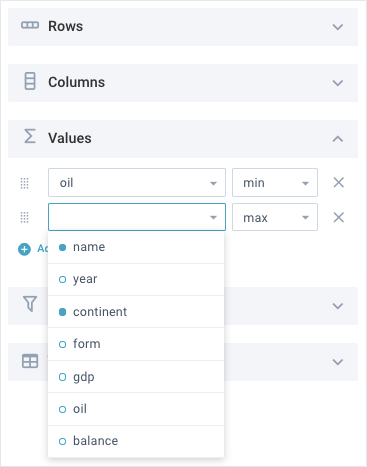
Besides the new interface for managing data, the settings themselves were also expanded. So, the functionality of Values section was enhanced by the following functions:
– avg – average value
– wavg – weighted average value of two parameters
– any – default value
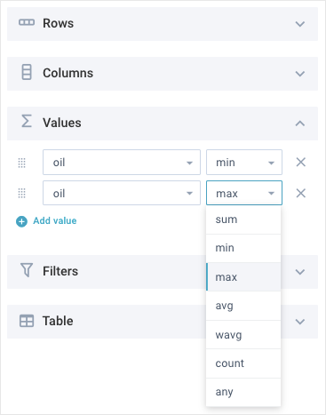
But you can still add your own operations as you need.
General table settings
In the Table and Tree modes, a new “Table” section appears on the settings panel. It is intended for the general setting of the pivot table. Here you can highlight the minimum and maximum values of the rows and columns, as well as control the table footer.
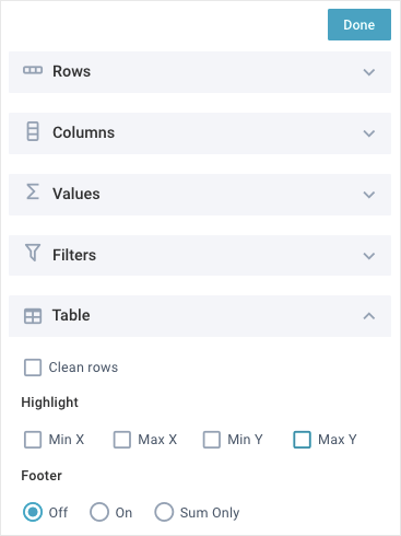
Note that in the old Pivot, you could also highlight the max and min values. But this could only be done for table rows, and only via the corresponding APIs.
Similar changes have touched the footer of the table. Previously, it was displayed via the settings in the widget configuration object. But in the new widget, there are special controls for this.
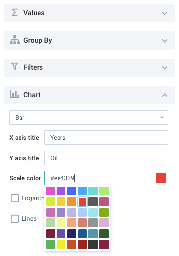
General chart settings
The settings panel of the old Pivot-chart widget has also been changed. Now it is the Chart mode of the new Pivot.
Pivot-chart (old version)
The general structure of the settings remains the same. But the interface of the new widget includes some new features that were previously available only via the API. Now, in the Chart section you can perform the following actions:
– specify labels for the X and Y axes
– specify the scale color
– show/hide chart lines
– specify “Circled lines” for the Radar type
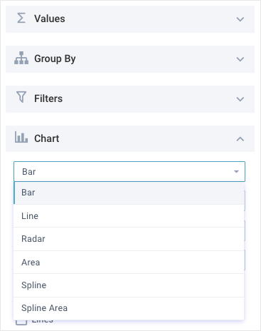
Among other things, the types of charts have also been enhanced by the new items. In the old version, you could use only 3 types, namely: Bar, Line and Radar. In the new widget, there are 3 more diagrams:
– Area
– Spline
– Spline Area
Configuring
Now let’s move on to the most significant changes that have occurred in the widget code. The fact is that the old Pivot was developed as a regular Webix component. To initialize it, you had to use the webix.ui() constructor. It accepts an object with the component settings:
view: "pivot",
structure: {
rows: ["form", "name"],
columns: ["year"],
values: [
{ name: "gdp", operation: "sum"},
{ name: "oil", operation: "sum"}
],
filters: [ ]
},
data: pivot_data
});
The old widget didn’t support a dynamic change of the locale and had several restrictions related to customization. But we will talk about it a bit later.
The code structure of the new Pivot is radically different from its predecessor. The main difference is that the widget was designed as a Jet application. Its main advantage lies in the flexibility of settings and customizing.
Now you can initialize the new widget in two ways:
– as a regular Webix component (as in the previous version)
view: "pivot",
url: "https://docs.webix.com/pivot-backend/",
structure: {
rows: ["form", "name"],
columns: ["year"],
values: [{ name: "oil", operation: ["min", "sum"] }]
}
});
– as a Jet application
url: "https://docs.webix.com/pivot-backend/",
structure: {
rows: ["form", "name"],
columns: ["year"],
values: [{ name: "oil", operation: ["min", "sum"] }],
}
});
app.render(document.body);
Since the updated Pivot combines the functionality of the two previous versions, its settings have also been changed. For example, working with filters has been greatly simplified.
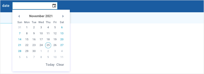
In the old Pivot, you could operate with only 4 types of filters, namely: text, select, multiselect, and datepicker. To display the default filters, you needed to specify the name of value the filter will be applied to and its type in the object of the filters array:
filters: [{name: "date", type: "datepicker"}],
...
}
Along with this, the widget had special APIs for working with filters. Some of them were removed as it was no longer needed. For example, the filter() and getFilterView() methods were gone as well as a number of properties for the filter settings, namely: filterLabelAlign, filterMap, filterMinWidth, filterWidth and filterPlaceholder.
In the new Pivot, filtering data is much easier. Firstly, the widget uses only the filter component instead of several separate filtering components (text, datepicker etc). In fact, it covers all the tasks of its predecessors. Secondly, you can still set filters by default, but now you don’t need to specify its type and a whole bunch of related settings:
filters: [{name: "continent"}, {name: "name"}, {name: "year"}],
...
}
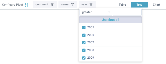
If the built-in filters seem to be insufficient for you, you can always create extra ones.
There are also completely new settings. Now you can set the default mode via the mode property and new data operations via the operations property.
mode: "table", // set the table mode by default
operations: { // object with custom operations
floor: v => v.reduce((acc, a) => acc + Math.floor(a), 0),
...
}
As I mentioned above, in the new Pivot, the users can dynamically change locales using the new setLang() method. It relates to the locale plugin of the Jet framework. In the previous version, localization was static and you could set it only during initialization.
Customizing
Now let’s compare the customizing abilities of the new Pivot and the old one. As you already know, in the new version, customization has become more flexible. This is due to the peculiarities of the Webix Jet framework on which the widget is written.
But along with this, there are additional difficulties. For example, to change this or that part of the interface or its behavior, you need to understand how the Jet framework works. To master its basics, you can first read the introductory article or go straight to studying the Jet documentation.
In short, each part of the widget interface is a separate class. To change the behavior or appearance of any part, you should create a new class by inheriting from the corresponding class by default. Then, you need to change or add a new logic of the desired elements. To save all changes, you should overwrite the class you were inheriting from.
Let’s look at an example of how to add a custom palette to select the chart color:
class CustomValuesProperty extends pivot.views["config/properties/values"] {
ItemConfig(val, i) {
const config = super.ItemConfig(val, i);
config[1].suggest = {
padding: 0,
type: "colorselect",
body: {
button: true,
},
};
return config;
}
}
// initialize the component
webix.ui({
view: “pivot”,
mode: “chart”,
structure: {
…
},
// overwrite the default class, replacing it with a custom one
override: new Map([
[pivot.views[“config/properties/values”], CustomValuesProperty],
]),
});
});
In the old Pivot, everything was done in a completely different way. For example, you couldn’t replace built-in elements with your own. And in order to add a new functionality, you had to handle certain widget events.
Let’s look at an example of how to add a supplementary search field to the Fields section of the settings panel:
{
id: "pivot",
view: "pivot",
structure: {
...
},
popup:{
on:{
onViewInit: function(name, config){
if(name == "fieldsLayout")
config.rows.splice(1,0,{
id: "fieldsFilter",
css: "fields_search",
view: "search",
on:{
onTimedKeyPress:function(){
var value = this.getValue().toLowerCase();
$$("pivot").getConfigWindow().$$("fields").filter("name",value);
}
}
});
}
}
}
}
]
Conclusion
In this article, we covered the main differences between the old and new Webix Pivot widgets. As you can see, the interface has become more user-friendly. There are 3 modes to display data, namely: Tree, Table and Chart. There are some new settings in the interface that earlier were available only via the API or were completely absent. Besides, the code structure was changed. It significantly expanded the possibilities of configuring and customizing. To find more details about working with the new Pivot, visit its documentation.