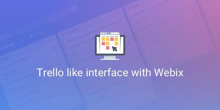
This week’s adventure is another visit to the kingdom of the Most Recognizable User Interfaces. Trello provides one of the best interfaces for task management. A single glance reveals all the latest tasks, who’s working on them and what tasks are planned. Let’s look at how the same interface can be created with Webix UI library.
The kingdom is populated by UI architects and builders, so during this trip, you’ll watch the construction of a small but amazing castle. The main unit for the castle will be Webix Kanban. You can see the live demo and get the blueprints from GitHub. And now the adventure begins.
Setting Up the Frame: Layout
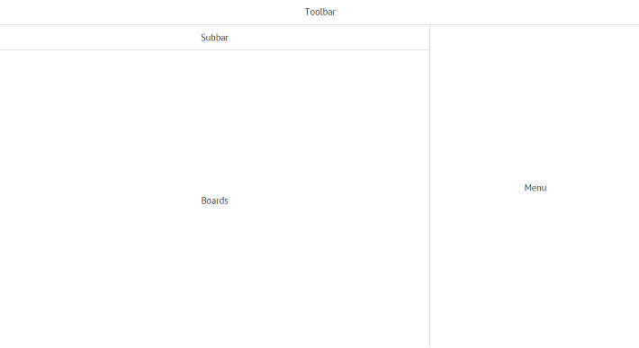
The first thing is constructing the layout. At the end of this part of the tour, you’ll see a frame like this:
Every architect needs tools and building materials. You can get them by including Webix files into index.html. Also do not forget to include FA icons stylesheet, I will use them in this demo. The styles and logic will be kept in separate files. Let’s include them into the page as well:
The foundation is ready. Let’s move on to creating panels for the UI components. Here are two toolbars for controls:
css:"draft", template:"<span class="title">Toolbar</span>", height: 40
};
var subbar = {
css:"draft", template:"<span class="title">Subbar</span>", height: 40
};
Next come the main unit for task boards and the side menu that later on will be toggled:
css:"draft", template:"<span class="title">Boards</span>"
};
var menu = {
css:"draft", template:"<span class="title">Menu</span>", width: 340
};
The CSS classes applied to the frame are created purely for the demonstration at this stage. You can find them in app.css. Next, the pieces of the frame are put together:
webix.ui({
rows:[
toolbar,
{ cols:[
{ rows:[ subbar, boards]},
menu
]} ]
});
});
You can check out the complete blueprints for this step on GitHub.
Raising the Towers: Toolbar and Basic Styling
The kingdom of User Interfaces is a curious one. You can begin building castles even from the towers after the frame and foundation are ready. Look, this is how the Top Toolbar tower is set up and filled with necessary controls:
css:"topbar", padding:1, view:"toolbar", height:40, cols:[
{ view:"button", type:"icon", icon:"fas fa-arrow-left", width: 40 },
{ view:"button", type:"icon", icon:"fas fa-tachometer-alt", label:"Boards", width:100 },
{ view:"search", width:300 },
{ view:"label", label:"<a href="https://webix.com/kanban/">Webix Boards</a>"},
{ view:"button", type:"icon", icon:"fas fa-plus", width: 40 },
{ view:"button", type:"icon", icon:"fas fa-question-circle", width: 40 },
{ view:"button", type:"icon", icon:"fas fa-bell", width: 40 }
]
};
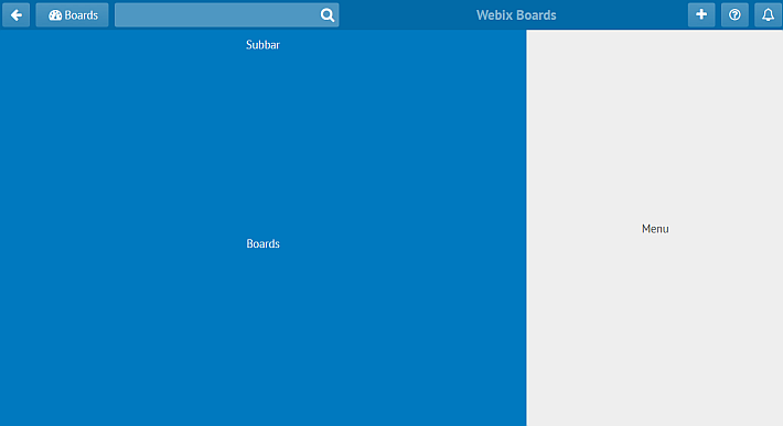
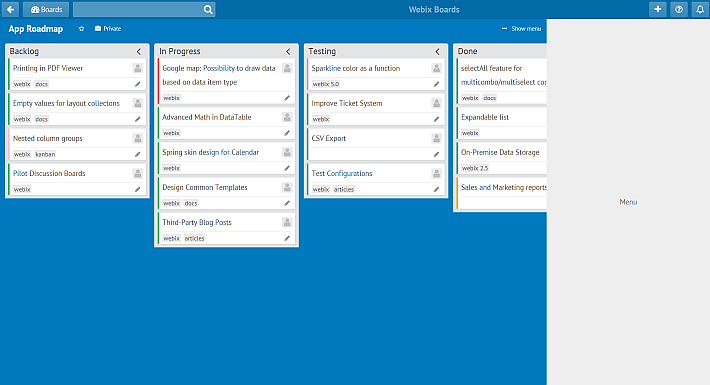
Next, the toolbar needs a change of style and the whole frame needs coloring. Look at the castle now:
You can find the stylesheet on GitHub. Let’s have a closer look at the styles for toolbar buttons. A 3D effect is created with the help of a transparent gradient:
.webix_layout_toolbar.topbar button .webix_icon_btn span{
color: #fff;
text-align: center;
border-radius: 3px;
background: linear-gradient(rgba(255, 255, 255, 0.3) 0px, rgba(255, 255, 255, 0.2) 100%);
}
To render the graphic effect of interacting with buttons, different gradients are added to pseudo-classes hover and active:
.webix_layout_toolbar.topbar button .webix_icon_btn span:hover{
background: linear-gradient(to bottom,rgba(255,255,255,0.4) 0,rgba(255,255,255,0.3) 100%);
}
.webix_layout_toolbar.topbar button:active,
.webix_layout_toolbar.topbar button .webix_icon_btn span:active{
background: linear-gradient(to bottom,rgba(255,255,255,0.45) 0,rgba(255,255,255,0.35) 100%);
}
Complete blueprints for the step are available, feel free to check them out for more details.
The Subbar Tower
Now that the upper tower is ready, the Subbar tower will be built. These are the controls that are placed on the subbar:
css:"subbar", padding:1, view:"toolbar", height:40, cols:[
{ view:"label", label:"
App Roadmap
“, width: 150 },
{ view:”button”, type:”icon”, icon:”far fa-star”, width: 28 },
{ view:”button”, type:”icon”, icon:”fas fa-briefcase”, label:”Private”, width:72 },
{},
{ view:”button”, type:”icon”, icon:”fas fa-ellipsis-h”, label:” Show menu”, width:100 }
]
};
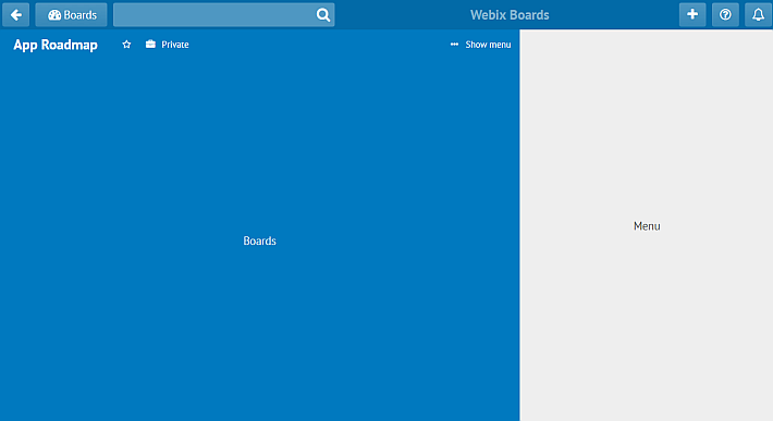
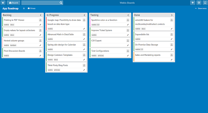
After brightening up with CSS, the subbar looks just like planned:
For more details, have a look at the blueprints for this step.
Constructing the Rose Window: Kanban Board
Necessary tools for the main unit are stored in Kanban files, so they are included into index.html as well.
Kanban board needs data, and it’s time to provide them. In real life, data are loaded from a server. For this tour, however, a JSON file will do. The data file contains an array of JSON objects, for instance:
{
"id": 1,
"status": "new",
"text": "Printing in PDF Viewer",
"tags": "webix,docs"
}, {
"id": 2,
"status": "work",
"text": "Google map: Possibility to draw data based on data item type",
"color": "red",
"tags": "webix"
},
//...other tasks
]
A Trello board usually has several panes (aka lists) for cards. The board of this castle will have lists for new tasks, for tasks in progress, for testing tasks, and the last one for accomplished work. For convenience sake, the architects defined a special function that will return lists:
return {
borderless: true, headerHeight: 30, header: header,
body: {
view: "kanbanlist", width: 300, status: id
}
};
}
The function initializes a kanbanlist view and sets the status and the header for the view. The status parameter links a list to tasks in the data file, so each task object should have the status property. Now Kanban is initialized with four lists:
view:"kanban", css:"kanbanarea", type:"space", cols:[
getList("new", "Backlog"),
getList("work", "In Progress"),
getList("test", "Testing"),
getList("done", "Done")
], url:"data.json"
};
For bigger castles with more projects and processes, boards usually have more than four lists. It would be swell to see them all, so a horizontal scroll is just what’s needed. Webix ScrollView suits well for that. Look how Kanban is enveloped into ScrollView:
view:"scrollview", scroll:"x", body:{
/* Kanban*/
}
};
To render a nice-looking custom scrollbar instead of the standard browser scrollbar, the CustomScroll mixin is initialized before the whole castle initialization:
webix.CustomScroll.init();
webix.ui({
rows:[
toolbar,
{ cols:[
{ rows:[ subbar, boards]},
menu
]} ]
});
}
After that, style is applied to the board. Mainly, it includes shades of gray for lists and cards:
background: #e2e4e6;
}
For more details, the blueprints for the step are also available.
A Secret Door: Menu Toggle
A castle is not charming enough without a door to secret corridors. It’s time to hide the menu and let users open it by pressing a special button.
The menu can be hidden by setting the hidden property of the menu to true. Next, the builders are going to give the Show menu button the power to show the menu back to the world. To refer to the menu from code, the menu ID needs setting:
width: 340, css:"menuarea", id:"sidemenu", hidden:true, type:"head",
css:"draft", template:"<span class="title">Menu Content</span>" }
};
And here’s the mechanism for the Show menu button:
view:"toolbar", /* style */ cols:[
//other controls
{ view:"button", type:"icon", icon:"fas fa-ellipsis-h",
label:" Show menu", id:"show-btn", width:100, click:function(){
$$("sidemenu").show();
this.hide();
}}]
};
In Trello, the menu is closed with a different button. Let’s add a header with this button on top of the menu:
width: 340, css:"menuarea", id:"sidemenu", hidden:true, type:"head", rows:[
{ cols:[
{ label:"Menu", view:"label" },
{ view:"button", type:"icon", icon:"fas fa-times", width: 30, click:function(){
$$("sidemenu").hide();
$$("show-btn").show();
}}
]},
{ css:"draft", template:"<span class="title">Menu Content</span>" }
]
};
The UI of the castle is ready, and you can download the blueprints from GitHub.
Conclusion
This is the end of the tour. I have shown you the construction of a Trello-like UI. Now you can construct a similar UI for your project management apps. If you ever wanted to create your own Trello-like boards, hopefully, this tour is a good starting point. Besides, you can get all the blueprints from GitHub and play around with them. In one of the future tours, you’ll see how to create a backend for the app. See you later, and good luck!

