Hi everybody! I’m lucky to inform you that summertime is approaching rapidly and it’s high time to rejoice, indulge into various kinds of outdoor activities, twist and shout. Today I suggest you to combine all these things with web development. So, are you ready to play the Accordion? 😉
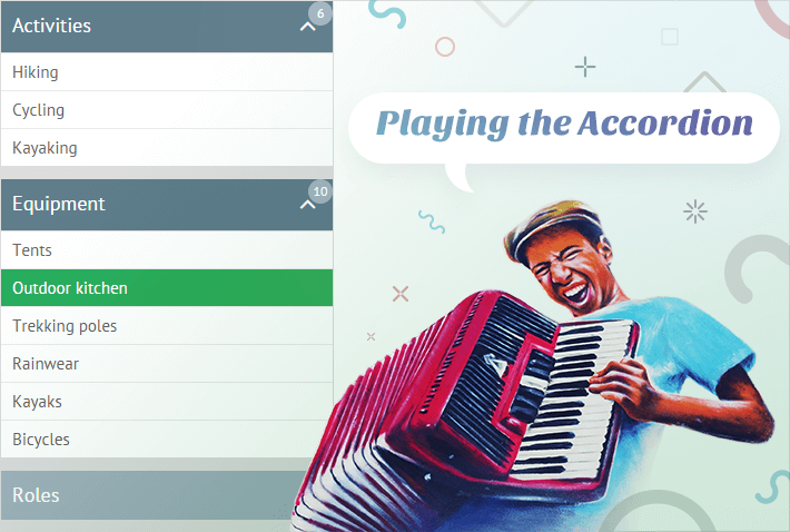
Still, I don’t want you to read musical notes. In HTML and Javascript accordion means a UI control that consists of panels that can be expanded and collapsed (just like the bellows of a musical accordion) to make the whole interface sound.
Webix accordion widget is one of the basic ui layout types. It seems to be very simple and non-configurable, but one needs to learn and practice to play the music. Here we gathered three common use cases and customization samples with the Accordion component:
- Accordion with extra controls on panels;
- Dynamic Accordion layout;
- Smooth Accordion menu.
Adding controls to panels of Accordion widget
Lots of users have asked us a question “How can I make the headers of my Accordion items interactive?” The headers look very much like the Toolbar and tempt one to fill them with buttons and icons, but the truth lies apart.
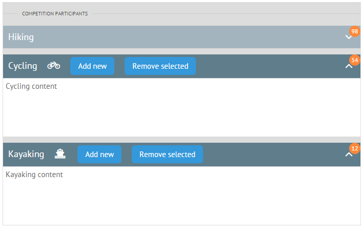
Indeed, you can embed interactive buttons and icons into the panels of accordion items, but only via HTML and CSS:
multi:"mixed",
view:"accordion",
rows:[
{
header:"Hiking <span class='webix_icon fa-paw'></span>"+
"<span class='webixbutton add'>Add new</span>"+
"<span class='webixbutton remove'>Remove selected</span>"+
"<span class='webix_badge'>98</span>",
body:"Hiking content"
}
]
});
Looks like a nightmare, especially when thinking about catching clicks, eh? But don’t judge too strictly as Webix offers convenient API for such cases. You can define CSS-specific click handlers with the help of the onClick property:
header:"Hiking", body:{}, onClick:{
"add":function(){
webix.message("Add new participant");
return false;
},
"remove":function(){
webix.message("Remove selected participant");
return false;
}
}
}
We need to return false here to cancel the default click action (collapsing or expanding).
Dynamic Layout based on Accordion UI
Another vital issue about Accordion component is the ability to make it flexible, e.g.
- Scroll the panels if Accordion height is not enough;
- Add a child accordion into the panel;
- Add and remove panels at runtime.
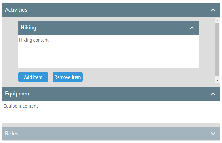
So what are the solutions?
To add a scrollbar, you need to place the Accordion widget into Webix scrollview:
view:"scrollview", height:420, body:{
view:"accordion", rows:[
{ header:"Hiking", body:"Hiking content", height:150 },
{ header:"Cycling", body:"Cycling content", height:150 },
{ header:"Kayaking", body:"Kayaking content", height:150 }
]
}
}
Adding a child Accordion is even more simple. Just put it into the body of a parent Accordion item:
view:"accordion", rows:[
{
header:"Activities", body: {
view:"accordion", rows:[
{ header:"Hiking", body:"Hiking content", height:150 },
{ header:"Cycling", body:"Cycling content", height:150 }
]
}
}
]
}
To add and remove items, Webix Accordion offers the related .addView() and .removeView() methods:
parent.removeView(view.config.id);
Creating a smooth menu with Accordion widget
And finally, let’s climb the new summit in mastering Accordion. The widget allows creating a smooth animated menu with just little customization tricks!
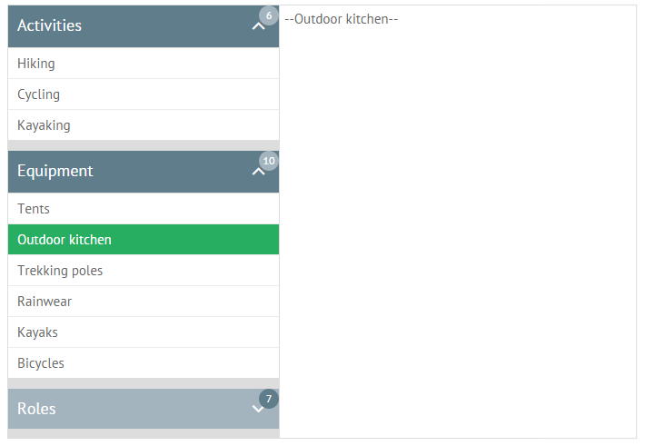
The final code of the menu is as follows:
view:"accordion-menu", multi:"mixed", width:300, rows:[
{ header:"Activities", badge:6, collapsed:true, data:activities },
{ header:"Equipment", badge:10, collapsed:true, data:equipment },
{ header:"Roles", badge:7, collapsed:true, data:roles }
],
on:{
onMenuSelect:function(id){
$$(id).show();
}
}
});
As you can see, here we have three sections made of Accordion items each of which houses a list of sub-items. Once a menu item is selected, the related multiview shows up.
For convenience’ sake we have created a custom accordion-menu widget that inherits from Accordion and adds extra functionality, namely:
- Creates a set of selectable Webix lists and calls the onMenuSelect event each time an item is selected in either of these lists.
- Removes selection, if any, from currently inactive lists.
Accordion animation and styling are added through CSS.
You can check the full code of a custom view as well as live demo by the link.
Now, when we have broadened our horizons together, you can create your own Accordion example. Just revise the basics browsing Accordion samples, read the documentation and start playing the API to elicit the right melody.

