Today Webix has been updated to the version 1.8 that brings some pleasant bonuses for our users. The new version includes UI improvements, bug fixes and a few techniques for building responsive apps.
Responsive web apps
Previously when you were developing Webix web apps for desktop you had a problem with adapting the same app for the mobile devices. These desktop web apps had screens too wide for mobile apps.
So in Webix 1.8 we’ve added 2 features that will make your web apps responsive and improve user experience on both desktop and mobile devices.
Let’s consider the responsive web app made with Webix to show you this functionality.
Here is the screenshot of desktop web app:
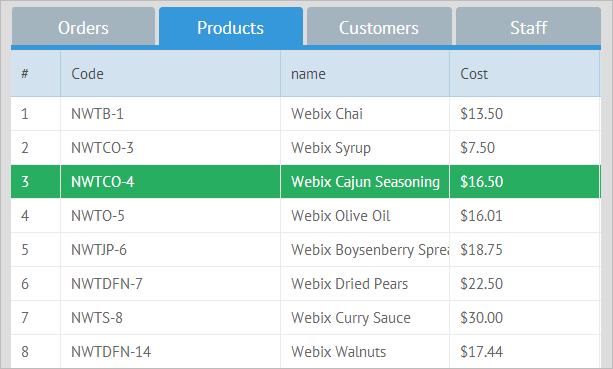
When the browser’s screen is minimized, the tabs of the tabbar component which don’t fit the visible screen size are transformed into a common button with a popup list attached to it (it can be either a tabbar tab or a button). Thus, you will have access to the hidden elements (tabs) through their labels located in the popup list.
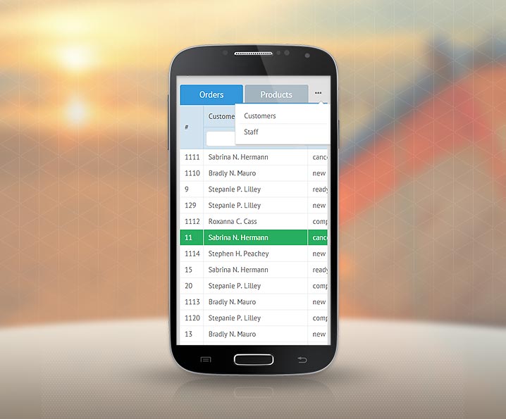
The other enhancements in the support for responsive web apps include responsive layouts.
Webix Layout and Accordion structures can respond to the changes of window size by hiding & showing or moving their rows (cols) depending on the currently available browser space.
Responsive layout behavior features 2 variants:
- Layout and accordion panels are hidden and can be shown back;
- Layout and accordion panels are moved to another place in a mobile web app.
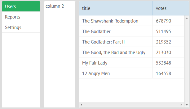
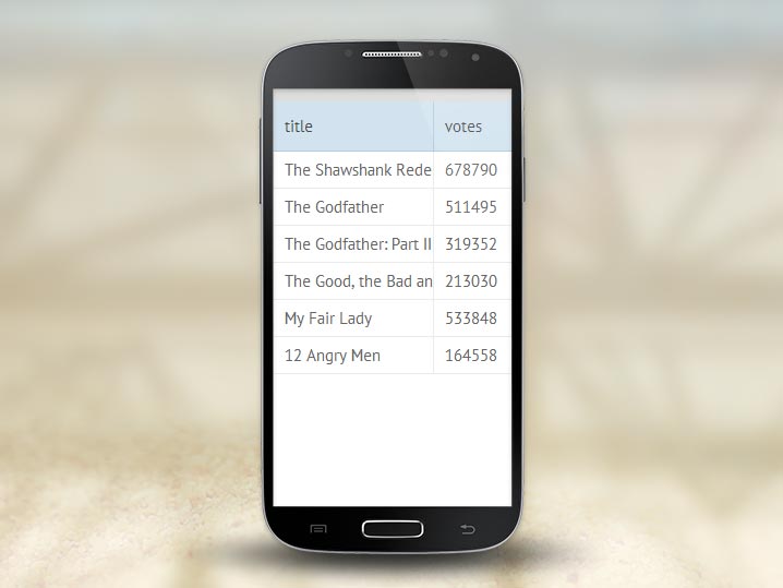
In the first variant when you resize a browser some layout panels which don’t fit the browser size are hidden (the left panel is hidden first).
In our example the following desktop web app:
turns into this mobile web app:
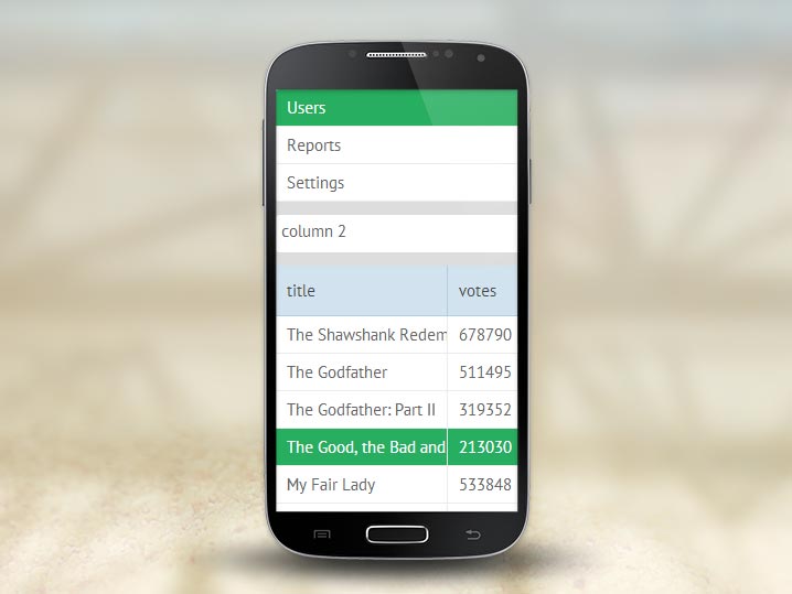
Now let’s consider the second variant. When you check the above mentioned desktop web app on your mobile device its layout panels will move to the place that you can specify yourself.
UI improvements
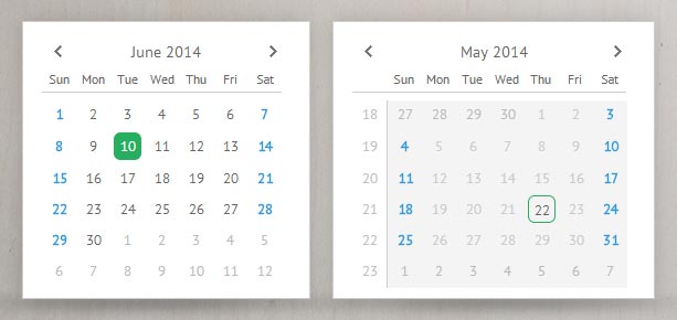
We have also added a new functionality to Webix Calendar. This new feature allows you to block a date range.
Webix 1.8 will make your web apps fully responsive and more feature-rich allowing you to create equally beautiful desktop and mobile web apps.
You can read about Webix 1.8 in detail in our documentation.
Download the latest Webix version.


