Hi guys!
Today, in the middle of June, we would like to share with you a fresh and still hot showcase directly from sunny Argentina. It was kindly provided by Diego Ferruchelli.

“Curvas (Spanish for “curves”) is a tool for data analysis and business modeling intended to be used in such spheres as agricultural insurance and risk management. It was prepared as a part of my independent consulting services for a local company which was developing a new product in this field.
I was using Webix for another application, and I felt it was the natural way to go with this one, in which good user interaction and charting are key features.
The tool is fed by actual statistical data, which is “expanded” to a continuous model using one of four predefined probability distributions. (The actual data is supposed to follow one of these four distributions.) The user can adjust several parameters and he/she can visually (and numerically) compare the suitability of each distribution and different rating strategies. Finally, the tool can export all the resulting values (insurance rate, premium, etc.) for the selected approach.
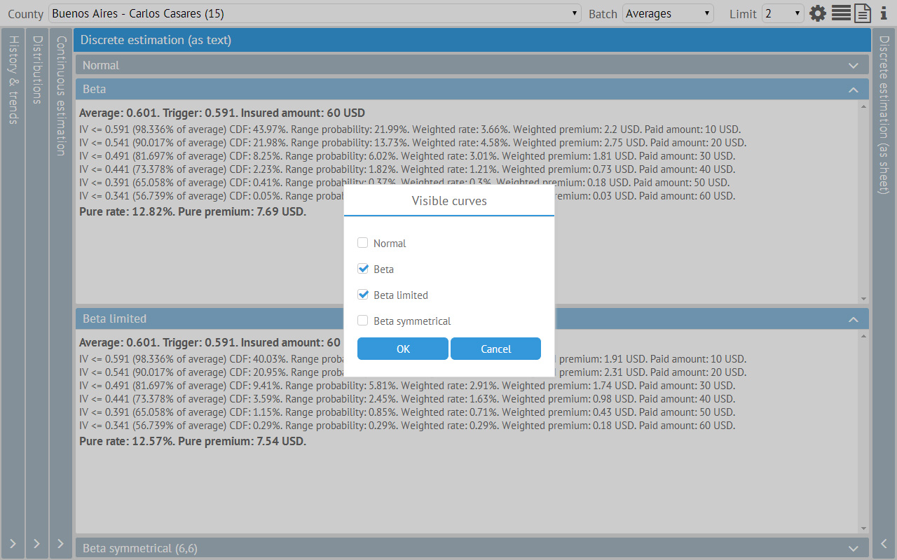
The interface is designed to be as simple as possible. The main screen shows the information for one county at a time. There is a toolbar with three dropdown controls (county selection, data batch and beta distribution upper limit) and a few icon buttons (configuration, selection of visible curves, reports generation, copyright information).
Almost everything is accessible via vertical and horizontal accordion-like panels of the main screen. Every change made by the user implies an automatic recalculation that dynamically changes the results shown in every panel and subpanel.
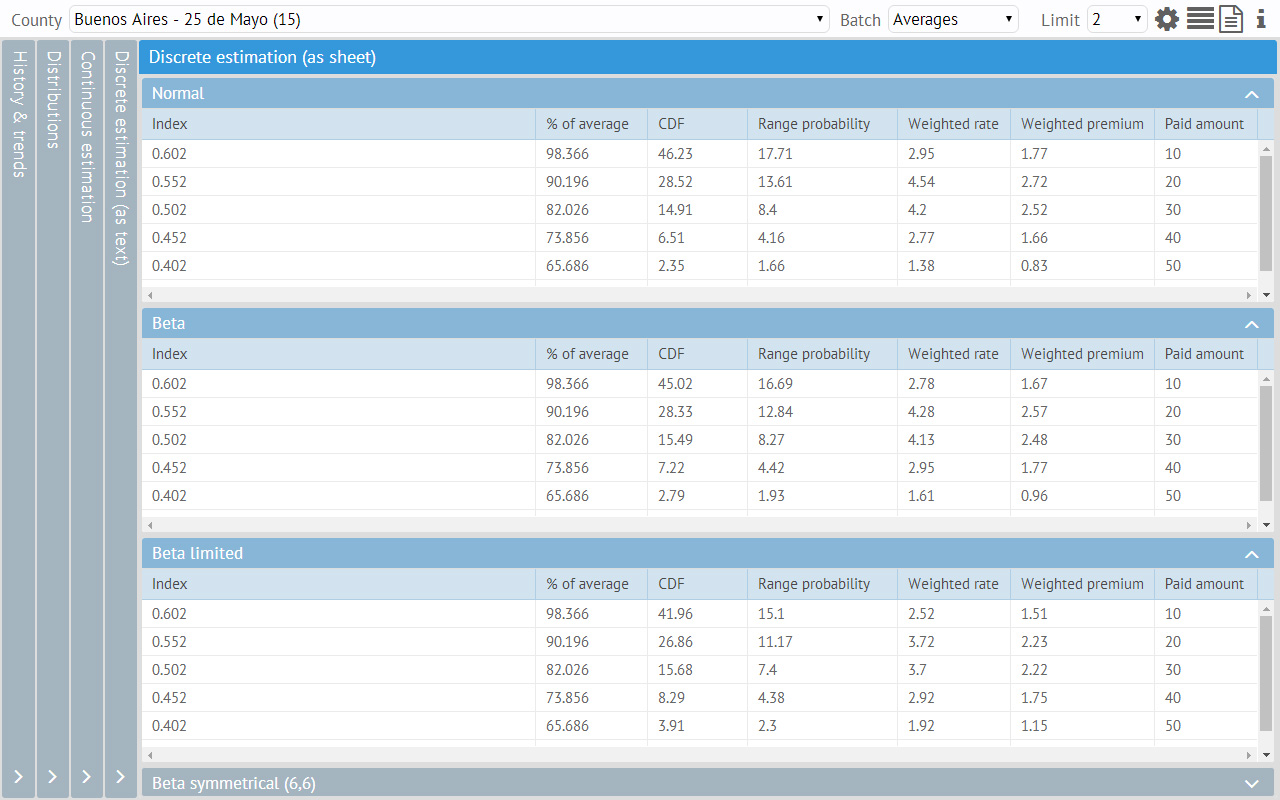
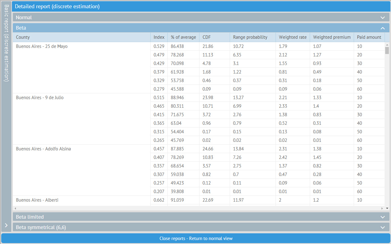
In each vertical panel (but the first one), there are four horizontal panels, one for each of the four possible distributions. These horizontal panels can be shown/hidden manually or by setting a global preference.
For each county different vertical panels show:
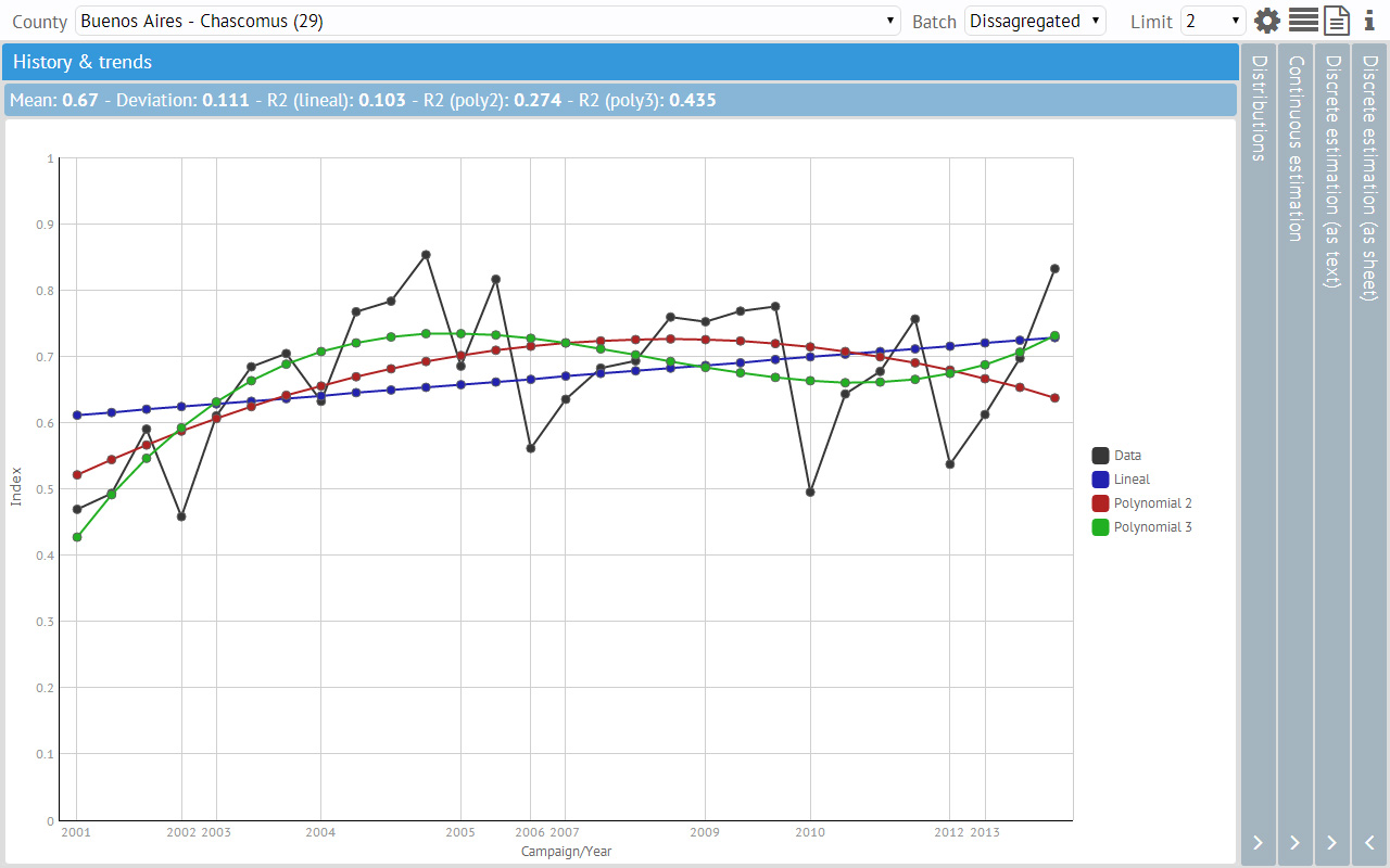
a) The original data and its historical trend (actually, several trends, because they may be linear or polynomial) (see the first picture). This trend is really important to establish if the data could be viewed as an ordered or unordered set.
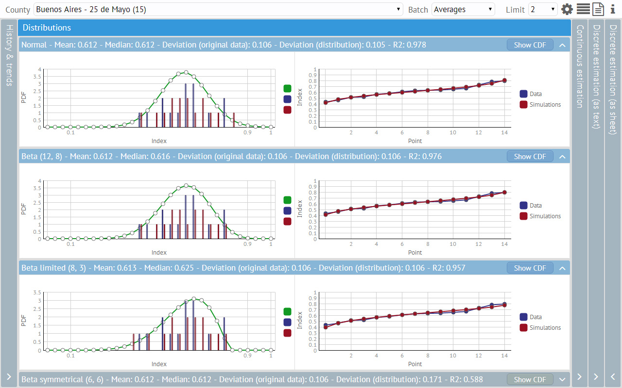
b) Several graphs that show the probability distributions and compare them to the actual data. On the left, there are charts with the corresponding PDF or CDF over two comparative histograms (actual data and simulated data based on the distribution). On the right, there are line charts which compare the actual and the simulated data. These charts with the related statistical indicators, measure the suitability of each distribution.
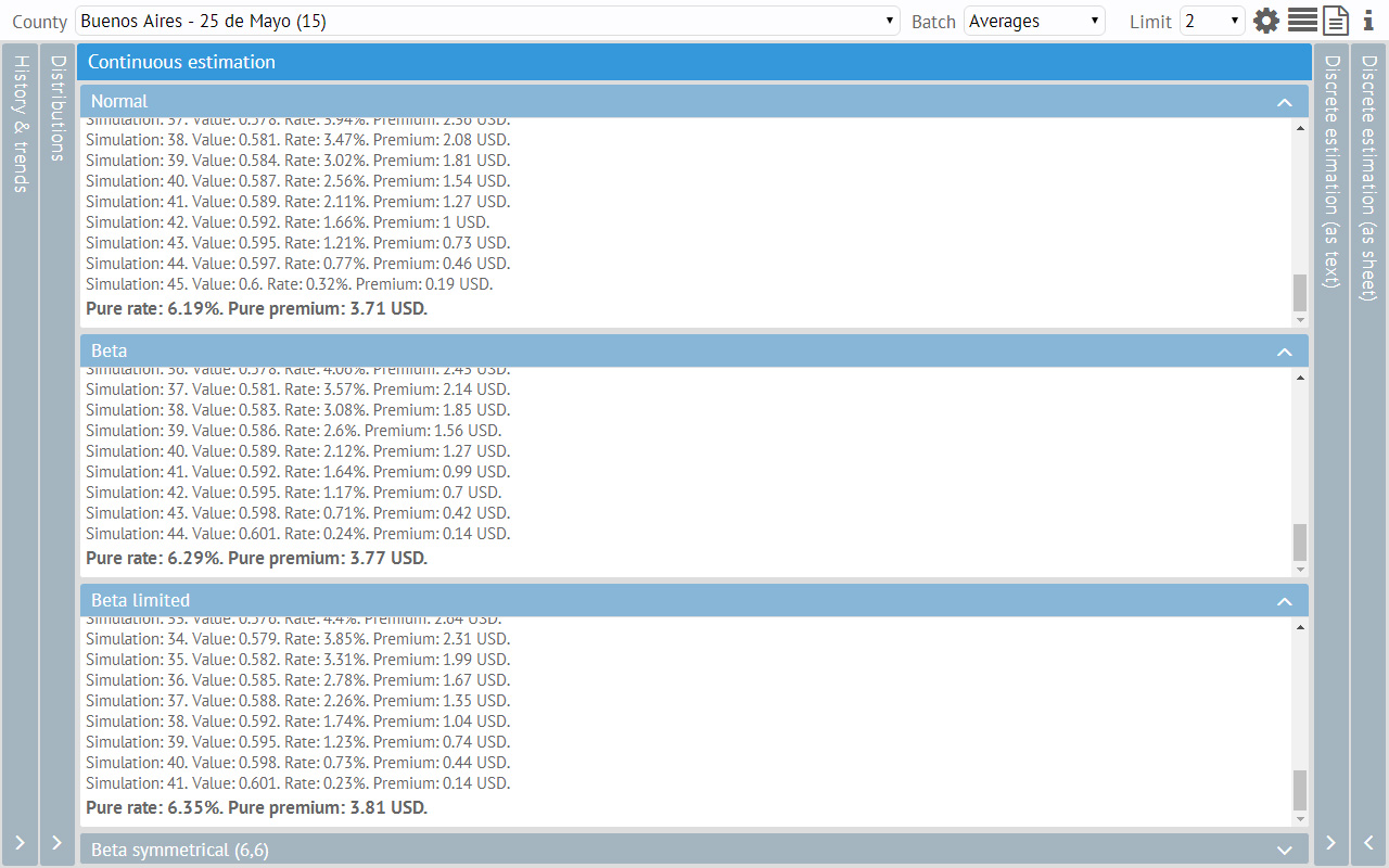
c) A classical insurance rating model (the so-called “continuous estimation”), which calculates an insurance rate and premium for a given “trigger” and insured amount.
d) Another rating and payment model (the so-called “discrete estimation”) which is intended to pay increasing amounts for different fixed ranges/steps.
All the parameters for estimations are defined in a dialog box, accessible via the gear icon. For instance, the user may establish the trigger for each county as a percent of its average value. Inside this configuration dialog there is also a sample box that helps the user understand relationship between all of the parameters.
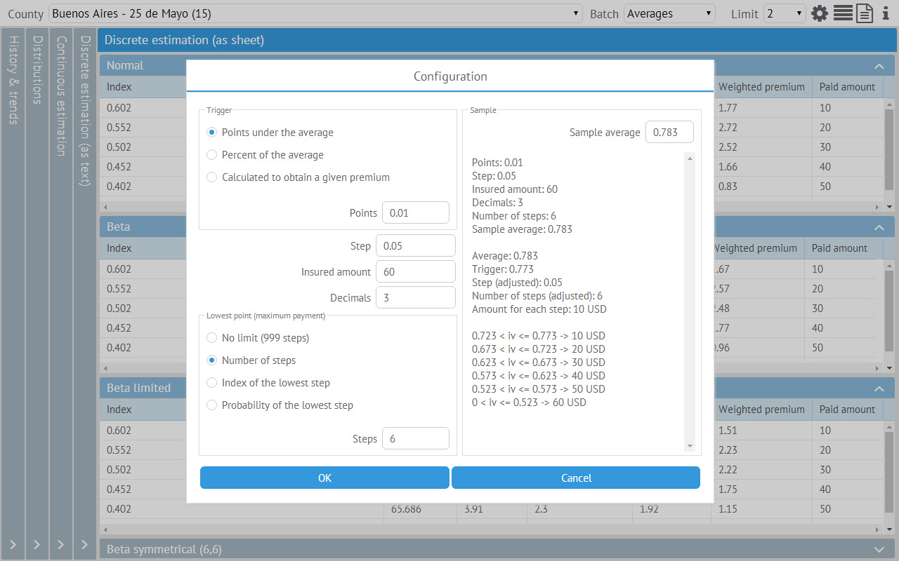
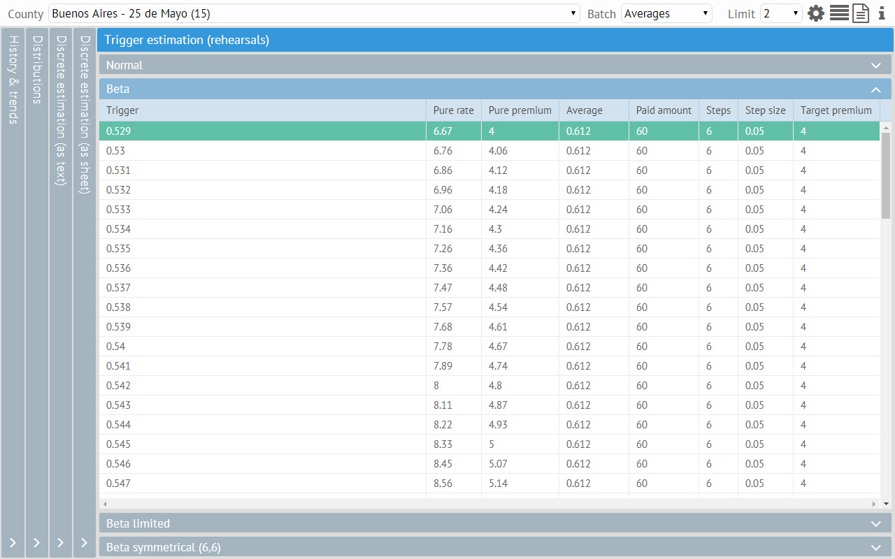
For the step (“discrete”) estimation model, the tool can also calculate the trigger for a given maximum premium (always, independently for each county). That is, the tool can answer the question: “which would be my trigger if I want to pay no more than *totalAmount* dollars for insurance and want to pay *stepAmount* dollars for each step and there are *n* steps of *m* size (based on these actual data and assuming they follow a distribution of *distribKind*)”.
When using this mode, the UI hides the “continuous” estimation and shows an extra vertical panel with the rehearsals (i.e. the steps of the solver process used to answer the question).
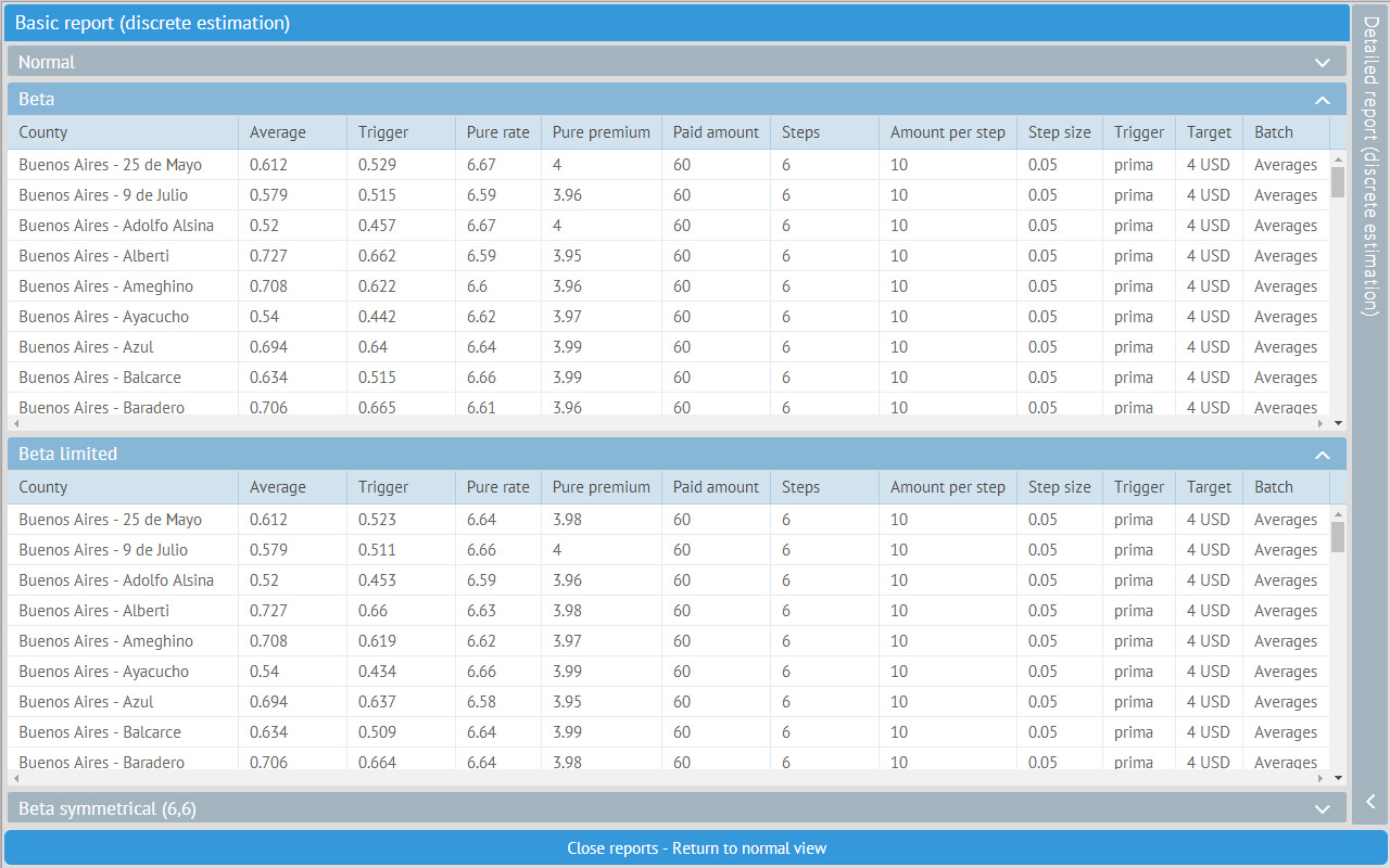
When the user is done with all the testing and is satisfied with the chosen distribution, parameters and general results, he/she may open the separate reporting system. The reports are just two big sheets, a summary one and a more detailed one, presenting the results for all counties. These sheets are supposed to be exported (via the clipboard) to Excel or another application.
Anyone can contact me via this mail: dferruchelli@gmail.com”.
We would like to thank Diego Ferruchelli for his great article.
If you have a real project made with Webix, you want to share it and highlight your company and product in our blog – feel free to contact us!
Stay tuned and see you next week!