Day by day Webix evolves and dozens of new features appear with every release. But while the framework is constantly improved, something always stays the same.
Let’s talk about the very basic and the most important Webix feature – component positioning and sizing.
Layout. Basics.
The main Webix way of the element positioning is dividing the page into rows and columns.
The basic layout can be created with the help of the same-name Layout widget. And you can place any of the numerous Webix widgets into any Layout cell:
view:"layout",
rows:[ //or cols:[]
{view:”toolbar”, .. }
]
});
But Webix can recognize Layout simply as webix.ui({ rows:[] });
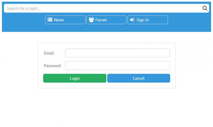
And here we go from a mockup to the real prototype. Let’s take a look at the basic code:
rows:[
{ view:”toolbar”, /*toolbar config*/ },
{ },
{cols:[
{ },
{ view:”form”, /*form config*/ },
{ }
]},
{}
]
});
In the snippet above we have created several Layout cells, each of which can contain widgets, so you can build the complex app by putting rows into columns and vice versa.
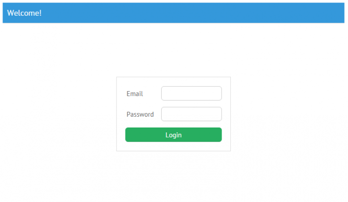
Not only Layout can form rows and columns. There’s a couple of widgets that work in the similar way – the Form and the Toolbar.
For both of them child widgets are placed into the elements:[ ] array. For the convenience sake, elements of the Form are represented as rows and elements of the Toolbar act as columns:
{ view:"search", width:300},
{},
{ view:"button", type:"iconButton", icon:"sign-in" }
]}
{ view:"form", elements:[
{ view:"text", label:"Email" },
{ view:"text", type:"password", label:"Password" },
{cols:[
{ view:"button", value:"Login", type:"form" }
]}
]}
But it is also legal to define rows or cols instead of elements – the widget will place its child views into rows or columns respectively.
Sizing
By default, a single Layout fits the whole screen. Several cells will fit the parent Layout in equal parts as shown in the above demo. But you can set the size of a particular cell through the following properties: width, height and gravity.
While width and height set the fixed size of the view, gravity defines the relative size within the parent container.
Spacer: where and why
In the above example, the middle cell is empty. In fact, this ‘emptiness’ is made with the help of a micro-widget called Spacer. It doesn’t show anything, but can be sized like every widget (via height, width and gravity), and that’s why the Spacer can help to align the components within the parent Layout.
Finally, we can totally understand, what was going on in the first demo:
rows:[
. . .
{ gravity:0.3 },
{cols:[
{}, //{ view:”spacer” } and {} are equal
{
view:"form",
/*form config*/
},
{}
]},
{}
]
});
Now let’s take another use-case. Assume that you need to add some space between two views: for example, the list of the values and the related chart. If you try to use align:’left’ (or ‘right’), as in HTML, nothing will happen.
In this case Spacer is exactly what you need. Place it between the list and the chart and they will be aligned to both sides of the screen while the spacer will occupy the middle part:
{ gravity:0.4 },
{ view: "chart", /*config*/ }
]}
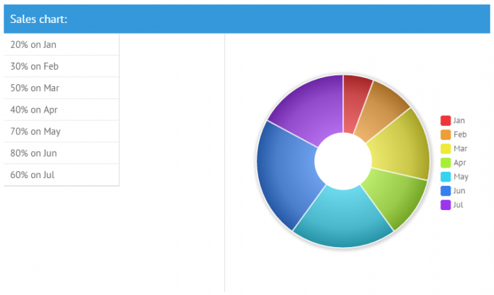
Alignment of the controls
But when we talk about inputs, the align property works as expected. The inner labels have HTML-like properties: labelAlign and labelPosition.
Moreover, the checkbox has an additional label, which can be defined as labelRight:
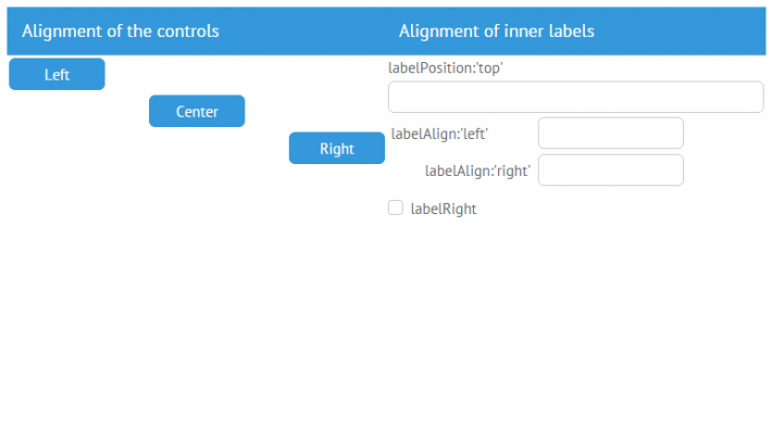
As you can see, the Webix methods of positioning are quite simple and can help you to avoid the excess CSS-styling and save your time, which is so important in our fast-moving world.

