Working with dependent data sources with Webix Datatable became more convenient with Webix 6.3+. You can use options to connect several data sources and set dropdown lists for editors and filters. I will share with you the tweaks and benefits that might not seem obvious from first glance.
Visualize Related Collections Connected by IDs
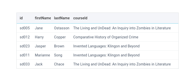
Tables in relational databases are linked with IDs, however on the client side you may need to visualize text values rather than IDs. With Webix Datatable, you can combine the related data into a single presentation.
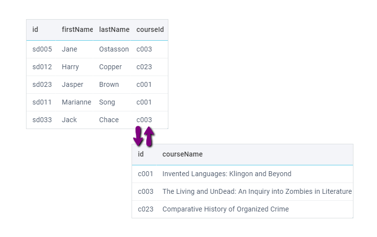
You can connect data sources to the main source with the help of the column-level options or collection.
Follow these steps:
- Load the main data source into the datatable (main_data),
- Set the linked data sources as options or collection for particular columns (e.g. years).
view:"datatable",
columns:[
{ id:"title", header:"Film", fillspace:true },
{ id: "yearId", header:"Released", options:[
{ id:1, value:1991 },
{ id:2, value:1999 }
] }
],
data:main_data
}
Please note that in Webix the dependent data should contain objects with IDs and values (like all selection widgets).
What if the data have other keys than value? You can customize column options.
All the Ways You Can Define Options
Column options can be defined in many ways, not necessarily as an array. For example, you can provide a function that returns the required data array:
return [
{ "id":1,"value":1994 },
{ "id":2,"value":1972 },
];
}}
Or, you can load the options from a database by defining options as a path to a script or a loading proxy, e.g.:
You can also sync the options with another data component:
{ id:"votesId", header:"Votes", options:"votes-grid" }
Or, you can create a Webix DataCollection and provide it as a data source for column options:
data:[
{ "id":1,"value":1994 },
{ "id":2,"value":1972 },
// ...data
]
});
...
{ id:"votesId", header:"Votes", options:years }
Whichever way you choose, the options will be stored in a data collection, which can be accessed from the column configuration.
Displayed Column Values
What if your data feed contains data fields other than value and you need to visualize them? You can customize displayed column values and column options accordingly.
To show column values from any data field, use a column template. As I mentioned previously, the option collection can be accessed from the column configuration. Get the related collection item and display the necessary field:
view:"datatable",
columns:[
{
id: 'titleId',
template:function(obj, common, val, config){
var item = config.collection.getItem(obj.titleId);
return item ? item.title : "";
},
options:[
{ id:1, title:"The Honorable Crusade" },
{ id:2, title:"Crucible" }
]
}
],
data:[
{ id:"1", titleId:1 },
{ id:"2", titleId:2 },
{ id:"3", titleId:3 }
]
}
Datatable Editors and Filters
By default, selection editors (e.g. select, combo, richselect, multiselect) and selection filters (e.g. selectFilter, richSelectFilter, multiSelectFilter, multiComboFilter) will take the options, provided for the column.
view:"datatable", id:"table", editable:true,
columns:[
{ id:"title", header:"Film", fillspace:true },
{
id: "yearId", editor:"combo", options:years,
header:["Released", {
content:"richSelectFilter"
}]
}
],
data:main_data
}
Displaying Options of Editors
If you want to visualize a data field that is not value, you need to display the correct text in the dropdown list of a selection editor. Define a template for the suggest:
id: 'titleId',
template:function(obj, common, val, config){
var item = config.collection.getItem(obj.titleId);
return item ? item.title : "";
},
options:grid_data,
header:"Title",
editor:"combo",
suggest:{
body:{ template:"#title#" }
}
}
Some editors allows typing in text, according to which the dropdown values are filtered. To make the filter work, you need to redefine the filter function of the suggest list.
The function is defined for the suggest dropdown and receives two parameters: the item from a dropdown list and the input value. Compare the value with the desired data field (title):
suggest:{
body:{template:"#title#"},
filter:function(item,value){
if (item.title.toString().toLowerCase().indexOf(value.toLowerCase())===0)
return true;
return false;
}
}
Displaying Options of Filters
Similarly to the case with editors, if the options are other than values, you need to define a template for the suggest list to display the correct values.
Also, some selection filters like richSelectFilter, have an empty option that is appended to the list automatically. The empty option has the “$webix_empty” ID. You need to return an empty string for the empty option as it does not correspond to any data.
'Title', {
content:"richSelectFilter",
suggest:{
body:{
template:function(obj){
if (obj.id == "$webix_empty")
return "";
else return $$("table").getColumnConfig("titleId").collection.getItem(obj.id).title;
}
}
}
}
]
Different Filter Options
By default, options are taken from the column collection. You can take them from the column values instead. Use collect:{ visible:true }:
id:"votesId", header:[ "Votes", {
content:"richSelectFilter", collect:{ visible:true }
}], options:years
}
If you want to provide custom data for filter options, define the options setting for a filter. FIlter options are set as an array, collection, path to script, etc:
id: "yearId", editor:"combo", options:years,
header:["Released", {
content:"richSelectFilter", options:[
{ id:4,value:1966 },
{ id:6,value:1957 }
]
}]
}
Conclusion
This is how one column setting can help visualize and edit dependent data sources. Column options can link data sources and provide options for Datatable editors and filters. Besides, you are not limited in the way you define options, because you can do it according to the way the data source is received.
You can read more about column options in our documentation:

