Quite often programmers face the necessity to filter large datasets by various periods of time whether it is a decade, year or a custom period. A vivid example here would probably be Webix Inventory App where we implemented such a solution with the help of the DateRangePicker and Richselect components. So in this tutorial we are going to build a control that will help you to filter multi-page data by certain date intervals.
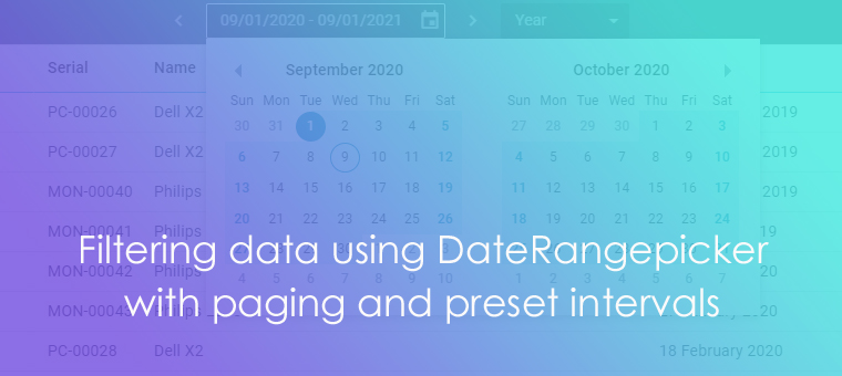
This is what you are going to build:
So let’s do it step by step.
Building the interface
The control is a combination of other controls, namely:
- DateRangePicker for date selection
- Richselect with predefined time intervals
- arrows to switch the intervals back and forth
As far as several controls are engaged you need a container to nest them in. Webix Toolbar seems to fit perfectly. So let’s define a toolbar and populate it with the controls. The date picker should be at least 220px in width. For sake of convenience specify the initial date range with the help of the value property. To hide all the buttons in the popup calendar add the suggest property to the config and inside its body field disable buttons and icons as it is shown below:
view:"toolbar", css:"webix_dark", paddingX:12,
cols:[
// ...
{
view:"daterangepicker", id:"dates", width:220,
value:{
start:webix.Date.monthStart(new Date()),
end:webix.Date.monthStart(webix.Date.add(new Date(), 1, "month"))
},
suggest:{
view:"daterangesuggest",
body:{
button:false, icons:false // hiding buttons
}
}
},
// ...
],
// config
}
On either side of the date picker add an arrow to be able to page back and forth through intervals.
view:"toolbar", css:"webix_dark", paddingX:12,
cols:[
{ view:"icon", icon:"wxi-angle-left", id:"prev"},
{/*date picker configuration*/},
{ view:"icon", icon:"wxi-angle-right", id:"next"},
// ...
]
}
You also need a list with predefined date intervals. In the demo they are a year, month, 12 months, and a custom interval. While with the first three periods the values are pretty clear the last one needs the $empty property to reset the current value. So let’s create Richselect and pass the options to it.
view:"toolbar", css:"webix_dark", paddingX:12,
cols:[
// arrows and date picker
{
view:"richselect", width:120, value:"month",
id:"dateMode", placeholder:"Custom",
options:[
{ $empty:true, id:"$empty", value:"Custom" },
{ id:"month", value:"Month" },
{ id:"year", value:"Year" },
{ id:"12", value:"12 months" }
],
}
]
}
By this point you should have a ready-made interface.
Implementing logic
The interface is ready, so it’s the right time to define the necessary behaviour for the controls.
Tuning Richselect
You have created a list of predefined options and now let’s breathe life into them. Richselect will set a date interval of DateRangePicker (a month, a year, or last 12 months). Let’s handle the onChange event to track changes in the select box and set dates for the date picker accordingly:
view:"richselect",
// config
on:{
onChange: function(value){
setRange(value);
}
}
}
function setRange(value){
if (value){
let dates = {};
switch (value){
case "month":
case "year":
dates.start = webix.Date.monthStart(new Date());
dates.end = webix.Date.monthStart(webix.Date.add(new Date(), 1, value));
break;
case "12":
dates.start = webix.Date.monthStart(webix.Date.add(new Date(), -11, "month"));
dates.end = webix.Date.monthStart(webix.Date.add(new Date(), 1, "month"));
}
}
}
The setRange function takes the ID of the selected option as a parameter and switches the value of the date picker according to that ID.
So the two components are bound and changing value in the select box will change the one of the date picker .
Setting custom mode
In the demo it is the date picker that deals with custom intervals. So when the user selects a date range that does not coincide with any of the predefined ones, you should reset Richselect value. Let’s add the onChange event listener that triggers every time the user selects a date range.
// number of days in ms
31622400000, // 366
31536000000, // 365
2678400000, // 31
2592000000, // 30
2505600000, // 29
2419200000 // 28
];
{
view: “daterangepicker”,
on:{
onChange:function(nv){
// if the period does not relate to any period from "modes", set custom
// do not do anything until the user selects the end date!
if (nv.start && nv.end){
// range in ms
const range = webix.Date.datePart(nv.end) - webix.Date.datePart(nv.start);
const r = ranges.indexOf(range);
if (r === -1){
$$("dateMode").setValue("");
}
// other ranges
this.getPopup().hide();
}
}
}
// config
}
As far as the user can pick a month/year/etc. manually уou should check whether the selected value matches any of the predefined time intervals stored in the array called “ranges” (all the values are in ms). If it’s the case, change the value of the select box value to the matched one (year, month, etc) if not – the value of the select box is reset.
Paging with arrows
Now let’s implement paging where the arrows will switch DateRangepicker value. You can add a common function that will be called upon a click on either arrow.
// inside the toolbar config
[
{ view:"icon", icon:"wxi-angle-left", id:"prev", click: function(){
changeRange(-1);
}},
// …
{ view:"icon", icon:"wxi-angle-right", id:"next", click: function(){
changeRange(1);
}},
]
This function receives a parameter (1 or -1) and steps forth or back correspondingly.
First, you need to disable the arrows until both start and end date are selected in the date picker. Apart from that copy the date to avoid changing the original object.
const mode = $$("dateMode").getValue();
const orDate = $$("dates").getValue();
// do not start until the user selects the end date!
if (orDate.start && orDate.end){
let dates = {
start:webix.Date.copy(orDate.start),
end:webix.Date.copy(orDate.end)
};
// further logic
}
}
Now you need to calculate the date according to the current Richselect option (or lack thereof) and the argument passed to the changeRange function. If no option is selected (the “Custom” option is selected) then the step will be based on the current date picker value. Basically, you need to shift the start and end date by this step. So it makes sense to use the add method of the webix.Date module that serves this purpose.
if (orDate.start && orDate.end){
// …
// checks if selected range matches one of the predefined options
if (mode){
switch (mode){
case "month":
case "year":
dates.start = webix.Date.add(dates.start, sign*1, mode);
dates.end = webix.Date.add(dates.end, sign*1, mode);
break;
case "12":
dates.start = webix.Date.monthStart(webix.Date.add(dates.start, sign*12, "month"));
dates.end = webix.Date.monthStart(webix.Date.add(dates.end, sign*12, "month"));
}
} else {
const period = webix.Date.datePart(dates.end) - webix.Date.datePart(dates.start);
const days = period / (1000 * 60 * 60 * 24);
dates.start = webix.Date.add(dates.start, sign*days, "day");
dates.end = webix.Date.add(dates.end, sign*days, "day");
}
}
}
That’s it! The control is fully armed and you can check it out in action e.g. for filtering some data.
Using the control to filter data
The resulting control can be used to filter data by date intervals e.g. to look for specific chunks of data. We are going to filter the Datatable by comparing the start field of the data items with the time interval from the date picker.
view: “daterangepicker”,
on:{
onChange:function(nv){
// if the period does not relate to any period from "modes", set custom
// do not do anything until the user selects the end date!
if (nv.start && nv.end){
// ....
// use values for datatable
$$("data").filter(function(obj){
return obj.start >= nv.start && obj.start < nv.end;
});
}
}
}
}
To sum it all up
We combined Daterange, Richselect, and icons into a small but useful tool that will help to pick date intervals as well as step back and forth through them. Originally this control was implemented in the Inventory App (right time to check it out if you haven’t yet). The resulting tool can be used for filtering large datasets by certain date intervals.
Have you ever faced such a task? How would you solve it? Share your thoughts with us in the comments section below.

