Unlike the regular menus that you can create using the Menu Component, Mega Menus are big and wide enough to allow you place other components and widgets within them. Such a type of menus is widely used on the online shopping websites since it’s pretty easy to use them for navigation purposes.
Here’s an example of how this menu works:

The demo of the final mega menu with its source code is here.
In this article, we’ll create our own mega menu with Webix in a few easy steps.
Step One. Redefine the Popup Component
The Popup Component is a variant of the Window Component that disappears after you click somewhere outside of it. It can be used to alert some info. It can also form a popup menu.
But our use case requires unusual behavior of this component. We want it to fill all the available page width. The other requirement is the same height of popup windows for different menu items. To make it we can use the protoUI Method that can help us create a new view on the basis of the existing ones.
Here’s how it works:
name:"subpanel",
defaults:{
padding:0,
position:function(state){
state.left = 0;
state.width = state.maxWidth;
state.height = 380;
}
},
$init:function(config){
config.body = config.data;
config.body.borderless = true;
}
}, webix.ui.popup);
In this code, we’ve created a new view with the subpanel name. After that, the default properties were defined. We set the left offset to 0 and changed the initial width and height values. The $init method defines the component initialization. And, finally, our new view inherits from the existing Popup Component.
You can check this guide to learn more about the creation of custom components.
Step Two. Create the Menu
The Toolbar Component will contain our mega menu, and since it’s still a menu, we’ll use the Menu Component for our application:
//enabling CustomScroll
if (!webix.env.touch && webix.ui.scrollSize)
webix.CustomScroll.init();
webix.ui({
paddingX:10,
cols: [
{view: "menu", submenuConfig:{ view:"subpanel" },
width: 460, openAction:"click",
data:[
/* mega menu items*/
],
},
{}
],
})
})
Let’s check the menu properties. The submenuConfig property sets the previously created subpanel view as the submenu object. You should choose the value of the width property accordingly to the overall number of your mega menu items. The openAction property alters the way of submenu opening. In our case, you should click the menu item to open it. The data property contains the items of our menu.
Step Three. Create the Menu Items
It will be a good idea to divide the content of our mega menu into the modules. Such an approach will give you a possibility to change the order of the elements easily or use them later in other projects.
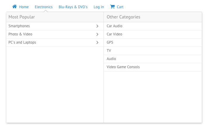
As an example, let’s create the “Electronics” menu item that is shown on the first screenshot of this article.
First of all, we should define its layout:
value:"Electronics", submenu:{
cols:[
{ rows: [
{/* 1-st header */},
{/* 1-st submenu content */}
]
},
{ rows:[
{/* 2-nd header */},
{/* 2-nd submenu content */}
]}
]
}
};
The submenu property contains the elements that will appear on the screen within the subpanel view after you click this menu item. We’ve divided the submenu into two columns. Each of them contains two rows: one for the header and one for the content. Here’s an example of how you can create the header using the Template Component:
For the first part of this mega menu item, we’ll use the Grouplist Component. It’s an animated widget that allows visualize the hierarchical data. Before using it, let’s define some data it can use:
/* first level data */
{ id: "1", value: "Smartphones", data: [
/* second level data */
{ id: "sm_0", value: "iOS", data: [
/* third level data */
{ id: "sm_0_0", value: "iPhone 5"},
{ id: "sm_0_1", value: "iPhone 6"},
{ /* more items here */}
]},
{id: "sm_1", value: "Android", data: [
{ id: "sm_1_0", value: "Nexus 5"},
{ /* some more items */}
]},
]},
{ id:"2", value:"Photo & Video", data:[
{ id: "p_0", value: "Digital cameras", data: [
{ id: "p_0_0", value: "Canon" },
{ /* etc */}
]},
]},
];
Hope, you get the idea. After you create the required data, you can add the grouplist element to the second row of the first column:
height:310, select:true, scroll:false}
This code will set the electronics_data array as the data source. The height: 310 property defines the height of the element that equals to 310 pixels, select: true allows you select the items and scroll: false disables the scrollbar.
The next step is to place something within the second row of the second column. This time there’s no need to use the hierarchical data which means that we can use the List Component.
Here’s the data that can be used:
{ id:1, value:"Car Audio"},
{ id:2, value:"Car Video"},
{ /* etc */},
];
To create a new list we can use the same properties as we used in the previous example:
height:310, select:true, scroll:false}
Step Four. Add the Created Items to Your Mega Menu
By combining the available widgets you can create the desirable mega menu content. To make all the components work together, just place the created variables within the data property of your menu.
Here’s the mega menu that was created as an example for this article:
home,
electronics,
films,
login,
cart
]
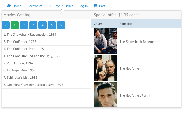
Here’s the result you can get combining the Template, Pager, List and Datatable widgets:

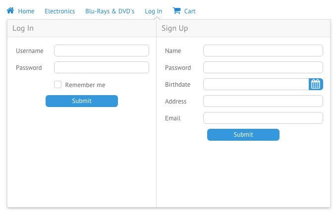
And here’s the combination of two forms:

Once again, notice the way we’ve defined the data array. Since there are previously defined modules instead of code, it’s pretty easy to change the sequence of items, find the errors or change the proper item.
Conclusion
Webix allows you create the Mega Menu that you want. You can use complex combinations of rows and columns to create the desirable layout. Within the mega menu, it is possible to embed any widget you like. And remember that there’s always a possibility to create a custom view on the basis of the existing ones.
If you want to check out the source code and a demo, you can visit this page: //webix.com/snippet/44a74eb4.


