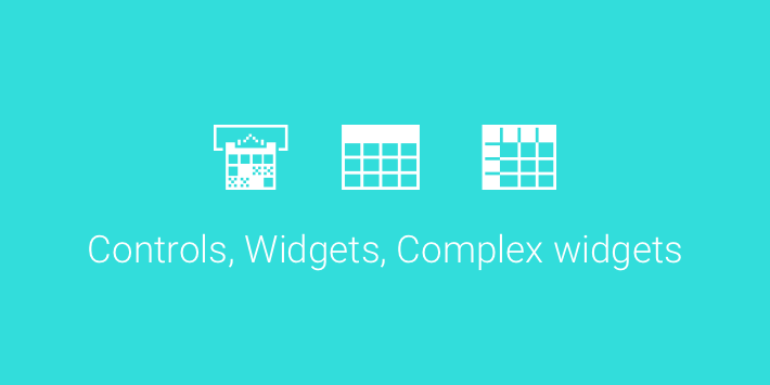
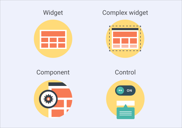
When reading Webix documentation you cannot but notice the variety of terms like component, ui control, ui widget and complex widget used alongside with each other. You may easily wonder whether they are interchangeable and how to distinguish between them. In the article below, we’ll put them all to order.
UI Control
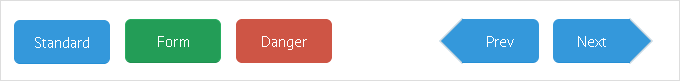
Controls are small interface elements used for interacting with users. You can place them into a form or on a toolbar, or simply use them as independent layout elements.
The most obvious example of a control is a button. Buttons allow users to navigate through a web application, submit forms and call for various actions.
Live demo >>
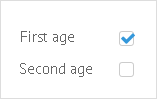
Or, take UI checkbox for instance.This small control allows users to respond as “yes” or “no” to various application options.
Standard Edition Controls
Currently, the following controls are available in the Standard Edition:
- Button
- Checkbox
- Colorpicker, an input with a colorboard for picking a particular color
- Combo, an editable input field with a pop-up window that contains options for selection
- Counter, a spin-box for entering numeric values
- Datepicker, an input with a calendar for picking dates
- Fieldset, a container for grouping same-purpose controls
- FormInput, a container for rendering UI widgets within a form in a common style
- Icon, clickable control with an icon
- Label, a plain text label
- Radio, a control for choosing a single item from several options
- RichSelect, a non-editable input field with a pop-up window that contains options for selection
- Search, an input with a “search” icon
- Select, a wrapper for HTML select
- Segmented, a button divided into the several sections
- Slider, a control with a draggable marker for inputting numeric values
- Tabbar, a switch control to navigate between application parts
- Text, a simple input field
- Textarea, a multiline input field
- Toggle, a two-state button
- RichText, an editor for entering and formatting text
- Uploader, a control for file uploading
PRO Edition Controls
Webix PRO edition adds the following controls to the above-mentioned list:
- DateRangePicker, an input with related calendars for picking date ranges
- Multicombo, an editable input field for choosing multiple items from the related popup
- Multiselect, a non-editable input field for choosing multiple items from the related popup
- Multitext, a set of input fields for entering multiple text values
- RangeSlider, an advanced version of a Slider for entering a range of values
UI Widget
The UI Widget is an integral part of user interface. Unlike controls, it is an independent module with a specific purpose, e.g.:
- data visualization (JavaScript Charts, Organogram);
- data management (JavaScript Table, JavaScript List);
- displaying date and time (JavaScript Calendar);
- organizing other widgets and controls (JavaScript Form, JavaScript Layout).
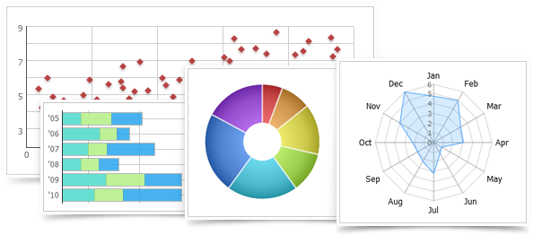
Take, for example, JavaScript Charts. Their purpose is to present data in a graphical form.
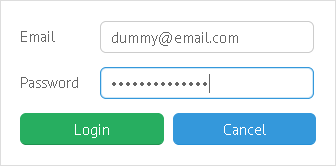
Another example is the JavaScript Form. Its main goal is to help users share their information with the web application:
Standard Edition UI Widgets
Webix JavaScript library contains a number of widgets in the Standard Edition:
- Accordion, a list of collapsible panels
- Double List, a two-part list
- Calendar for displaying date and time
- Carousel for arranging multiple application parts
- Chart for data visualization
- Colorboard for displaying a color palette
- Context, a popup window that opens by a right mouse click
- Contextmenu, a popup window with a menu that opens by a right mouse click
- Datatable for advanced data management
- Dataview for data management
- Form for arranging input controls
- Grouplist, a list for a grouped data set
- Htmlform, a container for a simple HTML form
- Iframe, a container for an iframe
- Layout, a container for widgets and controls
- List for displaying a plain data set
- Menu for navigating between application parts
- Multiview and tabview for arranging application parts
- Pager, a helper component to enable paging within data management widgets
- Popup, a simple window
- Property, for managing simple data
- Resizer for resizing application parts
- Scrollview, a container for a long scrollable application part
- Sidemenu, a navigation panel
- Spacer, a placeholder for an empty application part
- Template, a text or HTML wrapper
- Toolbar for arranging buttons and similar controls
- Tooltip, a small popup hint
- Tree for managing hierarchical data
- Treetable for advanced management of hierarchical data
- Unitlist, a list with sections for related data items
- Video for playing video files
- Window, an advanced window
- Maps, a wrapper for Google Maps with data management logic
PRO Edition UI Widgets
The PRO edition adds another 10 widgets to the above list:
- Barcode for displaying codes
- Bullet Graph for displaying dynamic data
- Daterange for displaying date and time period
- Excel Viewer for rendering Excel data in a web application
- Gage for displaying dynamics of a certain parameter
- Organogram for visualizing hierarchical schemes
- PDF Viewer for rendering PDF files in a web application
- Portlet, a layout with draggable parts
- RangeChart, a chart with a draggable frame for detailed data visualization
- TreeMap for visualizing hierarchical data
Complex UI Widget
Complex widgets in Webix terms provide extended functionality. Placed on a web page, they look like complete applications and perform in the same way. Complex widgets are comprised of multiple Webix widgets and controls, but there’s no need to tune them in configuration, as everything works out of the box.
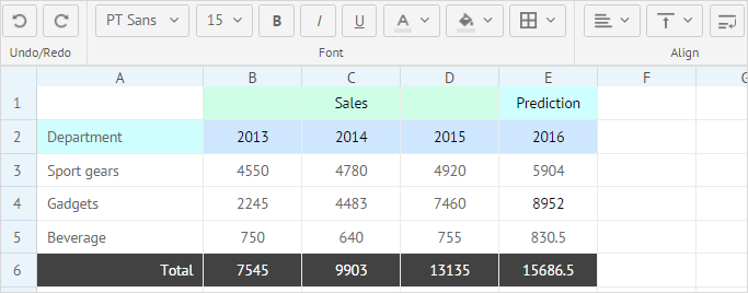
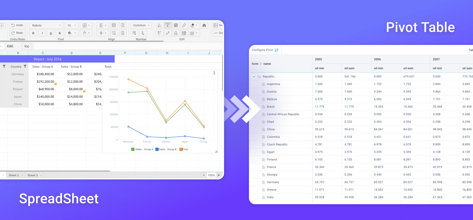
For example, with the SpreadSheet UI widget you can create a web app for working with tabular data in Excel manner, but the initialization code is incredibly laconic:
And you get the fabulous app in a browser tab:
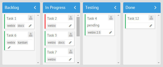
Another example is a Kanban Board. Its initialization code is more extended as you need to provide settings for separate Kanban lists, but the idea remains the same.
view:"kanban", type:"space", cols:[
{ header:"Backlog", body:{ view:"kanbanlist", status:"new" }},
{ header:"In Progress", body:{ view:"kanbanlist", status:"work" }},
{ header:"Done", body:{ view:"kanbanlist", status:"done" }}
],
data: base_task_set
});
Sure, complex widgets are not black boxes. They can be configured and customized to a certain extent to match developer needs.
Complex Widgets are available in a PRO edition only. Here’s the list of them:
Components
I guess, the “component” can be a key word of Webix documentation :), but how does it correlate with complex and simple widgets and controls? Simply put, a component is a generalized notion and can easily substitute “widget” or “control” in a developer hangout. It’s an abstract concept of a tool you use, while a UI widget is its real-life implementation.
To cut a long story short…
Here’s a little memo with the key findings:
- Controls always presuppose interaction with users. They are small, clickable and primarily visual. It is developers who attach actions to them.
- Widgets are integral parts of user interface. They have a particular goal and a lot of specific features to achieve it.
- Components act as an alias to widgets treated from a developer point of view
- Complex widgets are self-sufficient applications which can be used standalone as well as embedded into Webix or HTML layout.
From now on, possible misunderstandings will not confuse you anymore, and you will confidently pursue your goal in a web app world with Webix right behind your back.
