Today Webix has been updated to the version 1.8 that brings some pleasant bonuses for our users. The new version includes UI improvements, bug fixes and a few techniques for building responsive apps.
Responsive web apps
Previously when you were developing Webix web apps for desktop you had a problem with adapting the same app for the mobile devices. These desktop web apps had screens too wide for mobile apps.
So in Webix 1.8 we’ve added 2 features that will make your web apps responsive and improve user experience on both desktop and mobile devices.
Let’s consider the responsive web app made with Webix to show you this functionality.
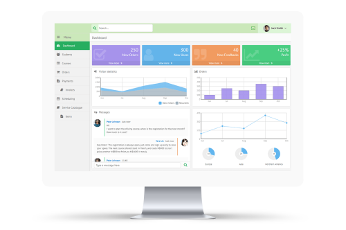
Here is the screenshot of desktop web app:
