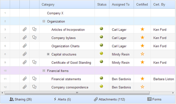
While developing Webix, we’ve made several demo projects, in order to check the usability of our library. One of these projects is “Smart Sheet demo”. It is focused on the DataTable, one of the core Webix components. Smart Sheet demo can be used to show tabular or hierarchical data.

You can download the full demo or check the demo online.
This mini application resembles the interface of Smartsheet, one of the best web-based spreadsheets. It presents the hierarchy of tasks and allows users to edit it. (We’ve implemented only the client-side interface. There’s no real back end code for this demo).
Let’s look from the inside.
index.html
The HTML file is compact:
<html>
<head>
<title>SmartSheet</title>
<meta http-equiv="Content-Type" content="text/html; charset=utf-8">
<link rel="stylesheet" type="text/css" href="//cdn.webix.io/edge/webix.css">
<script type="text/javascript" src="//cdn.webix.io/edge/webix.js"></script>
<link rel="stylesheet" type="text/css" href="./styles.css">
<script type="text/javascript" src="ui.js"></script>
</head>
<body>
<script type="text/javascript">
webix.ready(function(){
webix.i18n.parseFormatDate = webix.Date.strToDate("%m/%d/%Y");
webix.ui(ui_scheme);
});
</script>
</body>
</html>
It starts with HTML5 doctype, then includes the Webix library together with js and css files of the demo app. The document itself doesn’t enclose any content, except for the html placeholder for the app, and webix.ui call, which initializes user interface of the app (ui_scheme is defined in ui.js ).
There are two key moments:
- initialization code is placed inside of the “webix.ready” block, which guarantees that the code will be executed only after full page’s loading. It is a good habit to place initialization code into the webix.ready block
- as we’re going to work with dates, we should set the date format for data parsing, which can be done with the help of webix.i18n.parseFormatDate
ui.js – Interface and Logic
Firstly, pay attention to ui_scheme structure that was used in index.html to create interface:
container: "app",
cols: [{}, {
rows: [header, grid, footer],
width: 800
}, {}]
};
It’s a usual Webix markup: a horizontal layout, consisting of three columns, with a vertical layout inside. The vertical layout has a header, a grid and a footer. The first and the last elements of the horizontal layout don’t contain anything. We define them in order to place the middle element in the centre of the page. The internal vertical layout doesn’t contain any detailed description of the components. It just contains links to variables. It’s another good habit – to place the detailed description of each component into a separate variable. This way, the code is easier to read.
The header and the footer aren’t very complicated. The first one is a usual template, which type is set as “header” to make it look like a header (it is rather self explaining):
The footer is a horizontal layout that has buttons inside. Each button has “type” property with “icon” value, which defines their appearance – transparent buttons with icons:
view: "toolbar",
height: 25,
elements: [{
view: "button",
type: "icon",
icon: "users",
label: "Sharing (26)"
}, {
view: "button",
type: "icon",
icon: "flash",
label: "Alerts (5)"
}, {
view: "button",
type: "icon",
icon: "attach",
label: "Attachments (112)"
}, {
view: "button",
type: "icon",
icon: "vcard",
label: "Forms"
}]
};
The grid settings look more complicated:
view: "treetable",
editable: true,
autoheight: true,
leftSplit: 5,
columns: [
// [columns configuration]
],
url: "data.json?v=4",
onClick: {
"webix_icon": function(ev, id, trg) {
// [icon action]
}
},
on: {
"onbeforeeditstart": function(cell) {
return !this.getItem(cell.row).notedit;
}
}
};
There are two major blocks: columns settings and event handling logic.
Columns Settings
For each column we can define the way it should render itself. It can be an automatic template like the column “num” has:
or a more complex string template like for dates and categories columns:
id: "category",
header: "Category",
width: 250,
template: "{common.space()} {common.icon()} #value#",
editor: "text",
sort: "string"
}, {
id: "start",
header: "Start date",
map: "(date)#start#",
editor: "date",
sort: "int"
},
or, if the above is not enough, we may use a function as a template. In SmartSheet demo it is used for columns with icons.
id: "attach",
header: "",
width: 40,
css: "myicon",
template: function(obj) {
if (!obj.attach) return "";
return "";
}
},
Event Handling Logic
The demo app has several columns with icons: attachments, comments, and the status icon. All of these elements contain CSS class “webix_icon”, which allows us to write a common event handler for all of them. It looks like this:
"webix_icon": function(ev, id, trg) {
if (id.column == "attach")
webix.message("Attach call for row: " + this.getItem(id.row).num);
}
}
The above defines the logic, according to which the code that we’ve specified will be called after a click on the element with CSS class – webix_icon. The second block of event handling specifies the logic of edit operations in the datatable. It consists in blocking edit operations for the rows marked by “notedit” attribute:
"onbeforeeditstart":function(cell){
return !this.getItem(cell.row).notedit;
}
}
In total
As you can see, it is possible to create a rather complex UI with a minimum of code. DataTable, as well as other Webix components, attempts to use auto configuration whenever it’s possible. At the same time it accepts the detailed configuration when you need to implement more complex behavior.


