JavaScript Table is the most popular widget of Webix UI framework. It is fast, flexible and can be used in many different scenarios. By default, it shows only a text content in its cells. Nevertheless, you can use cell templating to show a more complex content in the cells of DataTable. Icons, buttons, and even other widgets can be used as cell templates.
Let’s look how it can be done.
Checkbox and Radio buttons
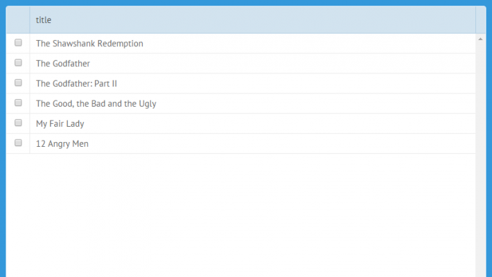
The most common use-case is the adding of a checkbox into a cell of a DataTable. It is so common, that we have added a ready-to-use shortcut. Just write the cell template as follows:
and you will get a fully-functional checkbox input.
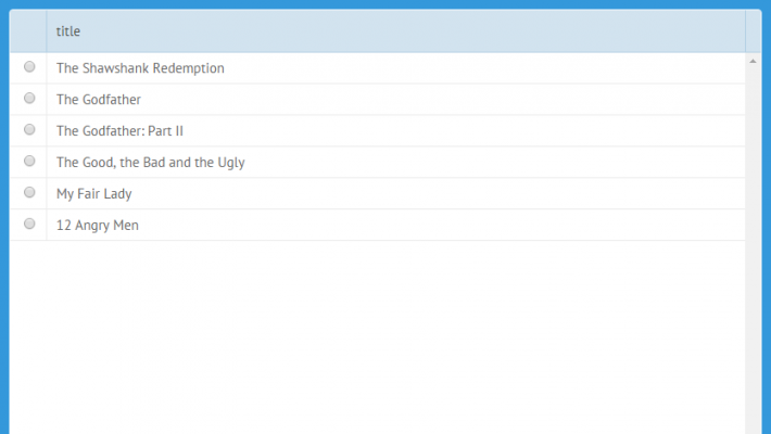
To get a radio button control, you can use a similar syntax:
Action elements
Another common case is the adding of a button into a row to trigger an action. This task can be solved in two ways: by adding a button or by adding an icon.
Icons
The Webix js ui library doesn’t provide a special shortcut for it, but you can write a simple HTML template to render an icon in a cell. It can be done like this:
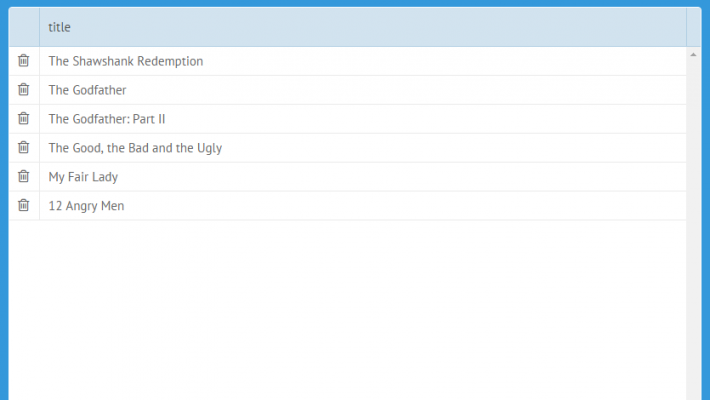
That’s it. Now, if you have an icon in the UI, you can attach a click handler to it as easy as it’s shown below:
"fa-trash-o" : function(ev, id){
//id - row id
this.remove(id);
}
}}
According to the above code, you need to assign the onClick handler for the element with the “fa-trash-o” CSS class. The same technique can be used for any custom HTML elements.
Buttons
Buttons can be added into a DataTable in a similar way:
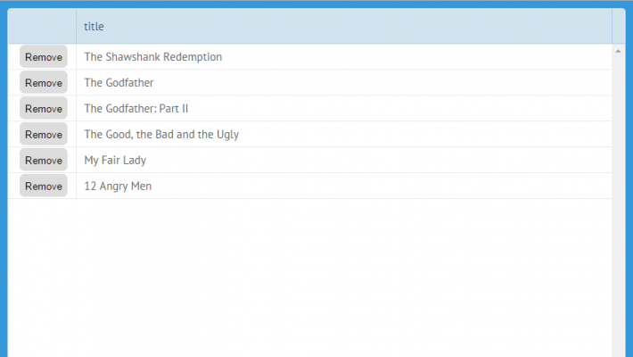
Here webix_button is a predefined CSS class that makes an input look like a button in the current skin. It is not mandatory, you can use your styling as well.
To assign the click handler, you can use the same solution as the one used for icons. Just apply a different CSS class for event attaching.
Embedding UI controls
There are two ways to show a complex UI as a content of DataTable. The first one implies the use of subviews and the second one offers to make use of active-content solutions.
Subviews
Subviews allow showing any Webix UI as the content of a row. They work for DataTable and TreeTable only.
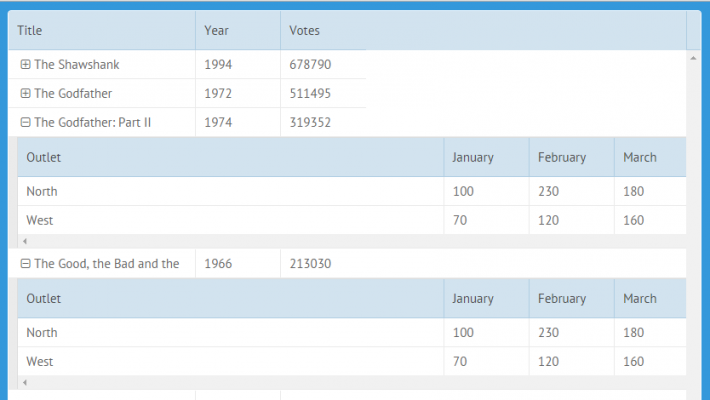
All you need to do is to describe the structure of the embedded UI in the subview property. You can read more in the documentation or check the live demo.
Active content
Active content allows showing Webix Form controls as the content of a cell. It can be useful if you want to show something more complicated than buttons or icons (which can be easily added through simple HTML templates). For example, active content can be used to show segmented buttons or a slider as the content of a cell.
To begin with, you need to extend a datatable with the ActiveContent mixin:
name:"activeTable",
}, webix.ui.datatable, webix.ActiveContent);
After that, we need to describe the content that we wish to embed through the activeContent property:
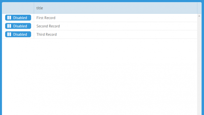
status:{
view:"toggle",
type:"iconButton",
offIcon:"pause", onIcon:"play",
offLabel:"Disabled", onLabel:"Enabled",
width:110, height:30,
earlyInit:true
}
}
As the last step, we need to use the active content element in the template of a cell.
Adding active content is the most complicated way to embed new elements in a datatable, so use it as a last resort.
ActiveContent vs Inline Editors
ActiveContent may seem to be perfect for using as grid editors. But it’s not a good idea. ActiveContent can’t serve as a substitute for the inline editors. If you want an editor to be always visible, you just need to change the style of rendering as it’s made in the example below:
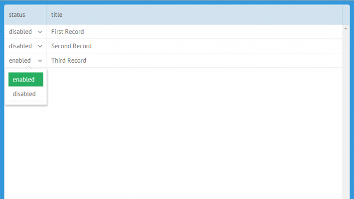
As you can see, the template contains both a custom icon for the select-like look and the content of a cell.
Do I miss something?
The above described techniques (except for subviews) can be used not only with DataTable, but also with other data components, such as lists, trees, treetables, dataviews and others. So, you can embed and mix UI controls to organize a rich UI in your apps.
As far as I can see, these techniques cover most of real life use-cases. If I’ve missed something, feel free to write your questions and ideas in the comments.

