Web and Internet should be accessible to everyone. This self-evident concept gives rise to another important principle, which modern UI developers should bear in mind: present-day web applications should be usable by all community members regardless of their physical abilities.
If you develop with Webix, you don’t have to worry about accessibility. From version 4.0 all its UI components have been enhanced to meet the standards. The article below tells about the main accessibility hallmarks in the library.
Unpacking the Box
Accessibility means equal possibilities for everyone in accessing one and the same thing. It presupposes providing assistance for blind, visually and hearing-impaired people as well as people with reduced mobility.
While web developers can cater for accessibility in their own source code, Javascript UI frameworks should join in to deliver the same functionality. Webix library decided for accessibility last year and now its UI widgets can be used for building accessible web applications.
The first and the foremost question that you may ask here is “Should I somehow switch on accessible behaviour for Webix UI widgets?”
The answer is no, you needn’t. Accessibility is an inseparable feature of all the widgets and you cannot toggle this option. While some features are vital only for impaired people, other bonuses like full keyboard navigation enhance user experience in general.
Let’s have a closer look at these features.
Three pillars of accessibility for UI components
According to the WAI-ARIA standard (Web Accessibility Initiative – Accessible Rich Internet Applications), UI components should have:
- Additional semantics in markup
- Keyboard navigation
- Enhanced visibility mode
Accessible markup
Blind or visually impaired people need assistive software to communicate with a web page. This software can read the screen and announce the contents and purpose of any element it encounters. For example, the ‘submit button“ or “‘user name’ editable input”.
The task of HTML markup is to provide the relevant information to the screen readers. Native markup elements such as < button > or < a > deliver this semantics by default. For the above mentioned tags it is “button” and “link” accordingly.
Plain DIV elements cannot be understood by assistive software, that’s why developers need to add the corresponding ARIA attributes to define meaningful roles, states and titles for them. Starting from version 4.0 all Webix UI widgets show these attributes in their markup.
For example, the UI List is given the listbox role while all its items feature the option role. For selected items List adds the aria-selected attribute set to true.
As a result, screen readers can announce not only the text of a focused list item, but also its role and position. Announcement text depends on a piece of software in use, but in general it sounds like “Item 1. List item (selected) 5th out of 10”.
JS code:
Markup output, rough:
<div>
<div class="webix_list_item webix_selected" tabindex="0" role="option" aria-selected="">1. Item 1</div>
<div class="webix_list_item" tabindex="-1" role="option">2. Item2</div>
</div>
</div>
The most popular screen reading software is JAWS and NVDA for Windows and VoiceOver for Mac OS.
Keyboard navigation within Accessible UI Components
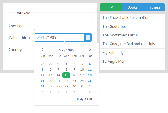
You may have noticed the tabindex attribute in the above markup snippet. It is defined for the first list item to make it focusable within tab navigation. Why is it important?
All Webix UI widgets are included in the tab order. When a user reaches a data component by pressing the tab button, focus jumps either into its first item, or into the selected one, if any. Then by pressing arrows – left, right, up and down – users can navigate between component items. Active items are marked visually by selection.
Such behaviour is true for all the data UI components, Calendar and Colorboard as well as widgets that include them as functional parts (e.g., a dropdown list of a Combo control contains UI List).
Basically, all the inputs and clickable areas in widgets are focusable by a tab. Focused areas within widgets are highlighted by a neat outline, while pressing “enter” over them invokes the click action. As you can see, a mouse pointer is no longer needed!
High contrast theme to enhance visibility
Webix UI components can be styled by as many as 12 ready-made skins, but only two of them fully support tab focus highlighting: Flat (default) and Compact.
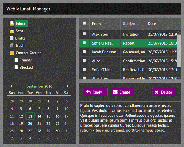
To increase the readability, the new skin called Contrast has been added to the library’s “stylish” family. Its dark theme can help color blind or visually impaired people perceive the content. At the same time the skin is useful for bad lighting conditions, for instance, while reading from a smartphone on a sunny day.
The Contrast skin takes after the Flat one and inherits its setting for UI dimensions and the green selection color, but features high contrast ratio among the colors and a dark theme. So the Contrast skin can be used as a dark alternative to the Flat skin.
Summing up
As you can see, Webix provides fully accessible UI widgets with ARIA markup and keyboard navigation, which are built in and do not need to be specifically enabled. Using the contrast theme is optional, so you can create the default and the dark versions of your application and switch between them.
All the accessible features are available in both GPL and PRO versions of the library.
For further reading you can study the full guide on accessibility in Webix to check for existing functionality or, if you are going to create custom UI components, follow WAI ARIA best practices to learn the concept in detail.


