One of the key advantages of the Webix library is the ability to work on both desktop and mobile devices. A web-based user interface created with Webix will work properly on both platforms. Still there are some recommendations which will help you to achieve a better user experience while developing your mobile web app.
In this article I’ll try to describe the most significant features of mobile applications development. Let’s go into details by creating a simple ‘contact list’ app. This is a common app that allows users to create a contact list, look up the necessary contacts and view their details.

You can download the full sources of the actual working application from the github repo or go check a live demo.
Creating a Page
The same as for a desktop web app, we should start with creating an HTML page. It needs to include the HTML5 doctype, all the necessary js and css files and the webix.ui command.
<script type="text/javascript" charset="utf-8">
webix.ui.fullScreen();
webix.ui({
template:"App will be here"
});
</script>
Webix provides a nice feature of “full screen” mode to get more screen space. When this mode is enabled, the library will try to hide the browser’s toolbars and the app will take up the entire screen of the mobile device. You need to add webix.ui.fullScreen(); command before UI initialization to enable the “full screen” mode.
UI Sizing
Mobile devices come in a variety of screen sizes and resolutions, and we need to take it into account. There is a wide range of models with different specifications and new ones being developed each year. So it’s better to avoid fixed sizes while creating a user interface for a mobile app. Fixed sizes should be set only if they are really needed. Webix components are initially intended for such an approach, and can detect and adopt unspecified sizes automatically. For example, take a look at the following configuration:
rows:{
{ view:"toolbar", height:50 },
{ cols:[
{ view:"list", gravity:2 },
{ view:"template" }
]}
}
});
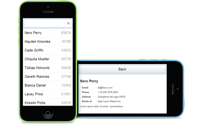
The above code will produce a screen similar to the next:

Here we have defined a fixed size only for one view – the height of the toolbar. The heights of the list and of the template view will be calculated automatically, as well as the width of all the components. So the elements of our app will be resized to fit nicely on any screen size. What is more, due to the gravity property, a list view will remain twice as wide as a template on a device with any screen.
UI Structure
In most cases we would start creating a desktop web application by specifying the UI layout. Then we will arrange smaller components in the layout. This approach is suitable for mobile applications, as well. However, we should take into account a smaller size of mobile devices. Thus, it’s better to build mobile interface with the help of multiview component. This element makes only the active page visible allowing to switch between different pages.
For example, for a desktop we could use the following:
rows:{
toolbar
{ cols:[ list, preview ] }
}
});
For a mobile device, a different scheme should be used:
rows:{
toolbar
{ cells:[ list, preview ] }
}
});
If we speak about a desktop, we will see a list with extra details on the right. As for a mobile device, either a contact list or a contact details page will be displayed on the screen, and users will be able to switch these two views.
Switching Views Dynamically
As our application shows either a contact list view or a template view with contact details, we should add some logic to switch between these views. There are two main approaches to control the visible view. The first one is to use some specific form controls (for example, segmented buttons) for visibility control:
rows:[
{ view:"segmented", multiview:true, options:[
{ id:"list", value:"List" },
{ id:"temp", value:"Template" }
]},
{ cells:[
{ view:"list", id:"list" },
{ view:"template", id:"temp" },
]}
]
});
The key points of the above solution are:
- the view’s id is equal to the option’s id in the segmented button
- multiview property of the segmented button is set as true
The second approach is based on event handling and direct view.show API calls.
rows:[
{ view:"button", value:"Back", click:"$$('list').show()" },
{ cells:[
{ view:"list", id:"list", on:{
onItemClick:function(){ $$('temp').show(); }
}},
{ view:"template", id:"temp" },
]}
]
});
The second approach is based on event handling and direct view.show API calls.
rows:[
{ view:"button", value:"Back", click:"$$('list').show()" },
{ cells:[
{ view:"list", id:"list", on:{
onItemClick:function(){ $$('temp').show(); }
}},
{ view:"template", id:"temp" },
]}
]
});
Both approaches can be used in desktop and mobile web apps. The first approach requires less coding, but it is limited to specific UI elements. The second one allows using any control or action to change the active view, but requires a bit more coding.
Dynamic Toolbar
One of the above snippets contains a “Back” button in the toolbar. This is a common scenario for a mobile application, but we need to show this button only when we are in a specific view. Of course, we can put toolbar inside of a multiview component, so each page will have its own toolbar, but there is a better solution. We can define a single toolbar and just mark which buttons need to be shown when different views are visible.
view:"toolbar",
height:50, visibleBatch:"list", id:"toolbar",
elements:[
{ view:"button", value:"Back", batch:"details" },
{ view:"search", value:"", batch:"list" }
]
};
As you can see, all buttons now have a “batch” attribute, and the toolbar itself has a “visibleBatch” attribute. Basically, all buttons in the toolbar are divided into groups by “batch” parameter and the “visibleBatch” parameter defines which buttons are visible. To change the visibility you can call the “showBatch()” method:
This method will show all the buttons with “details” batch value and hide all other buttons. Such technique allows us to show different buttons on the same toolbar during the view switching (the “batch” parameter actually works for all layout components, so this technique is not limited to toolbars only).
“Back” Button Support
There aren’t many buttons in modern mobile devices, but most of the devices have at least a “back” button. So it will be nice to provide support for such a button in our application. We can do it in a pretty easy way:
rows:{
toolbar
{ cells:[ list, preview ], id:"multiview"}
}
});
webix.history.track("multiview", "list");
We use the webix.history.track () method to store the history of the views changing. The method takes views’ ids as its parameters.
In the code snippet above, the first id is the multiview id. The second id is the initially visible view’s (“list”) id. Now, each time when the visible view changes, the previous visible view will be stored in history and shown again on pressing the “back” button.
Styling
It makes sense to increase the size of font for mobile applications. In our case it can be done with the help of the following “style” block:
Combining All the Features
You can go check out the real live app which combines all the above tricks.
As you can see, Webix contains not only the necessary tools for creating desktop web apps but it also allows you to use the same UI components to deliver simple and usable mobile apps that target all kind of modern mobile devices.


