Hey guys, let us check today what Webix offers to make our lives easier during app navigation. I bet that there’s something worth a closer look.
Since the launch of the library its users had a standard Menu at their disposal with the possibility of placing items horizontally or vertically (too simple). But not very long time ago the developers went further and ended up with two handsome widgets created with user-friendly navigation in mind – Sidemenu and Sidebar.
So, let’s explore the widgets’ functionality to find out the use cases that are more suitable for each of them.
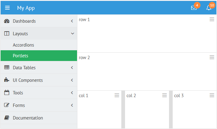
Basically, Sidebar can be initialized on the page with the following code:
view: "sidebar",
data: [
{id: "dashboard", icon: "dashboard", value: "Dashboards", data:[
{ id: "dashboard1", value: "Dashboard 1"},
{ id: "dashboard2", value: "Dashboard 2"}
]},
...
]
});
And you get:
Sidemenu requires more settings in its initialization code:
view: "sidemenu",
body:{
view:"list", borderless:true, scroll: false,
template: "<span class='webix_icon fa-#icon#'></span> #value#",
data:[
{id: 1, value: "Customers", icon: "user"},
{id: 2, value: "Products", icon: "cube"},
...
]
}
}).show();
And the resulting view is:
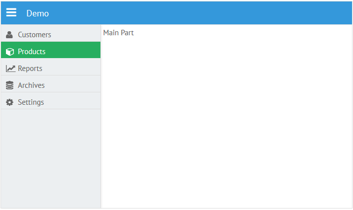
As you can see, the widgets look similar. Both of them feature the same item structure and appearance. But even the code hints that they have different behavior based on their purpose.
The below research will help you to get familiar with these peculiarities.
Sidebar
Sidebar is based on Webix Tree. It offers nice visualization of hierarchical data with any complexity level. Moreover, you can apply all the tree API to the widget.
Sidebar can be placed into Webix layout, which allows positioning it everywhere within the app using layout-building rules. For instance, you can have a toolbar and two columns below it, one of which is occupied with Sidebar while another houses the main part of the application:
rows:[
{view:”toolbar”},
{cols:[
{ view: "sidebar",id:"sidebar", data: menu_data},
{template:”Left column”}
]}
]
});
It may seem that such implementation takes too much screen space, but it can be easily solved with two states of the Sidebar – expanded (default) and collapsed:
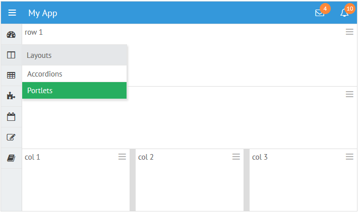
In the collapsed state menu items are minimized to the icons and subitems are pushed to the related popup that appears on hovering the parent item.
Collapsed state can be set during initialization:
or in dynamics:
$$(“sidebar”).expand(); //expands sidebar
$$(“sidebar”).toggle(); //collapses or expands sidebar depending on its state
Additionally, sidebar relative position can be configured to help the related popup find its position in the proper way. For the left sidebar the popup will appear on the right and vice versa:
So, Sidebar is an excellent choice if:
- you are building a totally Webix application;
- you have hierarchical menu structure;
- you need a sticky navigation panel either on the right or on the left of the screen;
- you need to minimize or maximize this panel;
- you want to use an integral widget that requires little configuring.
Sidemenu
Sidemenu is based on Webix window. Normally, it houses Webix List that displays menu items.
Unlike Sidebar, Sidemenu lies above current layout and can be shown and hidden without shifting the neighbouring views (while Sidebar does):
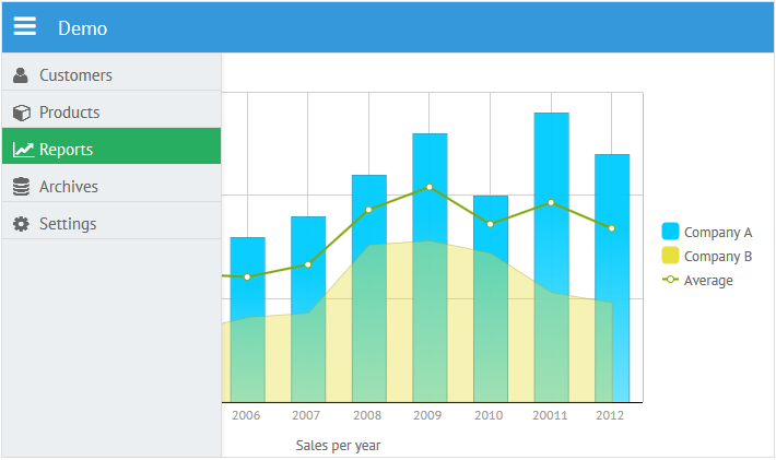
webix.ui({
rows:[
{ view: "toolbar", elements:[
{view: "icon", icon: "bars",}
]},
{ template: " " }
]
});
//sidemenu initialization
webix.ui({
view: "sidemenu",
id: "menu",
body:{
view:"list", data:data
}
});
For this very reason Sidemenu does not feature collapsed state – you can simply hide it when it is not needed. Use Window API to implement this:
if( $$("menu").config.hidden) $$("menu").show()
else $$("menu").hide();
}}
By default, smooth animation accompanies the above operations.
Being window in its essence, Sidemenu can appear from any side of the screen, which also makes it different from Sidebar that has only left and right positions.
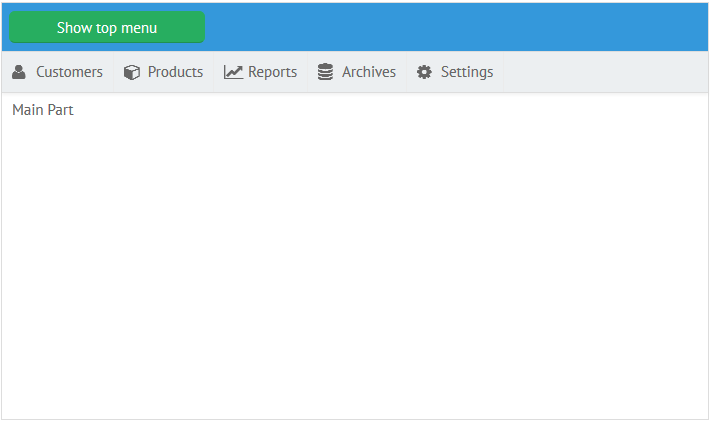
Just note that you will need to arrange list items horizontally in the case of top and bottom positions:
view:”list”, layout:”x”
}}
Probably, you have already asked yourself a question: “Can I embed something else into the body of a Sidemenu window?” The answer is – definitely, yes, but the best options are List and Grouplist as they can display navigation items neatly.
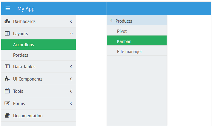
Thus, it becomes clear that data possibilities of Sidemenu depend on the view you put into it. List can work with linear data while grouplist is designed for multi-level structures, but grouplist’s visualization of multi-level data may be not well suited to navigation purposes.
So when it comes to the hierarchical data, Sidebar is the winner.
Simply put, Sidemenu is a better option if:
- you need to place the navigation panel at the top or bottom of the screen;
- you need to hide and show the panel while expand and collapse options are not important;
- you need animation for this panel;
- you have linear data to visualize;
- you are brave enough to write extended configurations on Webix – joke, it’s rather simple:)
The final choice is up to you. Just remember that both widgets are highly customizable in look-and-feel as all Webix widgets.
You can study tuning possibilities as well as check the samples in the related documentation articles – Sidebar and Sidemenu.
Both widgets are available in the GPL version of the library. Sidemenu is included into the package while Sidebar comes as an extension that can be downloaded from Webix hub on GitHub.


