Hi everyone! Today I suggest you dive into 6.3 updates and have a closer look at the buttons.
Starting from the new version you can easily tune the look and feel of your buttons thanks to the optimized settings. However, we couldn’t avoid some breaking changes, but still, you can easily integrate new buttons into your application by following this guide. Let’s start!
New Scheme for Buttons
In Webix 6.3 we have unified the buttons to make styling easier. We have separated the settings that define CSS (color) and type (functionality), so now you can specify button type and apply styling to it with the help of built-in and custom CSS classes .
Here is the new CSS-based scheme for Button and Toggle controls:
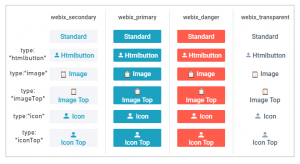
The scheme is true for all skins, just the colors differ. In the live demo below you can switch the skins in the related menu (right top corner) to see the difference.
The same rules apply for Toggle buttons as well.
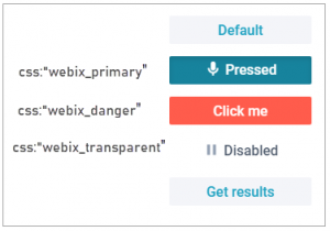
As you can see, all the buttons get the webix_secondary class by default while the Uploader control gets the webix_primary one. To change it, just define the “css” setting with a built-in class:
{ view:"button", value:"Standard", css:"webix_primary" },
{ view:"button", value:"Standard", css:"webix_danger" },
{ view:"button", value:"Standard", css:"webix_transparent" }
In addition to CSS, you can choose button type depending on the required content. Now we have the following button types:
- standard – a standard button;
- “htmlbutton” – a button with an ability to embed any custom HTML;
- “image” – a button with an ability to embed images;
- “imageTop” – the same as “image”, but with a top position of the images;
- “icon” – a button with an ability to embed icons;
- “iconTop” – the same as “icon”, but with a top position of the images.
Deprecated Buttons
In the pursuit of a more up-to-date look, we have removed the buttons that are no longer popular.
Goodbye to arrow buttons:
{ view:"button", type:"prev"}
New syntax for some buttons:
To comply with the new scheme, some features were removed. But the same functionality is still available with a different syntax:
CSS types
type:"danger" /* is changed to */ css:"webix_danger"
and the content types
type:"imageButtonTop" /* is changed to */ type:"imageTop", css:"webix_primary"
type:"iconButton" /* is changed to */ type:"icon", css:"webix_primary"
type:"iconButtonTop" /* is changed to */ type:"iconTop", css:"webix_primary"
Mind that the types mentioned above will remain till Webix 7.0 to make the transition less painful. So please take your time, but be sure to apply the new settings in advance.
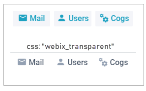
Changes for Icon and Image buttons
Also, as you can see, icon and image type buttons are now painted with a colored background. If you are not ready for such change and want to get back to the old transparent styling, just apply the webix_transparent CSS class:
label:"Mail", width:80, css: "webix_transparent" }
How to Style the Buttons
All the HTML buttons within Webix buttons now have the “webix_button” class name, while the top parent DIV element receives one of the built-in CSS classes (“webix_secondary”, “webix_primary”, etc.).
You can override the default styling by chaining the class names in the CSS selector.
font-size: 24px;
font-style: italic;
color: yellow;
}
Sometimes you may need to specify both built-in and custom CSS classes to define a more specific rule:
color:#1ca1c1;
}

What’s next
You might be already anxious about breaking changes that happen with each new release 🙂 But the goal we are trying to achieve is a simple and consistent API that is easy to work with.
Buttons, as well as icons, are now more straightforward, flexible and open for user customizations. Besides, don’t miss the new tooltips as they are one more important UI element in any application.
As a bottom line, we are reminding you about the upcoming API deprecation in Webix 7.0 in September. So stay tuned for the updates and be prepared for all the good.