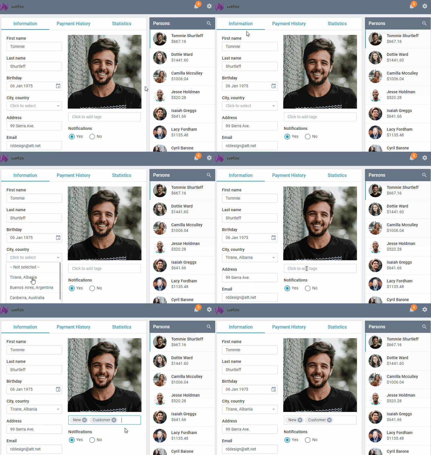
The long-awaited feature has finally come into the world! Webix Tooltips can be added anywhere. If you want to create stylish and useful tooltips for different elements of your web application, join me. You will learn how to create tooltips for DataTable headers and footers, controls, and HTML elements inside or outside Webix views. So let’s start our journey.

Why Webix Tooltips?
Webix tooltips have several essential benefits in comparison to HTML tooltips, because you can:
- display any text, markup, or image in a Webix tooltip;
- display different text in a tooltip based on some condition (when you define a tooltip as a function);
- customize tooltips is the same way as Webix data templates.
How to add
So how can you add Webix tooltips? It’s a piece of cake! You need just one setting to add a tooltip, e.g.:
{ view:"datatable", autoConfig:true, tooltip:true }
If you need tooltips with more complex content, make use of the common templating techniques and turn them into exactly what you want. You will find the details below. Mind that they depend on the target widget or UI element.
Tooltips everywhere
You can add Webix tooltips almost everywhere. Let’s look closer at the most common cases.

Items of Webix data widgets
A simple tooltip for items of datatables, dataviews, and lists can be added with tooltip:true. It will show what is in ‘value’ of each data item. But you can also create something much more complex: tooltips with images and dynamic text. Apart from the item data, such tooltips can display any HTML content.
view:"list",
width:250,
select:true,
tooltip:obj => {
var result = "<div>" + obj.lname + ", " + obj.fname + "</div>";
result += `<div>Born ${dateFormat(obj.birthday)} </div>`;
result += `<p style="margin: 0px;" align="center">
<img src="data/photos/${obj.photo}_1.jpg" width="200px" height="200px" />
</p>`;
result += `<div>Click twice to see more goodies</div>`;
return result;
},
// ...rest of the config
}
Moreover, you can change the position of tooltips and apply your CSS classes. Define tooltip as an object and add the necessary settings:
view:"list",
width:250,
select:true,
tooltip:{
template:obj => {
//... same tooltip template as above
},
dx:10, dy:10,
css:"persons_tooltip"
},
// ...rest of the config
}
Webix Controls
With Webix 6.2, you can set tooltips for any form controls. Default tooltips are added with simple tooltip:true and display the value of the control. For example, here is how you can define a simple text tooltip that will show the selected date on the datepicker:
view:"datepicker", tooltip:true
});
And here is how you can create something more complex. The same principles as for data item tooltips apply here. The only difference is that the contents that tooltips can display come not from the data, but from the control settings.
view:"datepicker",
tooltip:obj => {
var result = "";
if (obj.value){
var age = Math.floor((new Date() - obj.value) / (1000 * 60 * 60 * 24 * 365));
result += "Client is " + age + " years old";
}
return result || "Age is unknown";
}
}
Controls with options have their own peculiarity: tooltips are added for each option and can show data of an option, not the settings of the control:
view:"radio", name:"notifications",
label:"Notifications",
tooltip:obj => {
var result = obj.id%2 ? "" : "no";
return "You will receive" + result + "email notifications.";
},
options:[
{ id:1, value:"Yes" },
{ id:2, value:"No" }
]
}
DataTable peculiarities
Webix tooltips have come to every corner of the DataTable realm. Now you can enable Webix tooltips for any part of DataTable.
Tooltips for Headers and Footers
In Webix 6.2 you can enjoy the new opportunity to create tooltips for DataTable headers and footers. You can set tooltips as:
a) true (default tooltips that show the ‘text’ of the header),
b) string,
c) function that receives the object of a header line.
view:"datatable",
tooltip:true, footer:true,
columns:[
{
id:"", header:{
text:"Purchase",
tooltip:"Click to sort the list by #text# name"
// "Click to sort the list by Purchase name"
}
},
{
id:"sum", header:"Cost",
tooltip:false,
footer:{
content:"summColumn",
tooltip:"Total money flow"
}
}
// ...other columns
]
});
If a header or a footer have a filter or an aggregator inside, the tooltip function is a bit more complicated, because you need to get the header / footer content. E.g. use the getHeaderContent method of grid to get the sum displayed in the footer of the column:
view:"datatable",
tooltip:true, footer:true,
columns:[
{
id:"", header:{
text:"Purchase",
tooltip:"Click to sort the list by #text# name"
}
},
{
id:"sum", header:"Cost",
tooltip:false,
footer:{
content:"summColumn",
tooltip:obj => {
var sum = this.$$("grid").getHeaderContent(obj.contentId).getValue();
return "Total money flow: " + sum;
}
}
}
// ...other columns
]
});
Tooltips for Sparklines
You can add tooltips for cells that show sparklines. You have two options:
a) tooltip:true if you need to display bigger versions of sparklines,
b) a special column tooltip if you want to show them for sparkline items.
To do this, define the tooltip as a function, which in this case receives one more parameter – the value of the sparkline item.
view:"datatable",
data:[
{ id:1, name:"Austria", income:[710, 780, 390, 660, 600] },
{ id:2, name:"France", income:[810, 500, 780, 800, 940] }
],
tooltip:true,
columns:[
{
id:"income", header:"Income per Month",
template:"{common.sparklines()}", width:200,
tooltip:function(obj,common,value){
return value || "";
}
}
]
});
Active zones within Webix widgets
One more nice opportunity that has appeared with the latest release is the ability to create tooltips for any HTML areas within Webix views. All you need to do is:
– set tooltips for the widget with the tooltip setting,
– set tooltip text as the webix_tooltip attribute to the HTML element.
view:"multicombo", name:"tags", id:"mcb",
placeholder:"Click to add tags",
options:tags,
tooltip:true
}
// ...
var delIcons = $$("mcb").$view.querySelectorAll(".webix_multicombo_delete");
for (var i = 0; i < delIcons.length; i++){
delIcons[i].setAttribute(
"webix_tooltip",
"<span class="danger">Click to remove the badge</span>"
);
}
Mind that such configuration will enable tooltips for the entire widget, not only for the desired area. If you want to display tooltips only for the areas that are marked with webix_tooltip, you can use lower-level API. The TooltipControl mixin allows you to add the “tooltip-ability” to the top HTML element of the component:
id:"photo",
template:`<img style="height: 260px;" src="/photos/jim.jpg" />`,
// ... other config
});
...
webix.TooltipControl.addTooltip($$("photo").$view);
Tooltips for HTML elements
You can also add Webix tooltips to any HTML on the page, even to the whole document body where a Webix and a non-Webix layout may be placed.
For example, this is how you can create a static text tooltip:
- Give the HTML area an ID.
- Use the TooltipControl mixin and its addTooltip() method that expects the ID and the text of the tooltip.
<div class="label"><label for="title">Book title</label></div>
<div><input id="title" name="title" type="text" value="" placeholder="Title" /></div>
// js code
webix.TooltipControl.addTooltip("title", "Enter book title");
And what if you have a lot of areas that you want to give tooltips to? Luckily, there is no need to call addTooltip() for each one. Just add the webix_tooltip attribute with the text of a tooltip to the areas and then enable “tooltip ability” for their common parent area with addTooltip():
<fieldset id="genre">
<div id="genre1"><label for="genre1">Poetry</label></div>
<div id="genre2"><label for="genre2">Horror</label></div>
</fieldset>
//js code
webix.TooltipControl.addTooltip("genre");
If you wish to create dynamic tooltips that depend on the changing contents of the master area, provide extra customization handlers within addTooltip(). The handlers determine the tooltip behavior and can be used to redefine it.
For example, let’s add a dynamic tooltip to a textarea. The tooltip will show either the text in the textarea or “Empty field” if nothing has been typed in. Let’s use the $tooltipIn handler that defines the look of the tooltip when a user moves the cursor inside the HTML area.
<div class="label">
<label for="annotation">Annotation</label>
</div>
<textarea id="annotation" cols="40" name="annotation" rows="5">
Some book annotation is here
</textarea>
// js code
webix.TooltipControl.addTooltip("annotation", {
$tooltipIn:function(node){
var tooltip = webix.TooltipControl.getTooltip();
tooltip.define("template", function(){
return node.value||"Empty field";
});
return node;
}
});
Bottom line
Design and functionality is a true power of a web app. You can increase both aspects with styling easy-to-make Webix tooltips. Now it’s really easy to create and customize stylish and functional Webix tooltips for almost any part of a web app.
You can find more detailed information in the related documentation articles:
And don’t hesitate to drop us a line in the comments below if you want to share your experience or ask a question.


