Webix has never been just a javascript library. At first sight it looks like a static collection of widgets and ties between them, but an experienced eye will easily trace the system of reusable mixins and UI components. At the same time, Webix API allows anybody build homemade but fully functional tools. In this article we will cast the light on the peculiarities of prototyping in Webix and create an Office-like ribbon interface.
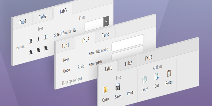
Looking forward to the end widget
So, what’s the ribbon interface definition? It’s an easy-to-use command bar that contains lots of buttons and switches. At the same time it helps users remain sane by grouping these controls into functional blocks and offering a tabbar to navigate between them.
Thus, we will add Webix Tabbar and Toolbar to the ingredients list. Webix toolbar features specific API for working with child elements, i.e. accessing them by name and routing their events to the toolbar itself. You can recognize Webix Form’s way of working with elements, but I’ll tell you the little-known secret: Form inherits from Toolbar in the widget hierarchy.
Let’s draw a sketch of the future widget to build ribbon interface. We will need:
- the possibility to define tabs or items in the constructor;
- listen to a common event for the Ribbon that fires when any control comes into action;
- manipulate controls without accessing them directly through Ribbon methods.
view:"ribbon",
id:"myribbon",
tabs:[], //an array of tabs with control blocks
items:[] // OR an array of control blocks,
on:{
onAction:function(name, value){}
}
});
//show and hide the control by its name
$$("myribbon").showItem("open");
$$("myribbon").hideItem("open");
I feel your impatience now, so I shall not make you wait. Keep an eye on the ribbon interface live demo and the source code while following the further story.
Building Webix Ribbon interface
Let’s create a new widget with the “ribbon” name and the necessary basics to achieve the goal set.
name:"ribbon",
defaults:{ type:"line"},
$init:function(config){
if(config.tabs && config.tabs.length)
config.cols = [this._getTabview(config.tabs)];
else if (config.items && config.items.length)
webix.extend(config, this._getItems(config.items, "cols", true), true);
this.$view.className += " webix_ribbon";
this.$ready.push(this._setActions);
}
}, webix.ui.toolbar);
We inherit from Webix Toolbar to take the logic of treating the elements from it, and add the initialization code to convert tabs and items from Ribbon configuration to standard config of Webix Tabbar or Layout.
The $init function allows working with widget configuration: it’s possible to read the initial properties – from the config parameter – as well as set them.
Setting tabs and items
Items define functional blocks that may contain rows and columns of any form controls. Any item has the type:”block” property and may have header and headerPosition:
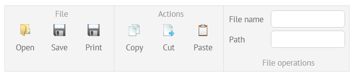
{ type:"block", header:"File", headerPosition:"bottom", cols:[ … ]}
]
Tabs define tabbar tabs that may contain blocks or controls themselves. The configuration allows setting header and an array of child items:
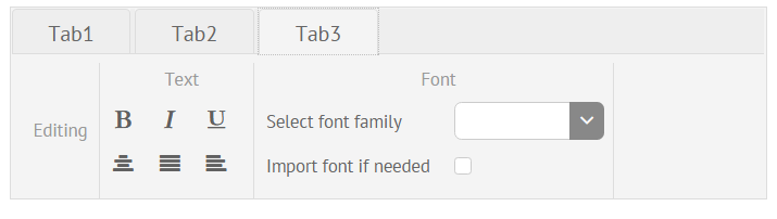
{ header:"Tab1", items:[
{ type:"block", header:"File", cols:[ … ]}
]}
]
Items will be converted into the necessary layout with Ribbon’s _getItems, while tabs form the necessary tabbar structure with Ribbon’s _getTabview method. Both of them are called during initialization.
Making some methods conventionally private
It’s a good idea to hide configuration methods from the public eye, by adding the “underline” sign before their names, as you can see in the code above. Such methods will not be private in essence, but will show their purpose to other developers.
Cleaning the CSS
By default, Webix Toolbar adds “webix_layout_toolbar” class name to its topmost DIV container to style the bar and its elements. We want to add our own styling, so to get rid of the layout CSS we need to redefine the default layout type in defaults object of the prototype:
This code line sets the “line” layout type as default for our Ribbon, which results in webix_layout_line class name. In addition, we will add the specific CSS class to the widget’s topmost container that can be accessed as $view.
Cleaning Configuration object
Since tabs or items are converted to a specific layout in the $init handler, we no longer need to store them in the configuration object. So, let’s use setters to get rid of the corresponding properties in the widget’s configuration.
Property setters, if defined, are called each time a property is set or changed in the widget configuration. They can redefine the property value before it is processed by a widget and return the confirmed value. For example, date_setter of the Calendar converts date strings into Date objects before setting them as Calendar date.
/*if value is a string, convert it to a Date object*/
return value;
}
If a setter returns nothing, the property will not be defined at all:
name:"ribbon",
$oninit:function(config){
//using config.tabs and config.items for Ribbon configuration
},
tabs_setter:function(){},
items_setter:function(){}
}, webix.ui.toolbar);
Setters trigger after the $oninit handler, which makes it possible to leave these properties undefined. At the same time, “live” elements, buttons or other controls, will be available via the parent Ribbon by their name as ribbon.elements[name].
Event handling with Webix Ribbon control
We need a common event that will be issued by the Ribbon when any button is clicked, or when the value of a text field and or selector changes. The Toolbar itself, and hence, our Ribbon, can route “click” and “change” events from its elements to the parent, so we can catch them and call a custom event with action name as a parameter.
The proper place to attach events handlers is the widget’s $ready handler that fires immediately after its initialization:
this.$ready.push(this._setActions);
},
_setActions:function(){
this.attachEvent("onItemClick", function(){
var view = this.$eventSource;
if(view.name == "button" || view.name == "icon")
this.callEvent("onAction", [view.config.name, view.config.value]);
});
this.attachEvent("onChange", function(newv, oldv){
var view = this.$eventSource;
this.callEvent("onAction", [view.config.name, newv, oldv]);
});
}
For buttons and icons clicking will be the “action” event , while other controls should change their value to come into action. Definitely, we are not interested in clicks on comboboxes and text fields.
Another interesting property we encounter here is $eventSource, that is available for routed events and denotes the widget that has initiated the event. Beware that you must set an item’s name to include it to elements collection and catch its events in the way above.
items:[
{ type:"block", header:"File", cols:[
{view:"button", name:"open", label:"Open", image:"images/open.gif"},
{view:"text", name:"path", label:"Path" }
]}
So, on clicking the button, Ribbon will trigger the onAction event with “open” name as a first parameter, while changing the text’s value will result in the same onAction event with “path” name and input value as parameters.
Webix Ribbon Methods
Basically, you can work with any control within the Ribbon by accessing it by its name
ribbon.elements["open"].hide();
But we can define specific methods for most common use cases for ribbon interface like showing and hiding elements or disabling and enabling them.
name:"ribbon",
...
showItem:function(name){ this.elements[name].show(name); },
hideItem:function(name){ this.elements[name].hide(); },
enableItem:function(name){ this.elements[name].enable(); },
disableItem:function(name){ this.elements[name].disable(); }
}, webix.ui.toolbar);
Final word
Now, our ribbon interface is fully ready. Feel confident enough to create Webix of your own? 😉 Then, you may equip yourself with the basic manual and try conquering the world of awesome widgets. In our turn, we warmly welcome questions as well as breathtaking DIY examples.
If your mind is not satisfied, please follow another longread on Creating the Form with Automatic configuration. But don’t forget to admire the snowy winter before you start 😉