Time is one of the most precious resources. If you know how to properly manage this resource you will be able to organize your team work more efficiently. And as a result, it will affect your company’s success.
In this article, we’ll show how to build a JavaScript Time Tracker app using Webix UI components. I hope it will help you to manage the time of your employees in a more effective way.
You can find the full source code and live demo here.
Let’s assume you are the head of an IT department that works in three directions:
- Development
- QA
- Documentation.
And you, as a good manager, need to know how efficiently your employees work during the working day.
In our app, we will create a special table where the employees will be able to look through the tasks assigned to them. This table will have two view modes: tasks by days and total tasks for a week.
We will put a special tracker to monitor the time spent on it next to each task of the current day. The worker needs to turn the tracker on when he starts working on the task and turn it off when the task is done. The tasks of other days will be available for preview only.
The navigation through the weekdays will be implemented via the special tabs. For switching between the table display modes (“Week Days” and “Week Totals”) we will provide a special control on the toolbar.
With all the requirements mentioned, we may assume that our app will be consist of:
- Toolbar with controls
- Navigation bar
- Schedule panel, with an ability to look through the tasks in the different display modes and track the time of today’s tasks.
In the browser, our app will look like this:
The “Week Days” mode
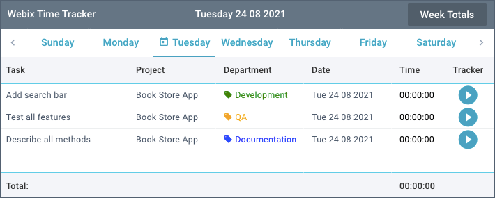
The “Week Totals” mode
Interface and functionality are pinned down. Great. Now let’s move on to the practice and see how to implement this using the components of the Webix library.
Setup: Preparing Webix UI for Time Tracker
To work with Webix, we need to connect its resources. In our app, we will use the GPL version of the library. You can download it here. And you can also connect the required files of this version via the CDN using the following links:
Now let’s get down to the application layout. And it is worth mentioning here that Webix uses a declarative approach when building the interface. This means that each component is a JSON object with all needed parameters.
Including such objects into one another, we form the app interface that will be initialized inside the webix.ui() constructor. This method takes a JSON object with a ready-made layout as a parameter.
As you know, it is not very convenient to store the app config in one big JSON object. Therefore, we will split it into smaller parts (rows of layout), each of which will be stored in a variable. Each of these parts will be developed in a separate file that also needs to be included in the index.html file.
<script type="text/javascript" src="js/subbar.js"></script>
<script type="text/javascript" src="js/datatable.js"></script>
Ultimately, our layout will include three rows and look like this:
rows:[
toolbar,
subbar,
datatable
]
});
And here we have to be completely sure that the app code will start executing after the HTML page is fully loaded. For this, we need to include the layout code into the webix.ready(function(){}) method. It looks like this:
webix.ui({
rows:[
...
]
});
});
We have connected the needed resources and created the app layout. Now is the time to go forward to developing the corresponding parts of the interface and its functionality.
Building the Schedule Panel with Webix DataTable
To create the schedule panel, we will use the DataTable widget. In the table we need to visualize the following information:
- the task name assigned to an employee
- the project name, that the task belongs to
- the department name (development, QA or documentation)
- the date of the task assigned to employee
- the time spent on the task
- the tracker that starts and stops monitoring the time spent on the task.
As you can see, our table will consist of 6 columns. Let’s code it.
In the datatable.js file, we create a table and save it to the datatable variable. The widget basic configuration looks like this:
view:"datatable",
id:"table",
url:"./data/data.json",
columns:[...]
}
The component is declared using the view:”datatable” expression. After that, we specify a unique id that allows us to access the table (for example, to call its methods).
To load the data from a remote server, we need to set the url property to the required path. We can also specify a special script instead of this path, that should return the corresponding data in the JSON format. If the data were on the client-side, we would use the data property instead of url.
Each element of the array is an object with the following fields:
"id":"1",
"task":"Create a toolbar with controls",
"project":"Book Store App",
"department":"Development",
"date":"08/23/2021",
"time":5000000
}
Now let’s distribute this data among the corresponding columns of our table.
Configuring Table Columns
To configure the table columns, we have to specify the corresponding config objects into the array of the columns property.
First, we need to display the corresponding data in each column. For this, in the config object of each column, we specify the id property and set it to a special key under which the data are stored.
{ id:"task", ... },
...
]
For each of the columns, we set the header name via its header property, as well as a fixed width via the width property for all columns except the first. The fact is that the task names of this column will most likely take up more space than the rest of the data. Based on this, we will allow him to take the maximum amount of reminded space. And for this, in the first column settings, we will set the fillspace property to true.
{ id:"task", header:"Task", fillspace:true },
{ id:"project", header:"Project", width:140 },
...
]
Working with Dates
Now let’s move on to the column that will display the date of each task assignment. And here we have a small snag. The point is that the dates come from the server as the strings like “08/23/2021”. As you may know, working with the string dates in JS is not the most pleasant experience. Since we are going to format dates and use them for filtering the table, it would be better to redefine them into the corresponding JS Date objects.
For this, in the widget’s constructor, we specify the scheme property. In the object of this property, we need to define a special $init key and set it to a callback function. It will be executed after the data loading but before their rendering. Inside this callback, we redefine the string date to the corresponding Date object. For this, we use the dateFormatDate() method of the webix.i18n module.
view:"datatable",
...
scheme:{
$init:function(obj){
obj.date = webix.i18n.dateFormatDate(obj.date);
}
}, ...
}
Now all the dates will be displayed in the column as corresponding objects instead of strings. But we need to display the date like Mon 23 08 2021.
For this, in the “Date” column settings, we should specify the format property and set it to the dateToStr() method of the webix.Date object. This method takes the needed date format as the “%D %d %m %Y” keys and returns the corresponding date string.
In this way, the dates get into the table in the form of the corresponding JS Date objects and are displayed as the date strings.
Working with Templates
Besides the column with dates, there are several columns, which data need to be displayed in a different way. For this case, the table provides a special template property. With its help, we can set a template for displaying the particular column data.
This property needs to be set as either a string with a specific template or a function that returns it.
And we need to set such a template for the “Time” column, that will display the time spent on each task execution. The point is that the server returns time data as a number of milliseconds. But we need to display them as a corresponding “00:00:00” string. For this, in column configuration, we set the following template:
The timeToString() function inside of the template will take the time value in milliseconds. It is worth clarifying that this time is stored in the data object of each row under the time key. The function processes an argument, splits it into special segments (hours, minutes and seconds) and returns the time in the needed format. It looks like this:
if(time){
const diffInHrs = time / 3600000;
const hh = Math.floor(diffInHrs);
const diffInMin = (diffInHrs – hh) * 60;
const mm = Math.floor(diffInMin);
const diffInSec = (diffInMin – mm) * 60;
const ss = Math.floor(diffInSec);
const formattedHH = webix.Date.toFixed(hh);
const formattedMM = webix.Date.toFixed(mm);
const formattedSS = webix.Date.toFixed(ss);
return `${formattedHH}:${formattedMM}:${formattedSS}`;
}else{
return “00:00:00”;
}
}
Here we need to consider that the time is updated every time the obj.time property of a particular row is changed by the tracker. But we’ll talk about this a little later.
And now we get down to the “Department” column, which will display the department names the tasks belong to. To make it easier to read, let’s add a tag icon in front of the department name and mark each item with a specific color via the cssFormat property.
id:"department",
header:"Department",
template:" #department#",
cssFormat:markDepartment
}
The markDepartment() function of the cssFormat property checks the department name of each row and sets the font color for its text and tag (since it is a font-based icon). The function will look like this:
if(obj.department == "Development"){
return { "color":"green" };
}else if(obj.department == "QA"){
return { "color":"orange" };
}else{
return { "color":"blue" };
}
}
And in the last column, we need to implement a button for managing the tracker. Using this button the employee can start tracking the time spent on a specific task. For this, we will create a togglePlayPauseButton() function and set the template property to this function.
The template function will look like this:
return ``;
}
The function reads the $isRunning marker of the task the current button is displayed for. This marker is assigned to each task dynamically during the app execution. It shows the tracker state (play or stop) as well as the tracker button state (the mdi-play-circle or mdi-pause-circle icons). For convenience means, we will style the button with the pause icon in red to highlight its state visually. It can be done via regular CSS.
We will also mark the time string of the current task in red using the cssFormat property.
For this, we create a markTime() function that will check the state of the $isRunning marker. If the marker exists (the tracker is running), the time will turn in red. The function will look like this:
if(obj.$isRunning){
return { "color":"red" };
}else{
return { "color":"black" };
}
}
Total Time in the Footer
Now we have an interface for tracking the time spent on each task. It would be very convenient to look through the total time spent per day and week. Let’s make such a summary in the footer of our table.
By default, there is no footer in the table. To add it, in the widget’s constructor we need to set the footer property to true. After that, in the settings of the required columns we also need to set the footer property to the desired content.
For the first column, we define the summary title via the footer:{ text:”Total:”} configuration.
And now we are going back to the “Time” column, which displays the time values we need to calculate. And here it is necessary to say that the Webix library has special built-in elements for headers and footers of the table. We can set a special counter for them that will calculate and display the sum of all column’s values. For this, in the column settings we need to set the footer{content:”summColumn”} configuration.
But such a result doesn’t suit us, since the time is counted in milliseconds and its total number doesn’t look very informative. We need to format the total value and display it as a corresponding string.
Therefore, let’s create our own counter based on the built-in summColumn element. It will count all the column’s values, format the result and display it. New counter will look like this:
refresh:function(master, node, value){
let result = 0;
master.mapCells(null, value.columnId, null, 1, function(value){
value = value*1;
if(!isNaN(value))
result+=value;
return value;
});
node.innerHTML = timeToString(result);
}
}, webix.ui.datafilter.summColumn);
The refresh method of the new counter will calculate the sum of the available values and format it using the timeToString() function. Let me remind you that this function takes the number of milliseconds and converts it to the corresponding time string. The counter will be called every time when the column’s values are changed.
To use the new counter, all we need to do is to add the footer:{content:”totalTime”} configuration to the “Time” column settings.
We have created a schedule panel, loaded the required data and provided the necessary controls. In the browser we can see the following result:
In fact, we have the needed interface for working with a tracker. Now let’s define some extra features, namely:
- an ability to look through the tasks by days
- an ability to look through the tasks in a week.
Adding a Navigation Bar for Weekly Task View
Our navigation bar will consist of tabs for navigating through the days of the current week and arrows for switching to the previous and next weeks. We will mark the current day tab with a special icon. Let’s first define a panel layout and then move on to developing its elements.
We will create the corresponding tabs using the tabbar component and save it to the tabbar variable. The arrows for switching weeks will be created via two icon elements. We will arrange them on both sides of the tabbar.
For convenience, we put all mentioned above elements in a separate layout and save it to the subbar variable in the subbar.js file. Let me remind you that we use this variable to build the layout of the entire app in the index.html file. This layout code will look like this:
id:"navigation",
cols:[
{ view:"icon", icon:"wxi-angle-left" },
tabbar,
{ view:"icon", icon:"wxi-angle-right" }
]
}
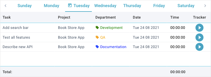
In the browser, we will see the following result:
For this panel, we have set a special id. This id allows us to access the panel and hide/show it when changing view modes. But everything has its time.
Now let’s go further to the tabs for switching the week days. As I mentioned above, we will use the tabbar component to create it. It is declared via the view:”tabbar” expression. To access the widget, we will give it a unique id. At the same time we set a fixed height via the height property and remove the component borders using the borderless property.
view:"tabbar",
id:"tabbar",
borderless:true,
height:45
}
Now we need to decide on the options for the corresponding tabs with the days of week. They are set via the options property as an array with needed data. And here we have to resort to a little trick.
The fact is that we will filter the tasks in the table by its dates when changing tabs. Based on this, it would be very convenient if each option (tab) contains the corresponding date. In this case we can filter the tasks by this date when clicking on the tab. And we can create these options dynamically. Now let’s see how to implement it.
By default, our tabbar shows all days of the week. But we need to know what day it is today. For convenience, let’s store the current date in the today_date variable in the index.html file.
const today_date = new Date(2021, 7, 24);
</script>
And it is worth clarifying here that in a real project the current date will be determined by the new Date() method. In this case we hardcoded the dates , since our data is in the range of a week.
To form an array with options, we need to get the index of the current day and store it in the day_num variable. To do this, we use the getDay() method of the Date object of today’s date.
It should be borne in mind that by default Webix uses the “en-US” locale, where the week starts with Sunday which index is 0.
To create options, we also need to get the start date of the week the current date belongs to and store it in the week_start variable. This can be done via the weekStart() method of the webix.Date object.
When we have all the needed variables, let’s form an array of options for the tabbar. The object of each option will contain the following fields:
- id – option id
- value – full name of the day
- icon – icon (only for today)
- date – date.
To create an array of options with the above-mentioned fields, we can use the map() method. It is called for the dayFull array of the calendar object. This array contains the full names of the days of week which start from Sunday. It looks like this:
return {
id: i,
value: day,
icon: i == day_num ? "mdi mdi-calendar-today" : "",
date: webix.Date.add(week_start, i, "day", true)
}
});
As you can see, the icon is set only for today’s day, which index corresponds to the cycle variable. The date of each tab is defined via the add() method of the webix.Date object. This method adds the required number of days to the initial date stored in the week_start variable.
And now we should set the options property to the new array with options and define the default tab using the value property. The widget constructor will look like this:
view:"tabbar",
id:"tabbar",
borderless:true,
height:45,
value:day_num,
options:options
}
In the tabbar, there is one more feature left we need to implement. When switching tabs, we will filter the tasks by the date of the current tab. To do this, we need to set the onChange event to the handler, which will be called when switching tabs. This can be done via the on property.
view:"tabbar",
...
on:{
onChange:filterDatatable
}
}
The handler function will look like this:
const tabbar = $$("tabbar");
const value = tabbar.getValue();
const current_date = tabbar.getOption(value).date;
table.filter(function(obj){
return webix.Date.equal(obj.date, current_date);
});
}
First, we need to get the date of the active tab by which we will filter the table. To do this, we get the id of the active tab using the getValue() method and pass it to the getOption() method. Last one will return the tab object where the date is stored.
After that, we need to filter the tasks by the date of the active tab. And here we can use the filter() method that returns only the tasks that match the date of the current tab.
Now users are able to navigate by the days of week and the tasks will be filtered by the corresponding date.
And here it would be logical to prohibit running the tracker on all days except today. For this we can just hide the column with timer controls and show it only for the tab with the current date.
We need to compare the current date and the date of the active tab using the equal() method of the webix.Date object. If the dates match, we check the “Tracker” column visibility using the isColumnVisible() method and display it with the showColumn() method.
If the dates don’t match and the “Tracker” column is displayed, we hide it with the hideColumn() method of the table.
And now the function will look like this:
const tabbar = $$("tabbar");
const value = tabbar.getValue();
const current_date = tabbar.getOption(value).date;
const table = $$(“table”);
const isVisible = table.isColumnVisible(“tracker”);
if(webix.Date.equal(today_date, current_date)){
if(!isVisible)
table.showColumn(“tracker”);
}else if(isVisible)
table.hideColumn(“tracker”);
table.filter(function(obj){ // unfilter the table
return webix.Date.equal(obj.date, current_date);
});
}
In this way, we have implemented navigation by the days of week and set up filtering of the tasks by the corresponding dates. But that’s not all. The point is that when initial loading, the table will display all tasks at once, while the active tab on the tabbar will correspond to the current date.
To fix it, we need to filter the table by today’s date immediately after the data loading. For this, we can add the ready property to the widget constructor and specify the filterDatatable() function inside the callback of this property.
view:"datatable",
...
ready:function(){
filterDatatable();
}
}
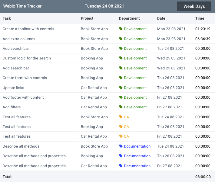
Now the data will be filtered right after component initialization as well as when switching by the corresponding tabs on the navigation panel. In the browser we will see the following result:
Toolbar: Switching Between Week Days and Week Totals
And now let’s implement viewing the tasks in a week. For this, we will provide a special control on the toolbar. And the toolbar of our app will consist of three elements:
- the app label
- the current date label
- the toggle button for switching the “Week Days” and “Week Totals” modes.
In the browser it will look like this:
In the toolbar.js file, we create a toolbar and save it to the toolbar variable. The widget is declared using the view:”toolbar” expression. We can define its style via the css property and fixed height via the height property.
To arrange the widget content as columns, we need to put the required elements in the array of the cols property. The widget constructor will look like this:
view:"toolbar",
css:"webix_dark",
height:45,
cols:[ … ]
}
Inside the cols array, we need to define the widget’s label and today’s date label. We also need to create a toggle button to switch the table view from the tasks for a week to a daily schedule and back.
The label widget itself is declared using the view:”label” expression. Its fixed width is set via the width property. The label name should be specified via the label property.
For the first component with the app name, we specify the “Webix Time Tracker” string. The second label will display the current date. For this we will use the dateToStr(“%l %d %m %Y”) method of the webix.Date object. The method takes the current date as a parameter and displays it by the specified template.
{ view:"label", width:150, label:"Webix Time Tracker"},
{}, // spacer
{ view:"label", width:190, label:webix.Date.dateToStr("%l %d %m %Y")(today_date) },
{}, // spacer
… // toggle button
]
And now we need to create a toggle button to switch display modes. Its constructor will look like this:
view:"toggle",
width:130,
offLabel:"Week Totals",
onLabel:"Week Days"
}
This widget has 2 states, namely on and off. We can specify their names via the corresponding onLabel and offLabel properties.
Now let’s take a look at the button functionality. When clicking on the control, we need to show the corresponding mode of the schedule panel. If the button is enabled (the “Week Totals” mode is set), we will display all the tasks of this week. But here we also need to hide the “Tracker” column of the table and the navigation bar. If the button is disabled (the “Week Days” mode is set), we will show the navigation bar and filter the table by the date of the active tab.
To implement the functionality mentioned above, we need to handle the onChange event of our button. And this can be done in the object of its on property.
view:"tabbar",
...
on:{
onChange:filterDatatable
}
}
The handler function will look like this:
const tabbar = $$("tabbar");
const value = tabbar.getValue();
const current_date = tabbar.getOption(value).date;
table.filter(function(obj){
return webix.Date.equal(obj.date, current_date);
});
}
First, we need to get the date of the active tab by which we will filter the table. To do this, we get the id of the active tab using the getValue() method and pass it to the getOption() method. Last one will return the tab object where the date is stored.
After that, we need to filter the tasks by the date of the active tab. And here we can use the filter() method that returns only the tasks that match the date of the current tab.
Now users are able to navigate by the days of week and the tasks will be filtered by the corresponding date.
And here it would be logical to prohibit running the tracker on all days except today. For this we can just hide the column with timer controls and show it only for the tab with the current date.
We need to compare the current date and the date of the active tab using the equal() method of the webix.Date object. If the dates match, we check the “Tracker” column visibility using the isColumnVisible() method and display it with the showColumn() method.
If the dates don’t match and the “Tracker” column is displayed, we hide it with the hideColumn() method of the table.
And now the function will look like this:
const tabbar = $$("tabbar");
const value = tabbar.getValue();
const current_date = tabbar.getOption(value).date;
const table = $$(“table”);
const isVisible = table.isColumnVisible(“tracker”);
if(webix.Date.equal(today_date, current_date)){
if(!isVisible)
table.showColumn(“tracker”);
}else if(isVisible)
table.hideColumn(“tracker”);
table.filter(function(obj){ // unfilter the table
return webix.Date.equal(obj.date, current_date);
});
}
In this way, we have implemented navigation by the days of week and set up filtering of the tasks by the corresponding dates. But that’s not all. The point is that when initial loading, the table will display all tasks at once, while the active tab on the tabbar will correspond to the current date.
To fix it, we need to filter the table by today’s date immediately after the data loading. For this, we can add the ready property to the widget constructor and specify the filterDatatable() function inside the callback of this property.
view:"datatable",
...
ready:function(){
filterDatatable();
}
}
Now the data will be filtered right after component initialization as well as when switching by the corresponding tabs on the navigation panel. In the browser we will see the following result:
Creating a Toolbar
And now let’s implement viewing the tasks in a week. For this, we will provide a special control on the toolbar. And the toolbar of our app will consist of three elements:
- the app label
- the current date label
- the toggle button for switching the “Week Days” and “Week Totals” modes.
In the browser it will look like this:
In the toolbar.js file, we create a toolbar and save it to the toolbar variable. The widget is declared using the view:”toolbar” expression. We can define its style via the css property and fixed height via the height property.
To arrange the widget content as columns, we need to put the required elements in the array of the cols property. The widget constructor will look like this:
view:"toolbar",
css:"webix_dark",
height:45,
cols:[ … ]
}
Inside the cols array, we need to define the widget’s label and today’s date label. We also need to create a toggle button to switch the table view from the tasks for a week to a daily schedule and back.
The label widget itself is declared using the view:”label” expression. Its fixed width is set via the width property. The label name should be specified via the label property.
For the first component with the app name, we specify the “Webix Time Tracker” string. The second label will display the current date. For this we will use the dateToStr(“%l %d %m %Y”) method of the webix.Date object. The method takes the current date as a parameter and displays it by the specified template.
{ view:"label", width:150, label:"Webix Time Tracker"},
{}, // spacer
{ view:"label", width:190, label:webix.Date.dateToStr("%l %d %m %Y")(today_date) },
{}, // spacer
… // toggle button
]
And now we need to create a toggle button to switch display modes. Its constructor will look like this:
view:"toggle",
width:130,
offLabel:"Week Totals",
onLabel:"Week Days"
}
This widget has 2 states, namely on and off. We can specify their names via the corresponding onLabel and offLabel properties.
Now let’s take a look at the button functionality. When clicking on the control, we need to show the corresponding mode of the schedule panel. If the button is enabled (the “Week Totals” mode is set), we will display all the tasks of this week. But here we also need to hide the “Tracker” column of the table and the navigation bar. If the button is disabled (the “Week Days” mode is set), we will show the navigation bar and filter the table by the date of the active tab.
To implement the functionality mentioned above, we need to handle the onChange event of our button. And this can be done in the object of its on property.
view:"toggle",
…,
on:{
onChange:toggleHandler
}
}
The handler function for this event will look like this:
const table = $$("table");
const nav = $$("navigation");
if(value){
nav.hide();
table.filter();
if(table.isColumnVisible("tracker"))
table.hideColumn("tracker");
}else{
nav.show();
filterDatatable();
}
}
It is worth clarifying here that we hide and show the navigation bar using the corresponding show() and hide() methods. And the filter() method of the table is called with no arguments to reset its data to the initial state.
Pay attention that in a real project we would have filtered the week data by dates from Monday to Friday. And since our database contains data only for one week (as a sample), we just reset the table data to the initial state.
Now we can switch the “Week Days” and “Week Totals” modes using the corresponding control on the toolbar.
Implementing Task Timers in Your Time Tracker App
We need to implement one more important feature of our app namely the tracker and its functionality. I want to remind you that we have created the corresponding controls in the “Tracker” column for tracking the time. Let’s make it so that the first click on the button runs our tracker and the second one stops it.
For this, we need to handle the button click event using the special onClick property of the table. When creating the button, we specified a toggleplaypause CSS class. In this case, it will be used for event handling.
Inside the object of the onClick property we specify this CSS class and assign the needed handler to it.
view:"datatable",
…,
onClick:{
toggleplaypause:togglePlayPauseHandler
}
}
Now let’s create this handler. And it will look like this:
function togglePlayPauseHandler(e, id){
if(tracker_state == id.row){
pauseTimer.call(this);
}else{
pauseTimer.call(this);
playTimer.call(this, id.row);
}
return false;
}
To make this function work we need to store the id of the task the tracker is running for. Based on this, we create the tracker_state variable outside the function. It will be updated each time when a new tracker is started and reset it when the current one is stopped.
When clicking on the control, we will compare the row id of the active tracker with the value of the tracker_state variable.
If the values match (the tracker is active), we will stop the current tracker using the pauseTimer() function.
If the values don’t match (the current tracker is not active), we will stop the active tracker if any and run a new tracker using the playTimer() function. It takes the current row id as a parameter.
At the end of this function, we prevent other events from firing (for example, row selection) by returning the false value.
Now let’s see how to create the playTimer() and pauseTimer() functions for running and stopping our tracker.
Function to Start the Tracker
The playTimer() function will start tracking the time of the current task. Its code looks like this:
const item = this.getItem(row_id);
let time = item.time,
interval = item.$interval,
start = Date.now() - time;
interval = setInterval( () => {
time = Date.now() – start;
this.updateItem(row_id, { time:time });
}, 1000); // update 1 time per second
this.updateItem(row_id, { $isRunning:true, $interval:interval });
tracker_state = row_id; // redefine state
}
To work with the tracker, we need to store the timer id. For this, we create the $interval marker and put it into each task object. It will be updated every time the timer method is called (setInterval()) in our playTimer() function. We will use this id to stop the timer that is already running.
Now let’s go back to the function. We get an object of the desired task by its id using the getItem() method. This object contains the obj.time and obj.$interval values we need. To manage the timer we should declare several local variables, namely:
- time (the number of time stored in the row object under the time key)
- interval (the timer id stored in the row object under the $interval key)
- start (the time in milliseconds). Its value is determined by the difference between the time that has passed since 1970 and the time the current timer has been running from.
After that, we start the setInterval() timer with a delay of 1 second. Inside the timer callback, we calculate the time and save it to the time variable. Its value is determined by the difference between the current time (Date.now()) and the value of the start variable.
To display the result in the corresponding row, we store the timer time to its object and redraw this row using the updateItem() method.
At the end of this function, we need to do the following steps:
- redefine the $isRunning marker to change the tracker button state
- store the $interval marker to stop this tracker next time.
Since these markers are stored in the current row object, we use the updateItem() method to update them.
And here we also need to redefine the tracker_state variable by setting it to the row id. It is used to stop the tracker when clicking again.
Now let’s get to the function that will stop our timer.
Function to Stop the Tracker
The pauseTimer() function will stop the task tracker if its id is stored in the tracker_state variable. The code of this function looks like this:
if(tracker_state){
const interval = this.getItem(tracker_state).$interval;
clearInterval(interval);
this.updateItem(tracker_state, { $isRunning:false });
tracker_state = 0;
}
}
At the beginning of this function, we need to check the tracker_state variable. If its value is true, the tracker is already running and the value of this variable corresponds to the row idthe tracker belongs to.
To stop this tracker, we need to get the value of the $interval variable. It is stored in the object of the current row. This can be done using the getItem() method, which takes the task id stored in the tracker_state variable.
After that, we stop the tracker using the clearInterval() method. It takes the $interval value as a parameter.
At the end of this function, we need to redefine the $isRunning marker using the updateItem() method to change the tracker button state. It will redraw the row and the $isRunning marker will be taken into account by the column template. I’d like to remind you that we defined this template via the togglePlayPauseButton() function.
return ``;
}
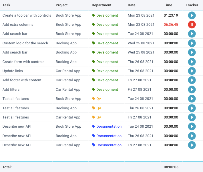
That’s all there is to it. Now your employees can run and stop the tracker of any task assigned to them for today.
Conclusion
You can find the full source code and live demo here.
In this article, we have figured out how to create the time tracking app based on the Webix UI components. To read more about all possibilities of the Webix widgets with related samples, visit the documentation of the Webix library.
Interested in creating a JavaScript Time Tracker for your team? Using Webix UI, you can implement a fully functional employee task management system with timers, weekly summaries, and interactive tables.

