Struggling for the correct data visualization? That’s the challenge! Catchy and informative charts immediately win the hearts of analysts and customers, that’s why Webix offers… let me count… 14 different types of charts with 2 functional variations alongside with 2 chart-like widgets for specific use cases.
Yep, diversity makes lives brighter while the choice becomes more difficult. You have to select the right chart for your application as carefully as you choose a Christmas gift for your best friend. The article below can guide you to the ultimate tool.
Bird eye view
Let’s look into the package and admire the available options:
- Pie charts: Pie, 3 Pie, Donut
- Line charts: Line and Spline
- Column charts: Bar and BarH (H for horizontal)
- Area charts: Area, SplinaArea
- Stacked charts: StackeArea, StackedBar, StackedBarH
- Radar chart
- Scatter chart
Variations for line charts:
- Dynamic chart with a moving graph
- Rangechart with a movable frame for selecting a data range (PRO version only)
Chart-like widgets:
- Treemap (PRO version only), a hierarchical heatmap
- Gage (PRO version only), a simple sensor for one parameter
Down-to-Earth research
Since the correct chart is a precious investment into any business, you should first analyze your data as well as your objectives and ask yourself a vital question:
What do I want to showcase with my graph: comparison, trends over time, distribution, composition or relationship? Let’s try to figure out what is the best chart to use for each conception.
Charts for comparing data
This is the most popular chart type ever and Webix repeats the overall tendency. You can find a lot of comparison chart examples in the library.
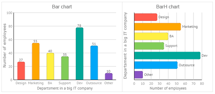
For instance, if the data is comprised of items that are independent of each other and your goal is to reveal the biggest value among them, then Bar charts, both vertical and horizontal, are exactly what you need.
For instance, you want to show how many people work in various departments of your company. These are your possible solutions:
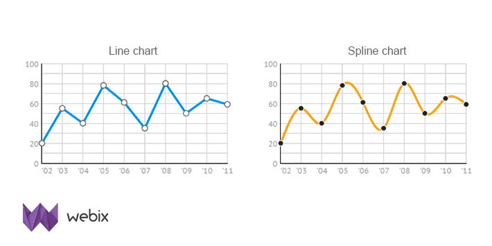
Line and Spline chart types are also great for comparison. They tend to be time-based and usually depict the dependent data that undergoes changes over time.
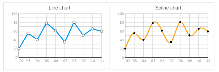
Spline chart is almost identical with the Line one but stands out by its smooth and curvy design.
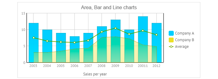
Area and SplineArea charts look very similar to the above mentioned group, but the area below the line is colored to show the magnitude of the value it represents. This connotation becomes extremely handy when you need to compare changing values for several categories within one scale. In Webix such independent categories are called series.
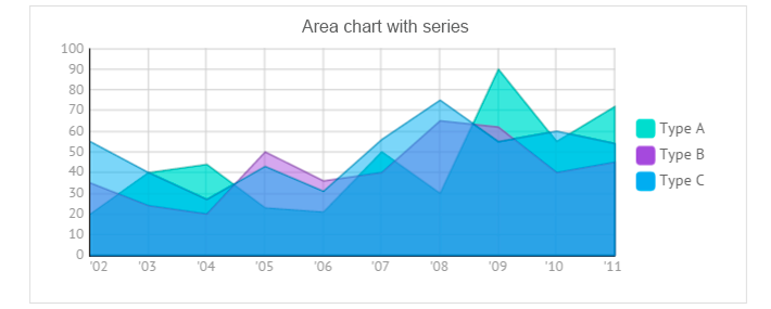
All three areas are transparent, so you can clearly see the graph for each parameter and the way it’s related to its neighbours. At the same time, you can click items on the chart legend to show and hide the corresponding graphs.
Radar chart
This is a circular chart with a scale going from the minimum value in the center to the biggest one on the periphery. The chart is great for revealing the biggest value from rather a small data set. For instance, you can paint a speaking sales rose (as well as a wind rose) per year.
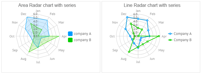
Within Radar chart you can paint either points or lines or areas on the scales.
Chart types for realtime monitoring
You may need to compare not only static data, but the data that is dynamically changed over time and monitor its current state. Below are the examples of charts that can help you achieve this task.
To reveal particular tendencies about changeable data and keep an eye on the current range of data, you can add dynamic performance to various types of charts: Line, Spline, Area and SplineArea:
setInterval(function () {
$$("chart").add({xValue: count, yValue: Math.random() * 100});
}, 1000);
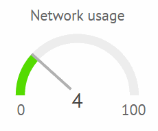
For monitoring live performance of one parameter and visualize only its current value with respect to minimum and maximum values, use the Gage widget (PRO version only).
Live Demo >>
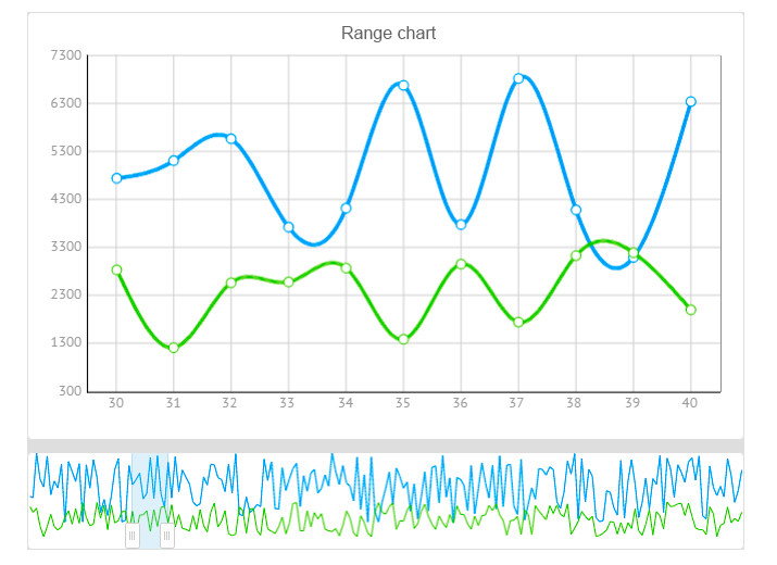
Chart for detailed data analysis
But what if you deal with really huge data that can’t be successfully analysed as a whole? In this case, you can narrow the output by the related RangeChart, which allows for a deeper insight apart from mere comparison.
rows:[
{ view:"chart", id:"dchart", type:"spline" },
{ view:"rangechart", data:data, on:{
onAfterRangeChange:function(){
$$("dchart").clearAll();
$$("dchart").parse(this.getFrameData());
}
}}
]
});
RangeChart can be built upon all types of line charts but exists as a separate Webix UI widget and is available in the PRO edition only.
Types of charts that reveal composition
The main goal of composition charts is to show how smaller categories relate to each other within a larger notion.
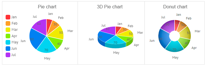
Pie charts, for instance, can clearly demonstrate the percentage taken by this or that category. Only you should note that the whole amount should be equal to 100%. There are three pie chart types in Webix: Pie, 3DPie and Donut.
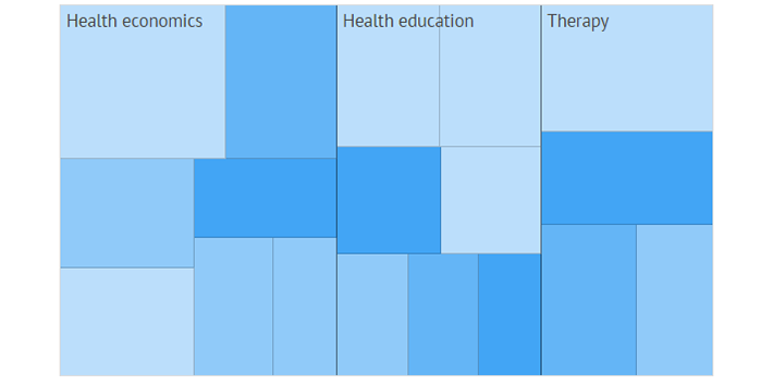
If categories are comprised of sub categories, you can have a glance at the Treemap. This is a hierarchical heat map that uses proportional squares rather than slices, which can in turn consist of dependant areas.
But Pie chart types and Treemap are not enough if you need to analyze part-to-whole relationship within several notions that are compared.
For example, you may need to compare the sales rates of a company over the period of ten years and you want to see which products compose the overall value each year. Then stacked charts will come to help you. Webix offers three types of charts for these needs: StackedBar, StackedBarH and StackedArea chart:
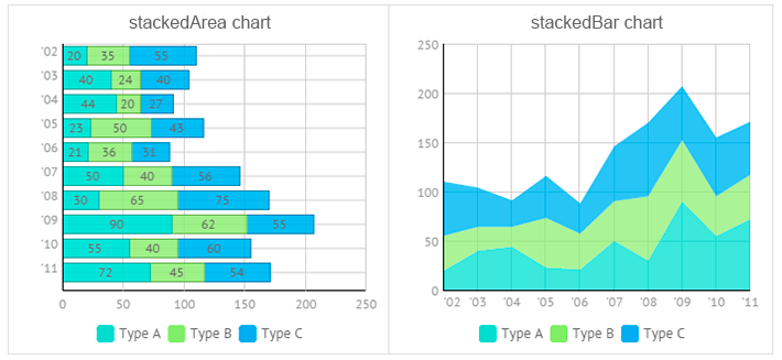
Stacked charts look very much like standard charts with series, but the difference is that you cannot switch off and on the desired part of data. And its legend just explains the graph.
Charts that show distribution
Distribution types of charts make it easier to perceive extreme values in the data, observe tendencies and reveal the range of values in the data.
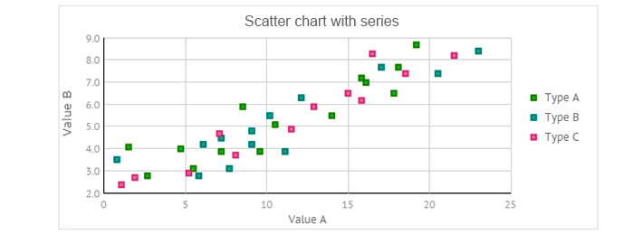
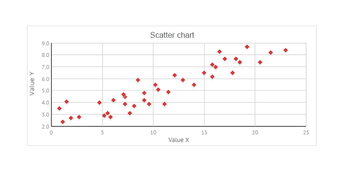
Scatter chart is known to be an excellent performer for this task. Normally, it is used to show how data is distributed between several categories.
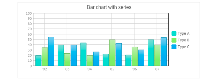
Also, a Line or Bar histogram can be drawn to show the distribution. The chart below tells how the overall data is distributed between three types, A, B and C:
Charts that show relationship
Again, Scatter chart becomes the winner as it clearly shows the correlation between two variables. It is even often called an “XY” chart.
What’s in Webix charts?
- You can find a lot of style presets and possibilities of custom styling for all types of charts;
- You can customize scales (X-axis and Y-axis) for charts with a rectangular scale;
- You can compare multiple categories of data thanks to support for a series chart;
- You can combine several types of charts with the same scale into one view;
- You can group data in the charts and export them to PNG.
And if your mind is not satisfied and you strive for other visualization tools (but still love Webix), you can check for available integrations with third party libraries that offer such types of charts as:
Summing up
In this article we have covered almost all the visualization tools of the Webix framework except for the Organogram, which is used to build hierarchical schemes.
As you can see, Webix offers different types of charts. There are a lot of solutions to create a comparison chart and a lot of possibilities to show data composition. Distribution and relation charts can also be built with Webix. In addition, you can monitor data in dynamics. Isn’t it cool?
But things become real when you touch them and work with them. So while charts are as beautiful as toys on the Christmas tree, they can be admired the whole year round. So, browse the samples, check the docs about data chart and you will be able to create your perfect chart till Easter!
I’m joking guys, much earlier, but still — Happy Holidays and best wishes from the whole Webix team!