Very often you have to design web apps that collect a lot of monotonous data from users, e.g., information about their previous employment, skills, working hours, preferences, etc. This is when you face the time-consuming necessity to write code for many repeated input fields and maintain value processing logic.
Surely, you can solve this issue by allowing users to write anything their heart desires in a textarea. But such an approach has nothing to do with a user-friendly interface. Besides, processing the collected information can become a real headache in this case.
A better solution is creating one dynamic control which you’ll be able to apply multiple times to your complicated forms. Sounds interesting? Read on to learn how to do it.

Creating Your Own Multi-Line Component
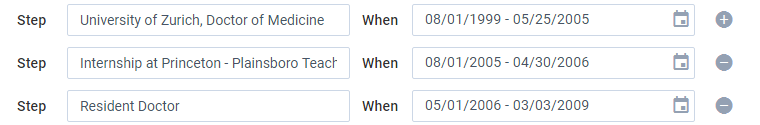
It’s quite a common case when data received from users contains a lot of similar items, e.g. like in the following sample dataset with data for a CV:
name:"Dr. Arienette Wolfe",
email:"arienette.wolfe@lupinhospital.com",
qualification:[
{ step:"University of Zurich, Doctor of Medicine", time:{ start:"2009-9-1", end:"2015-6-25" }},
{ step:"Internship at Princeton - Plainsboro Teaching Hospital, New Jersey, USA", time:{ start:"2015-9-1", end:"2016-5-30" }},
{ step:"Resident Doctor", time:{ start:"2016-6-1", end:"2019-1-11" }}
]
}
In real life, datasets might come with bigger bunches of similar data inside. It would be great to have a JS UI component that would instantly visualize these data in multiple inputs and collect user input afterwards.
Let’s create a component that will automatically build several lines of similar inputs:
– a text input for a step in a career,
– a DateRangePicker for selecting the date interval,
– an icon for adding new lines / removing the current line.

1. Creating the component
We will create the component on the basis of Webix Forminput, because this will allow you to align the component in a form alongside with other widgets, and name the component “multidate”.
name:"multidate",
}, webix.ui.forminput);
All “multidate” lines will look almost the same, so let’s define a method that will create them. Each line will be a form that contains a set of repeated input fields, so you will be able to use the Webix Form API for working with its values.
name:"multidate",
_getForm:function(mode){
const id = webix.uid();
return {
view:"form", id:id, borderless:true, padding:0, cols:[
{ view:"text", label:"Step", labelWidth:50, name:"step" },
{ view:"daterangepicker", name:"time", label:"When", labelWidth:50 },
this._getIcon(mode,id)
]
}
},
_getIcon(mode,id){
return { view:"icon", icon:"wxi-"+mode+"-circle" }
}
}, webix.ui.forminput);
Next, let’s create the main line on $init of the component and place it onto a layout inside the Forminput. After that, let’s store line IDs in the array for easy access to them.
name:"multidate",
$init:function(config){
config.body = {
margin:5, rows:[this._getForm("plus")]
};
this.$ready.push(() => {
this._inputs = [this.queryView("form").config.id];
});
},
_getForm:function(mode){ /* ... */ }
}, webix.ui.forminput);
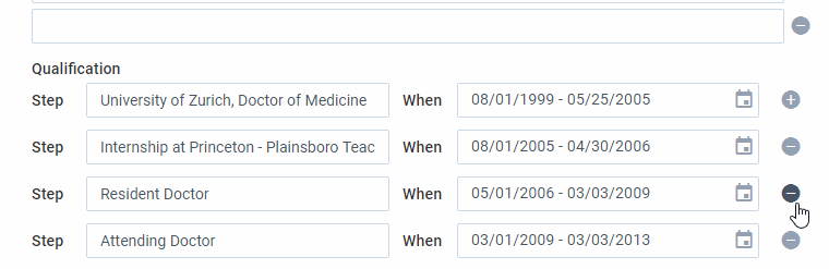
Mind that the first line can only add more lines but it cannot be removed, that is why it has the ‘plus’ icon.
2. Adding new lines
Now let’s teach “multidate” to add more lines below the main one. Define the addInput() method that will add a line to the component. The configuration of a line is built by the same _getForm() method, just mind that the icon is different:
const section = this.getBody().addView(this._getForm("minus"));
this._inputs.push(section);
}
As you might have already guessed, the method should be called on clicking the ‘plus’ icon:
name:"multidate",
...
_getIcon(mode,id){
return {
view:"icon", icon:"wxi-"+mode+"-circle",
click:() => {
if (mode == "plus") this.addInput();
}
};
},
addInput:function(view){ /* ... */}
}, webix.ui.forminput);
3. Removing lines
By now the user can only add the lines, so let’s add a way to remove them. Define a method that will first remove the ID of the line from the _inputs collection and then remove the line itself.
for (var i = 0; i < this._inputs.length; i++){
if (this._inputs[i] == id){
this._inputs.splice(i, 1);
break;
}
}
this.getBody().removeView(id);
}
Next, attach removeInput() to the “minus” icon of a line.
...
_getIcon:function(mode,id){
return {
view:"icon", icon:"wxi-"+mode+"-circle",
click:() => {
if (mode == "plus") this.addInput();
else this.removeInput(id);
}
};
},
removeInput:function(id){ /* ... */ }
},webix.ui.forminput);
Now users can remove a line by clicking its “minus” icon.
4. Getting the value of the component
Ok, now we have a nice user-friendly control, but how can you get its data?
Here is the getValue() method. It gets the values of each form with the help of its getValues() method, pushes it into an array and returns this array:
...
getValue(){
let values = [];
this._inputs.forEach((view) => {
values.push($$(view).getValues());
});
return values;
}
}, webix.ui.forminput);
5. Setting values of component
The final frontier for the Multidate component on its path to becoming the fully functioning form control is filling this control with existing data – so that users can edit it.
This is how setValues() will do this. Firstly, count the number of lines in the incoming data. Next, count the number of lines that are currently in the component. Depending on the difference between the desired number of lines and the current one, there are three ways to follow:
If you need more lines for data, add all the ‘missing’ lines.
If you need fewer lines, remove all the extra ones.
Then, in a loop, you can set the values of each form with its setValues() method.
const dataLines = value.length;
const inputs = this.getChildViews().length;
const delta = dataLines - inputs;
if (delta > 0){
for (let i = 0; i < delta; i++)
this.addInput(this);
}
else if (delta < 0){
for (let i = 1; i <= (-1)*delta; i++){ this.removeInput(inputs-i-1); } } this._inputs.forEach((view, i) => {
$$(view).setValues(value[i]);
});
}
What You Can Do Next
Create more components 🙂 For example, if you want a similar multi-line widget, but with different inputs, create it on the base of Multidate and redefine the _getForm() method. Have a look at this snippet. It’s a multitime component with dropdown lists for inputting working hours.
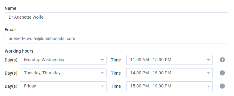
name:"multitime",
_getForm(mode){
const id = webix.uid();
return {
view:"form", id:id, borderless:true, padding:0, margin:10,
cols:[
{
view:"multiselect", label:"Day(s)", labelWidth:50, name:"day",
options:["Monday","Tuesday",/* ... */]
},
{
view:"richselect", name:"time", label:"Time", labelWidth:50,
options:["11:00 AM - 15:00 PM","14:00 PM - 19:00 PM"]
},
this._getIcon(mode,id)
]
};
}
}, webix.ui.multidate);
Bottom line
Okay, guys, now you have an awesome scalable input that makes both sides happy. Users have a smart input for typing or selecting smaller bits of information, and developers have a smart solution that can create inputs and process data.
Webix has a bevy of controls and widgets for various purposes. Even if you can’t find the right control, you can always get away with this issue by customizing the existing components or creating your own. If you want to share your know-how with us, feel free to drop a line in the comments section below.

